Supporting case study
One design system across four DHCS workstreams
California DHCS
I designed shared patterns that made service rules visible across four California health-care workstreams. The Figma system kept components, decisions, and handoff connected as teams moved from Adobe XD.
- Role
- UX Designer
- Program context
- IBM Consulting describes the larger CA-MMIS effort as provider-portal modernization, cloud migration, and digitized processes. That source does not describe my individual role.
Facts
- Client
- California Department of Health Care Services
- Dates
- January 2023 to March 2024
- Role
- UX Designer, with design-system and service-design responsibility
- Workstreams
- MCWeb Portal, OPUS, OLCC, and Provider Portal
- Working system
- Adobe XD to Figma transition with reusable Bootstrap-based patterns
- Accessibility checks
- JAWS, NVDA, and VoiceOver
- Delivery rhythm
- Weekly cross-workstream reviews, user stories, and ServiceNow handoff
The files were not the hard part
Moving a file did not move the decision
Four DHCS workstreams were moving in parallel while the design team shifted from Adobe XD to Figma. I rebuilt the existing Bootstrap patterns in Figma and kept their screens, review status, and delivery notes together.
The shared components needed to carry the service rules too: which claim types someone could assign, when a rule could be compared with an approved version, and which accounts should show paperless enrollment. I made those rules visible in the interface and kept the decisions with the work through review and handoff.
What the workstreams shared

The tool transition in progress
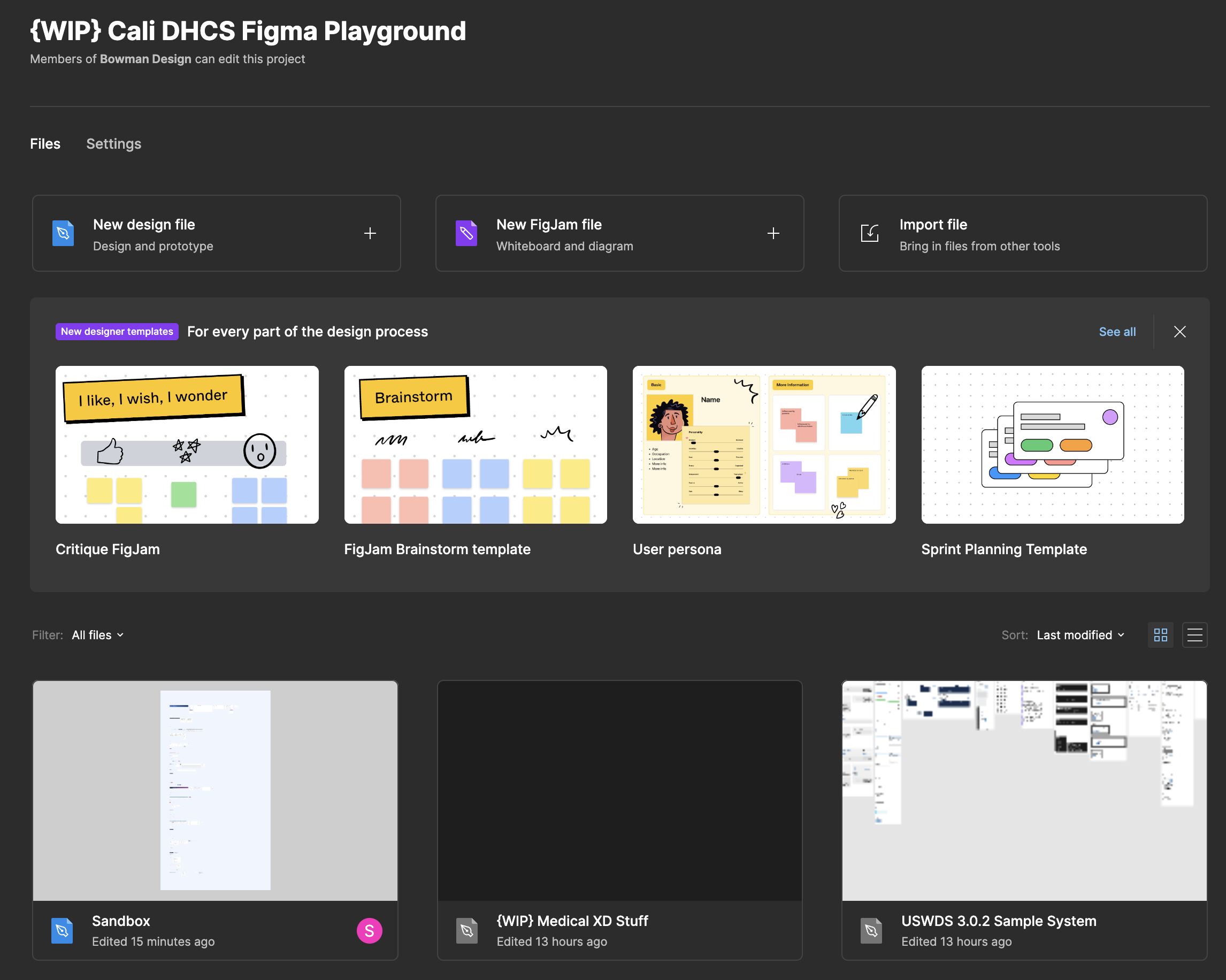
Change the tool, not the interface system
Preserve the existing Bootstrap system while changing the design tool and review workflow.
One pattern had to work in more than one screen
Review the pattern where people use it
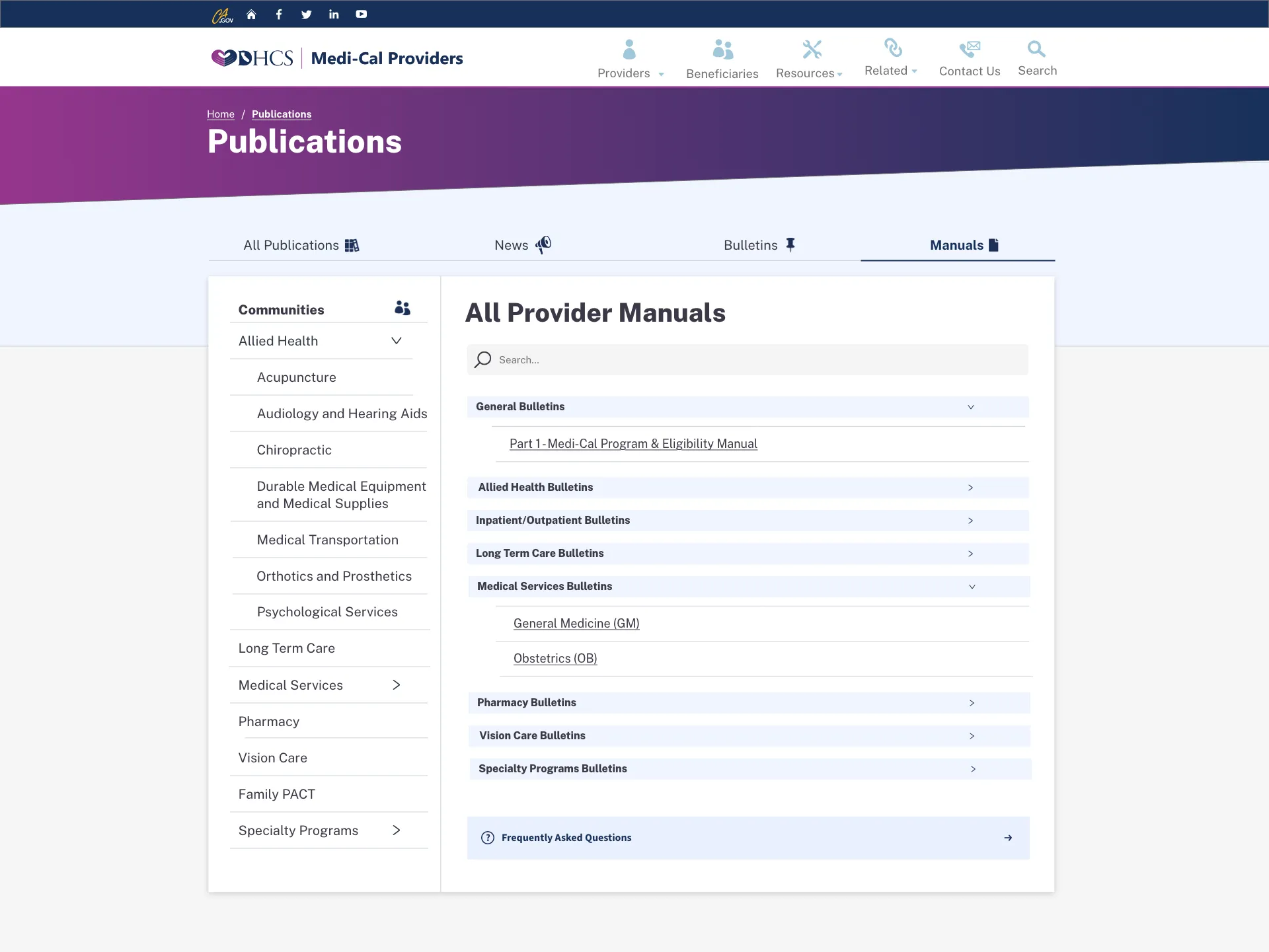
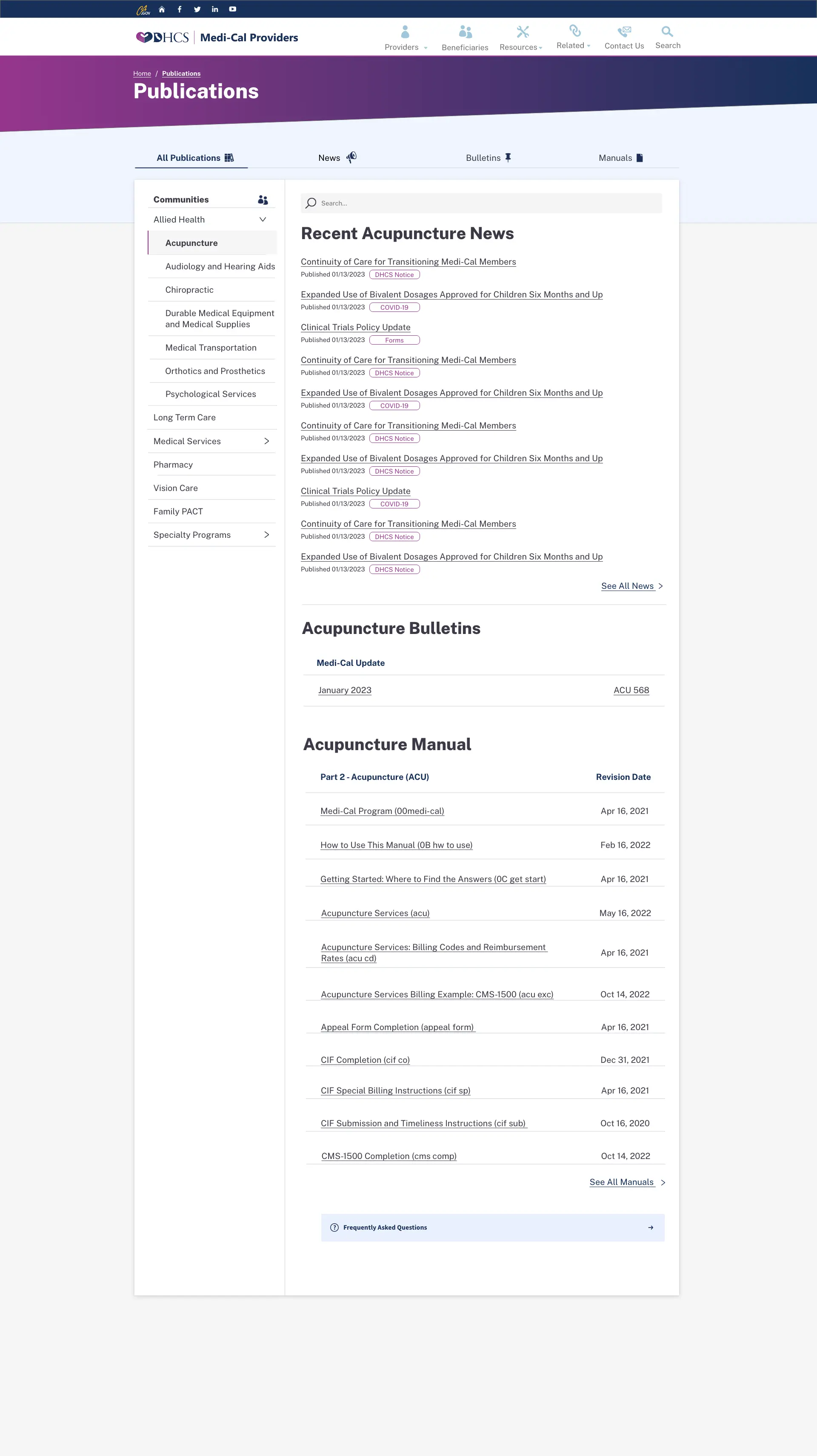
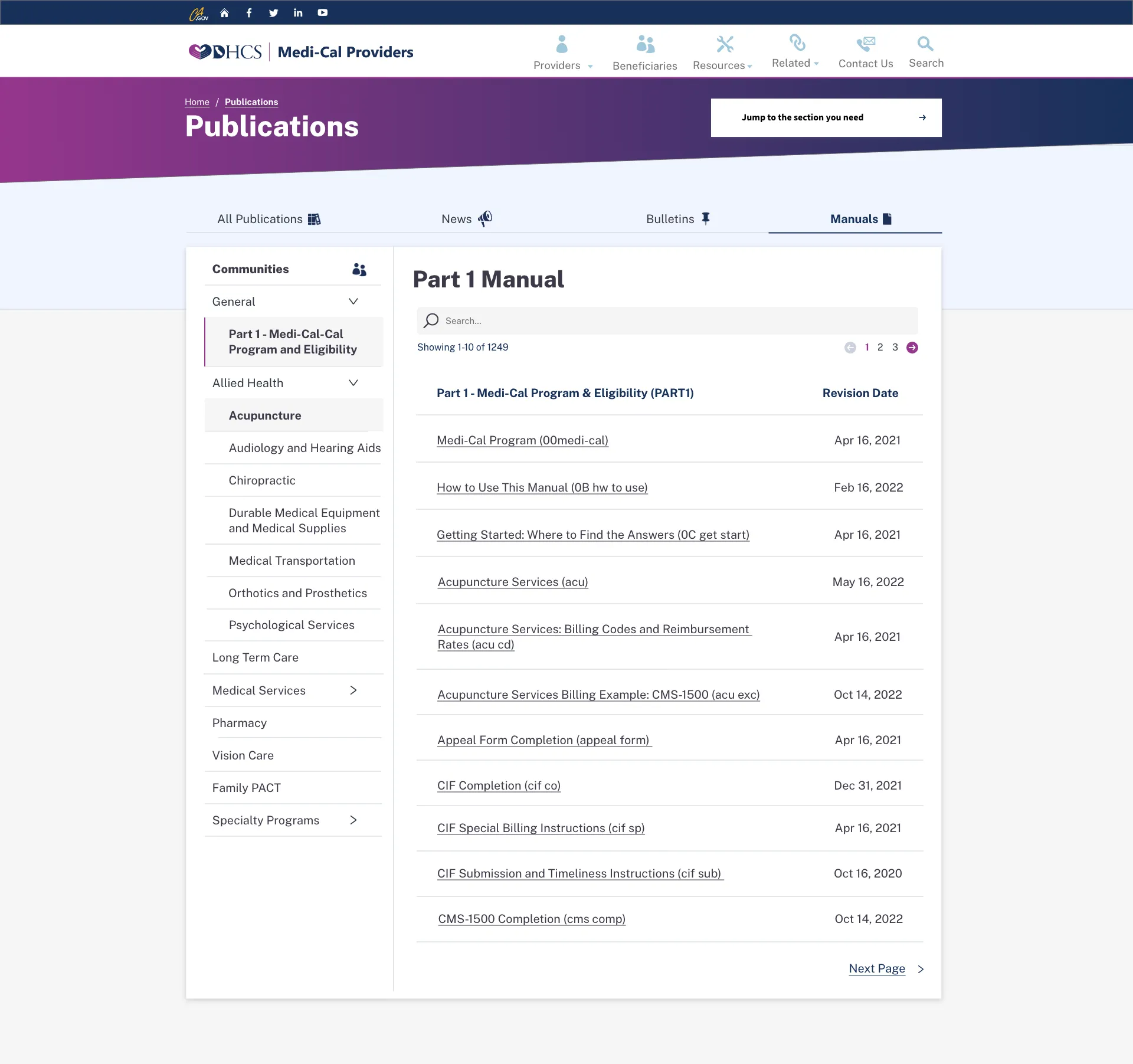
A reusable component only mattered if it held up across real work. The provider-publication overview combines community navigation, search, news, bulletins, and manuals. The manual detail keeps the same navigation and publication structure while adding revision dates and pagination.
I reviewed the pattern as part of those screens, not as a finished component in isolation. When it changed, I kept its usage note and related user story beside the screen so another workstream could recover the decision in the ServiceNow handoff.
One publication structure in two views
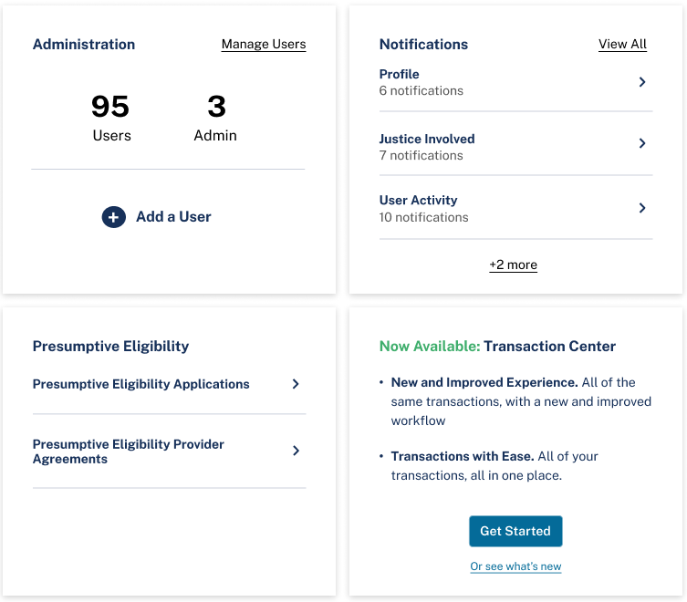
The dashboard applies repeated cards to administration, notifications, eligibility, and transaction entry. The selected detail shows those tasks together within the proposed interface.
Apply the card pattern to service tasks
The table needed rules for different values
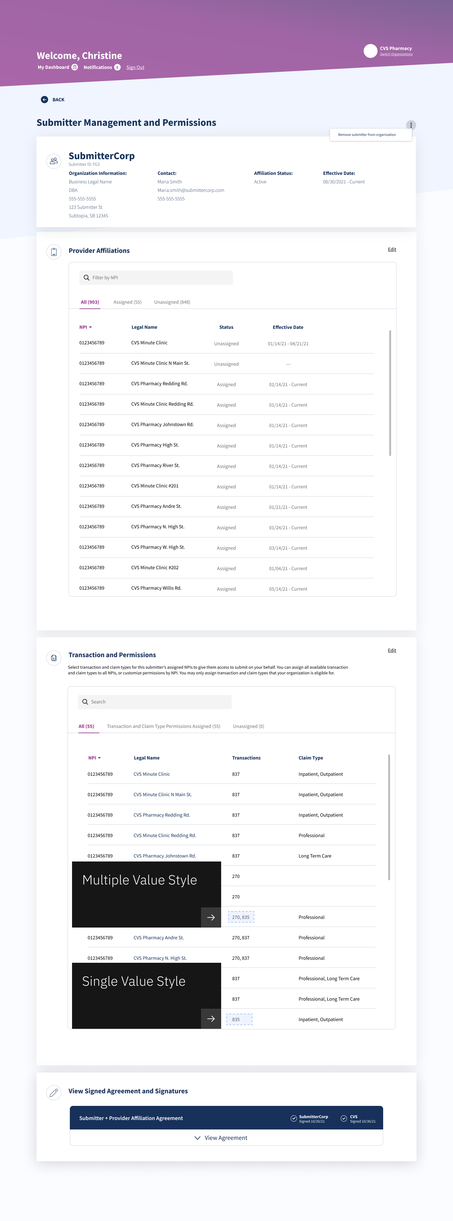
The Submitter Journey review distinguished a single transaction value from several values in one cell. The annotations kept that difference beside the table, making a small but reusable presentation rule visible during review.
Review detail: single and multiple transaction values
Carry the rationale into delivery
Review shared patterns in the screens that use them, then carry the reviewed rationale into the user story and ServiceNow handoff.
Permissions had to explain the consequences
Provider access came before transaction permissions
Assigning a National Provider Identifier, or NPI, allowed the submitter to submit on that provider’s behalf. Transaction and claim-type permissions then controlled the kinds of submissions available for that identifier.
The review added an explanation beside the assignment controls: unassigning an NPI also removed its associated transactions. That consequence needed to be visible before someone changed access.
Review detail: explain what unassigning removes

Permissions had to expose the service rule
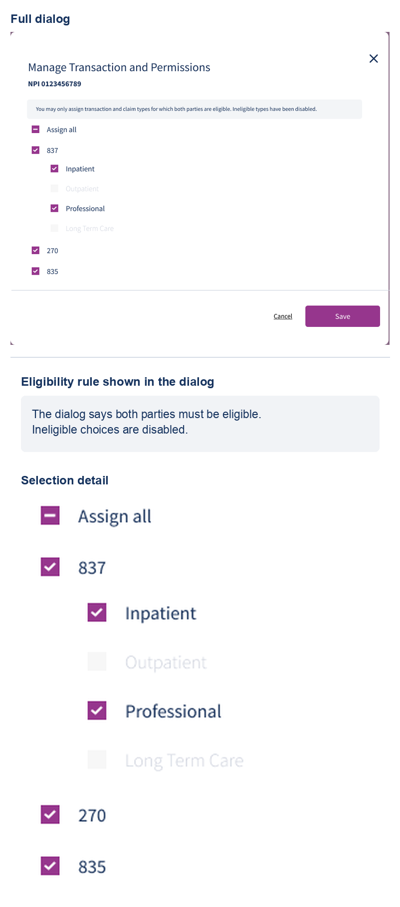
Both parties had to be eligible before a claim type could be assigned. I designed the Submitter Journey permissions dialog to explain that rule, disable ineligible claim types, and keep partial selection visible at the parent level before saving.
The artifact establishes only the interface states and hierarchy, not authorization enforcement in a live service, release, or conformance.
See the full dialog and selection detail
Make the consequences of removal explicit
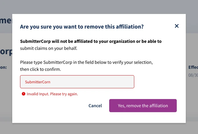
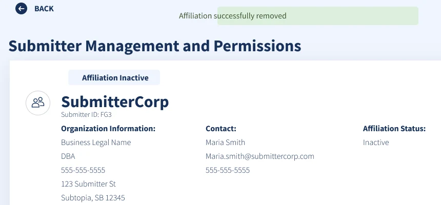
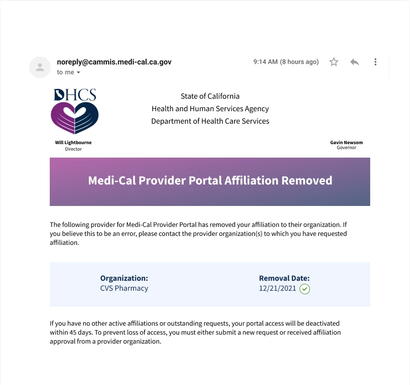
The removal sequence made the action and its consequences explicit. The confirmation required the submitter name and showed an inline error for a mismatch. The next frame marked the affiliation inactive, while the notification explained that portal access would be deactivated after 45 days without another affiliation.
The review cover below separates readiness for review from readiness for development. It marks the screens ready for review, with development readiness still pending. The sequence records the proposed interaction, error state, and notification, not a released flow.
Removing an affiliation in the reviewed frames

Expose eligibility before Save
Show eligibility, unavailable choices, and partial selection before a person saves the assignment.
The administrator needed the relationship history
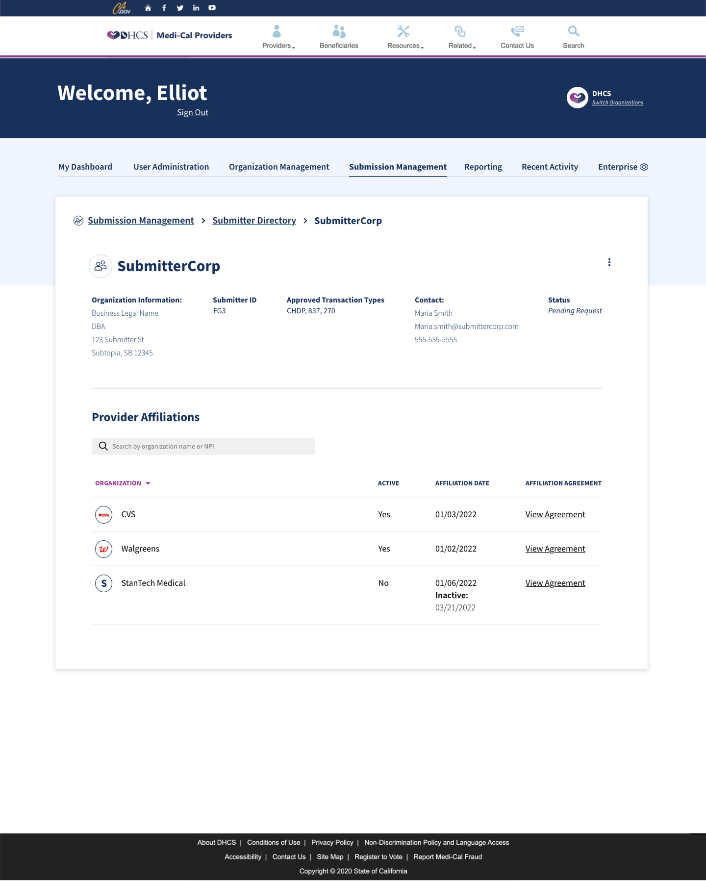
The DHCS admin view showed the same relationship from another role. A submitter record brought approved transaction types, contact information, and provider affiliations together. Active and inactive affiliations remained visible with their dates and agreements.
That view complements the provider-side permissions flow: it gives an administrator relationship context without repeating the assignment dialog.
Admin detail: affiliations, status, and agreements
A settings change needed a message
Saving the setting was only part of the task
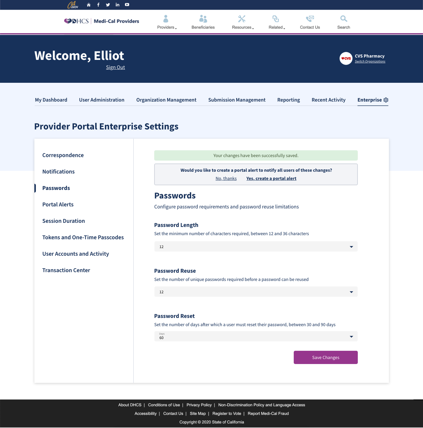
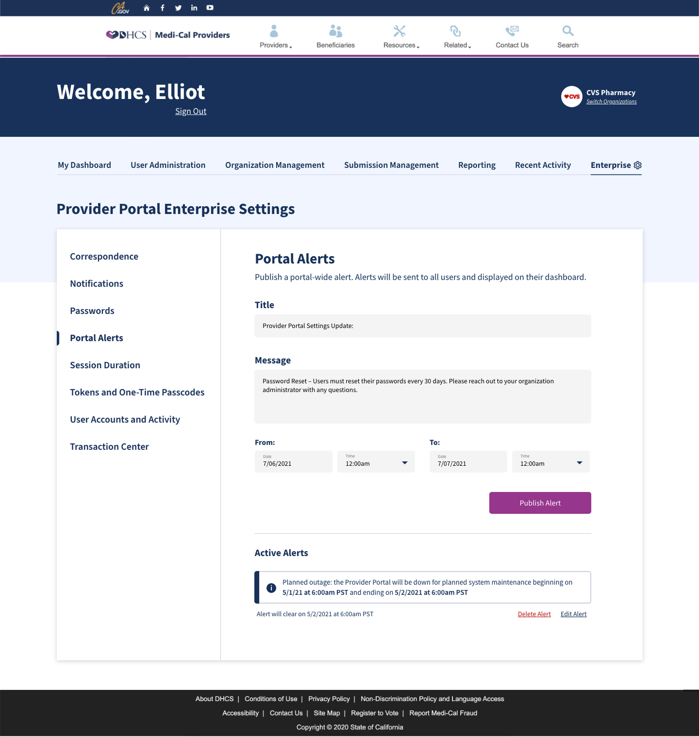
An enterprise setting could change what portal users needed to do next. The admin design connected a successful save to a prompt to create a portal alert. The alert editor provided a title, message, and start and end times.
These frames show how configuration and communication could fit into the same task. The example password-reset periods differ between the screens, so they document the proposed interaction rather than one consistent saved configuration.
From a saved setting to a scheduled alert
Connect the change to its communication
The proposed flow offered an alert after saving a setting so the administrator could explain the change to affected users.
Reporting started with the question
Define the reporting path before filling the table
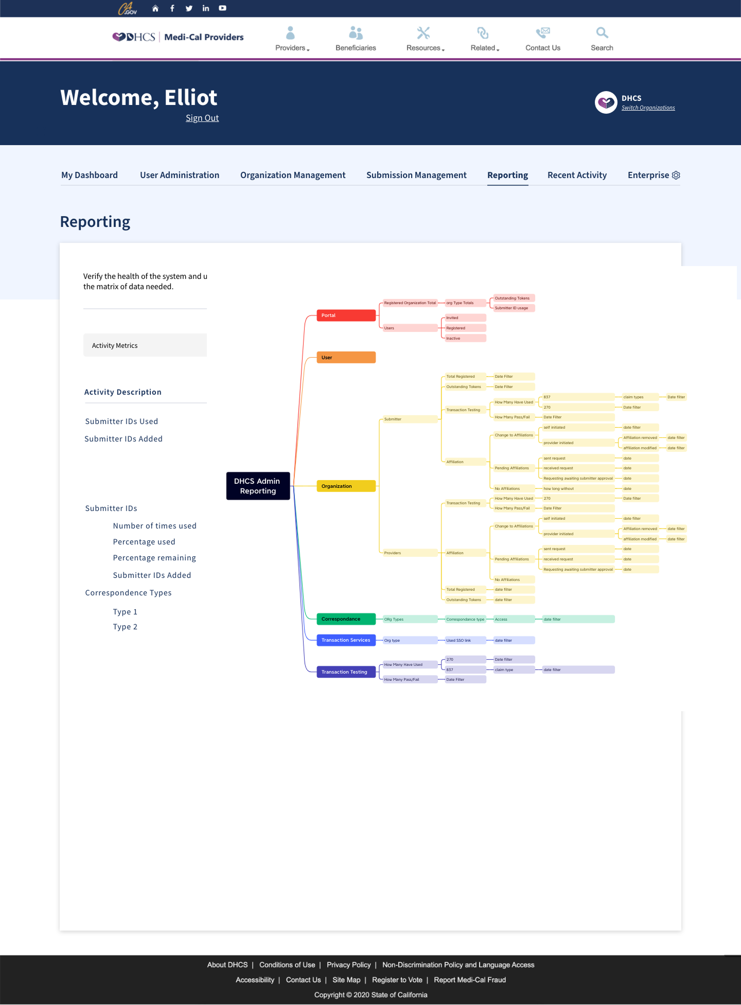
The reporting work explored how administrators would choose a metric, set a date range, inspect results, and export the data. The flow diagram connected those steps before the screen had to carry every reporting category.
A separate working map grouped reporting needs around the portal, users, organizations, correspondence, and transactions. Its organization branch distinguished providers from submitters and separated registration, testing, and affiliation questions.
Scope
These are original program workflow and design explorations. They show proposed structure and behavior, not released reporting, measured usage, or independently established authorship of each admin artifact.
Workflow detail: choose, filter, inspect, and export

Working-map detail: organize the reporting questions
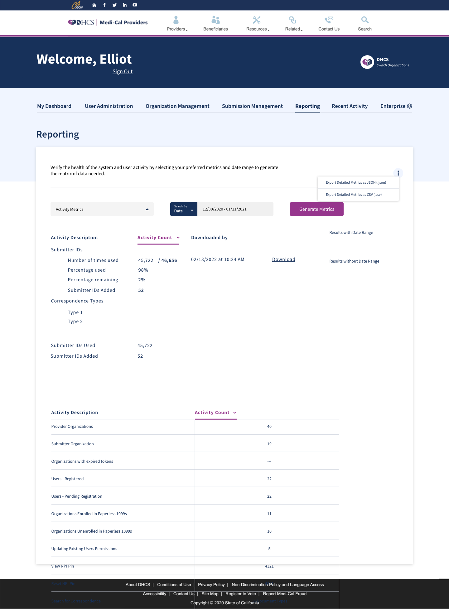
The results screen was still being worked out
The results exploration brought metric selection, a date range, counts, and JSON or CSV export into one view. It also retained unresolved layout problems: in the complete frame, table rows extend over the footer. The artifact makes the intended reporting task inspectable while showing where the design remained unfinished.
Exploration detail: results and export controls
The rule editor had to show what changed
Rules moved through added, updated, and deleted
OPUS staff maintained data-transformation rules that moved through three states: added, updated, and deleted. Someone reviewing a rule needed to see which items had changed, open the item behind a change, compare it with the approved version, and find a specific record without reading the whole list.
I wrote the requirements for the rule editor as thirteen Gherkin scenarios across three areas: rule navigation, rule details, and search. Each scenario named the window, the trigger, and the expected state, so a developer or tester could check the behavior without interpreting a wireframe.
The editor in three sections

The scenarios settled the small decisions
The editor opened in three sections. View options at the top left filtered the data table to all, added, updated, or deleted items with one radio choice. Action buttons at the top right stayed visible while the table scrolled. The table itself carried the action code, description, and comment for each item.
Two rules did most of the work. View Approved stayed disabled until the selected item was updated or deleted, because an added item had no earlier approved version to show. Search opened the item editor with every field editable, highlighted the first match, and enabled Find Next. When the list ran out, the editor asked whether to search again from the beginning instead of stopping without a message.
Scope
The scenarios are a requirements artifact dated July 2023. They establish the specified behavior, not a built editor, a release, or adoption by OPUS staff.
Specify behavior as scenarios, not annotations
Write each rule-editor behavior as a given, when, then scenario so the handoff carried testable states rather than annotated screens.
Enable comparison only where a comparison exists
Keep View Approved disabled until the selected item is updated or deleted, so the interface never offers a comparison that cannot exist.
A screen-reader check could change the guidance
Visual consistency was not the test
Figma could show a consistent component. It could not tell me what assistive technology would announce. I checked patterns with JAWS, NVDA, and VoiceOver. For each finding I documented, I named the affected component and changed its guidance rather than treating accessibility as a final visual review.
That made the finding useful beyond the screen where I found it. A later designer or engineer could see which pattern needed attention and why. These checks informed component guidance, but they were not a program-wide accessibility certification.
Keep the finding with the guidance change
Record the screen reader, the affected pattern, and the guidance change together.
The Go Green link depended on a service rule
The component did not decide where it belonged
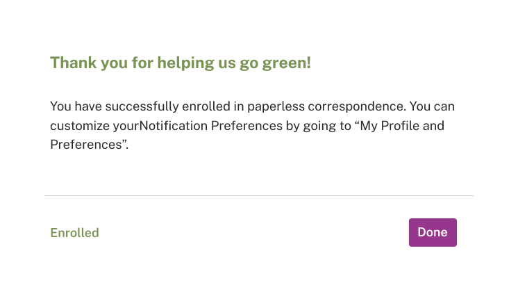
Go Green showed why the review notes belonged with the interface. The pattern could not appear on every account page simply because the component existed. Submitters did not receive correspondence, so I annotated the screen to remove the Go Green link from submitter pages.
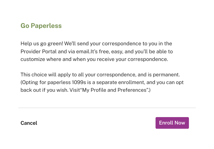
I designed the enrollment and confirmation screens and wrote the review annotation. The enrollment copy contains an unresolved distinction. It calls correspondence enrollment permanent, then says a separate paperless 1099 enrollment can be reversed. I kept that wording visible rather than smoothing it into a cleaner story.
Weekly reviews gave designers, engineers, and state stakeholders a place to test decisions like this across the workstreams. I linked the service rule to the relevant pattern and handoff notes so the next person did not have to reconstruct it from memory.
The service rule in the review note

The proposed enrollment flow
Let the service rule control the link
Show the Go Green control only where the user receives correspondence, and keep that service rule beside the screen.
Results
- The Figma design system cut design task time by 40 percent.
- The broader DHCS work increased claims-submission accuracy by 25 percent.
- The broader DHCS project received a state process-optimization award.
Evidence limit
The 40 percent result applies to design task time. Available project records do not connect the claims-submission-accuracy result or the award to Go Green, the screen-reader checks, or a named workstream. The chapter images are design and review artifacts, not evidence of release.
Related work
From thirteen systems to one service task
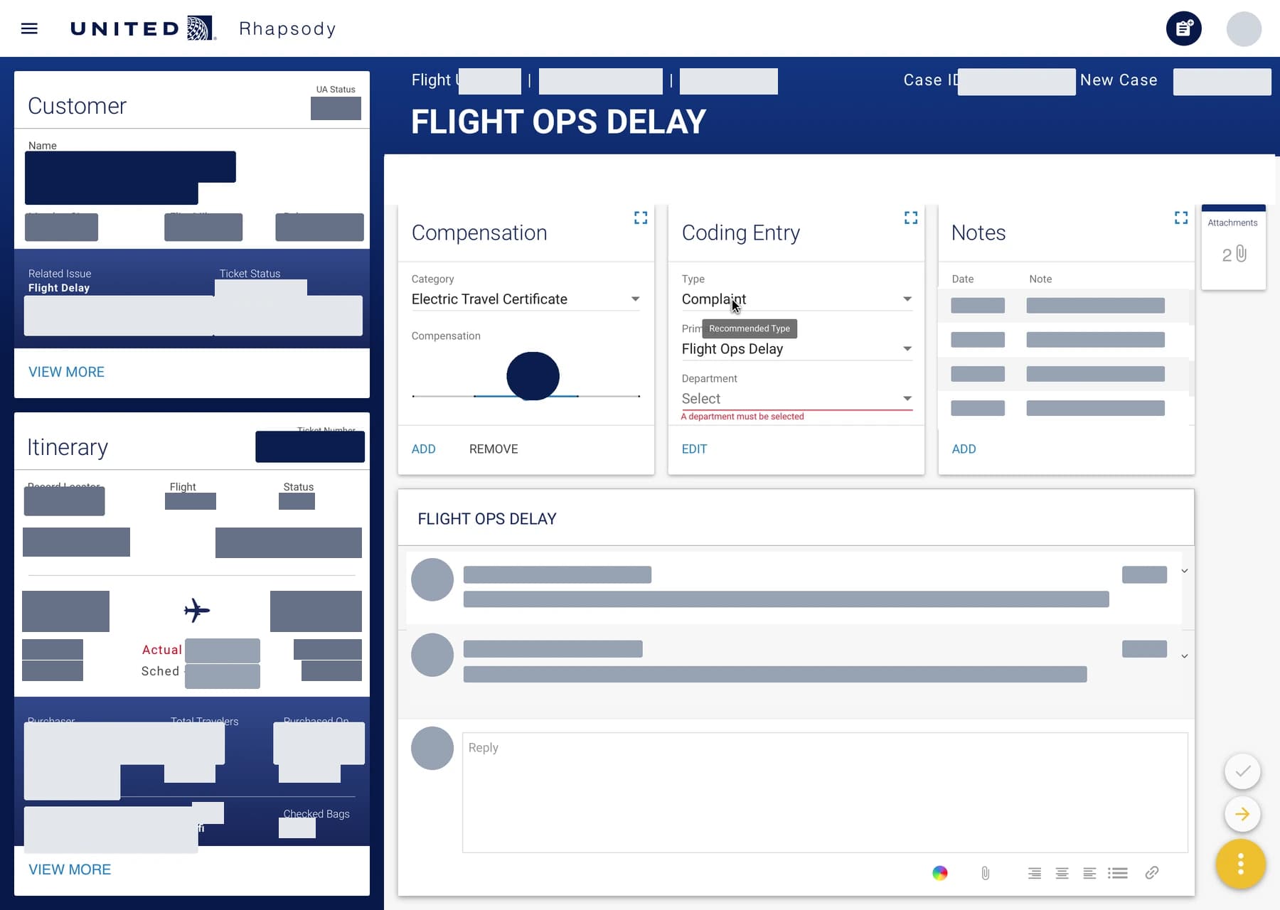
At IBM iX, I helped consolidate thirteen customer-care systems into one task-centered dashboard. During the pilot, average throughput rose from two to seven complaint resolutions per hour.
- Information architecture
- Interaction design
- Ethnographic research
- Service design
Designing and building AI workflows at AstraZeneca
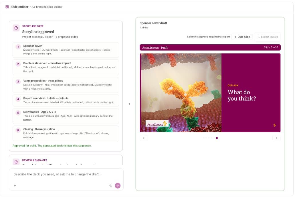
At AstraZeneca, I designed compliance tools, forecasting interfaces, and workflows for a shared AI workbench. I wrote requirements, built frontend prototypes with AI assistance, and developed components and guidance for engineers building their own screens.
- AI product design
- Design systems
- Frontend prototyping