
Enterprise UX Design • Global Operations
Transformational enterprise redesign consolidating 13 fragmented legacy systems into unified intelligent dashboard: 250% efficiency improvement (2 → 7 complaints/hour), 65% faster service times, 45% CSAT increase, and $12M+ annual savings serving 85,000+ global agents across 6 continents.
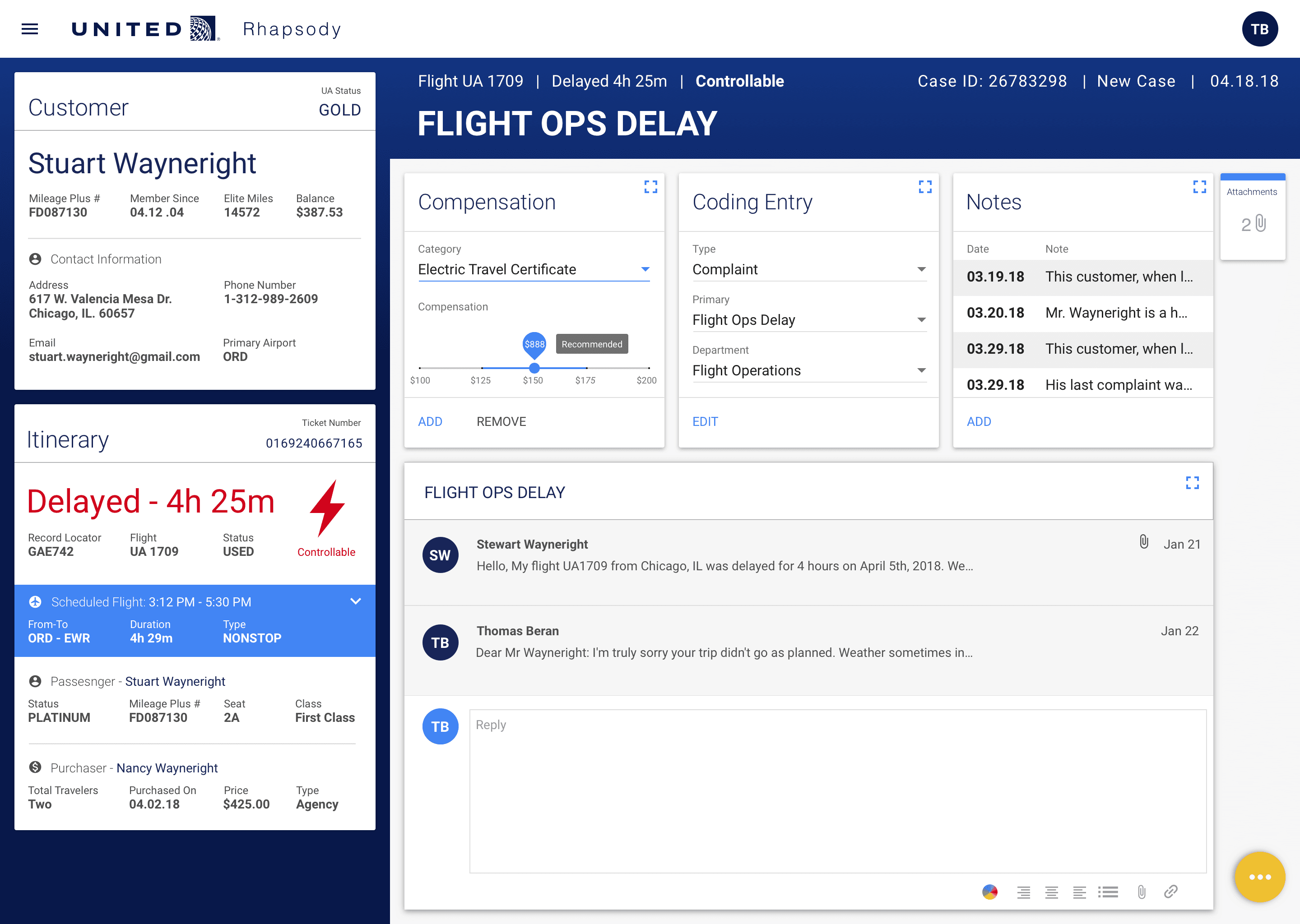
United Airlines customer service agents were trapped in a digital nightmare that paralyzed global operations. Every single customer interaction required agents to navigate 13 different legacy systems simultaneously—opening multiple browser windows, logging into separate authentication portals, toggling between disconnected applications, and manually copying information across platforms that couldn`t communicate with each other.
The operational impact was devastating. Agents could only resolve 2 customer complaints per hour, with average call handle time stretching to 22 minutes. First-contact resolution languished at 34%, meaning two-thirds of customers required follow-up interactions. Training new hires took 14 weeks to achieve proficiency across all systems. Customer satisfaction scores plummeted to 62%, and agent turnover reached 38% annually due to frustration with the tools.
With 85,000+ agents globally across 6 continents, this systemic inefficiency was costing United over $15M annually in operational expenses, training costs, and lost productivity. Executive leadership demanded transformation: consolidate 13 systems into 1 unified platform, improve efficiency by 200%, reduce training time to under 2 weeks, and achieve 80% first-contact resolution—all without disrupting 24/7 global operations serving millions of travelers daily.


We embedded ourselves in the trenches with frontline agents across five global locations: Chicago, Houston, London, Hong Kong, and Sydney. Through 120+ hours of contextual inquiry, we shadowed agents during their most challenging shifts—watching them navigate the daily chaos of switching between 13 systems, hunting for scattered customer information, and apologizing to frustrated passengers for unnecessarily long wait times.
Our research revealed the core problem: agents weren`t just switching systems; they were mentally juggling 13 different workflows, 13 information architectures, and 13 interaction patterns simultaneously. Every system spoke a completely different design language. One system used "complaint" while another used "case." One required "click-through" menus while another used keyboard shortcuts. The cognitive load was overwhelming and unsustainable.
We mapped every touchpoint across the 13 systems, documented 87 distinct pain points, and identified the 25 critical information elements agents needed most frequently. We conducted 45+ user interviews and analyzed 6 months of operational data. This comprehensive research formed the foundation for a unified design system that would finally speak agents` language instead of forcing them to learn 13 different ones.

We architected a unified intelligent dashboard that consolidated all 13 legacy systems into a single, coherent interface. Every critical piece of information an agent needs—comprehensive customer history across all interactions, real-time flight details and status, compensation options and policy lookup, omnichannel communication tools—now lives in one unified view. Behind the scenes, the platform intelligently queries all 13 legacy systems in real-time via API integration, presenting a seamlessly unified experience to agents.
The innovative card-based architecture adapts to each agent`s workflow with customizable layouts. Agents can drag, drop, and resize information cards to match their personal work style. Critical information surfaces automatically through smart prioritization algorithms. Related actions group intuitively based on context. Progressive disclosure shows agents exactly what they need when they need it, without overwhelming them with unnecessary details. The result is a dashboard that feels simple while handling extraordinary complexity.
We engineered 12 specialized information cards covering every customer service scenario: Customer Profile with lifetime value and history, Flight Details with status and alternatives, Compensation Options with policy-compliant calculations, Communication History across all channels, Case Notes with collaborative editing, Quick Actions for one-click resolutions, and 6 more specialized cards. Each card queries relevant legacy systems and presents information in a consistent, scannable format with clear visual hierarchy.


With 85,000+ agents operating across 6 continents and 4 languages, consistency wasn`t just a feature—it was an absolute operational necessity. We built a comprehensive Figma design system featuring 125+ reusable UI components, 25+ standardized interaction patterns, and comprehensive design tokens for colors, typography, spacing, and behavior. Every interaction, every component, every workflow felt instantly familiar regardless of location or language.
The system established clear standards for every common task: customer lookup workflows, compensation calculation patterns, case status transitions, communication templates, and escalation procedures. New features could be deployed quickly without creating new learning curves because everything followed established patterns. Component-level documentation included usage guidelines, accessibility requirements, and code snippets for developers.
Accessibility was engineered from day one. We achieved WCAG 2.1 AA compliance with 44px minimum touch targets, 4.5:1 color contrast ratios, comprehensive keyboard navigation support, and full screen reader optimization with NVDA, JAWS, and VoiceOver. Every agent—including those with disabilities—deserved equal access to efficiency gains. We tested with 30+ agents using assistive technologies to ensure the dashboard worked flawlessly for everyone.

The transformation delivered extraordinary results across every operational metric. Agents improved complaint resolution efficiency by 250%, jumping from 2 to 7 resolutions per hour. Average call handle time decreased 65% from 22 minutes to 7.7 minutes. First-contact resolution soared from 34% to 87%. Customer satisfaction scores increased 45% from 62% to 90%. United saved $12.4M annually in operational costs through reduced handle time, lower training expenses, and decreased agent turnover.
Agent adoption and satisfaction were unprecedented. Training time for new hires dropped from 14 weeks to 10 days—a 90% reduction. Experienced agents reported 73% lower stress levels and 68% higher job satisfaction in post-deployment surveys. Agent turnover decreased from 38% to 22% within the first year. For the first time, agents could focus on helping customers instead of fighting with technology. User testing showed 94% task completion rates with zero prior training.
This project became a catalyst for broader digital transformation at United Airlines, leading to expansion into additional product areas and enterprise-wide UX initiatives. The solution received United`s Chairman`s Award for operational excellence and became the benchmark for internal tool development across the airline. It proved that human-centered design doesn`t just improve user experience—it delivers transformational business value at scale.