Independent product
College football, beyond the scoreboard
CFB Model Lab
I built CFB Model Lab to explore why my predictions disagreed with the betting lines. A longtime interest in college football became a way to learn Python and modeling, and bring that research into a product I could use every week.
- Contribution
- Product design and AI-assisted development
Facts
- My work
- Product direction, interface design, Python modeling, and AI-assisted development
- Built with
- Python, pandas, scikit-learn, XGBoost, SQLite, Next.js, React, and TypeScript
- Foundation
- CollegeFootballData APIs, Starter Pack, Model Training Pack, and external rating sources
I wanted to understand the numbers
I've followed college football since I was a kid. When the BCS came along, I became interested in how the rankings worked. I wanted to understand the calculations behind the decisions, and that curiosity stayed with me.
I was especially interested in the Mid-American Conference, where teams receive less attention. I wanted to look beyond the record and understand how those teams actually played. Learning statistics such as expected points added, or EPA, gave me another way to look at a game.
That interest eventually led me to building models and comparing their predictions with the betting lines. I wanted to get better at handicapping games. When my numbers disagreed with the market, I wanted to understand why. CFB Model Lab became the place where I could work through those questions.
The first attempt went wrong in all kinds of ways
I started with the CollegeFootballData Starter Pack and Model Training Pack because the Python and modeling work were unfamiliar to me. The examples gave me somewhere to begin. I used AI coding tools to help turn them into an application while I learned how the pieces worked.
Over roughly a year and a half, I kept trying things, getting stuck, and starting again. The first attempt went wrong in all kinds of ways. More capable coding tools helped with the second attempt, but so did having a better understanding of what I was asking them to build.
The interface was the part I knew how to think through. I could use my day-to-day UX skills to decide what belonged together, what needed an explanation, and how to make the research useful when I came back to it the next week.
Start with the week's games
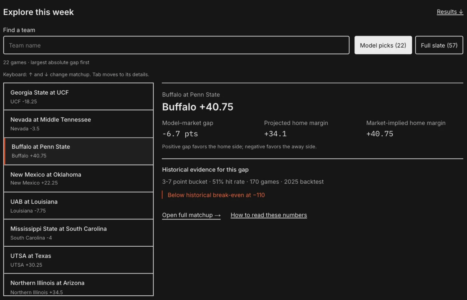
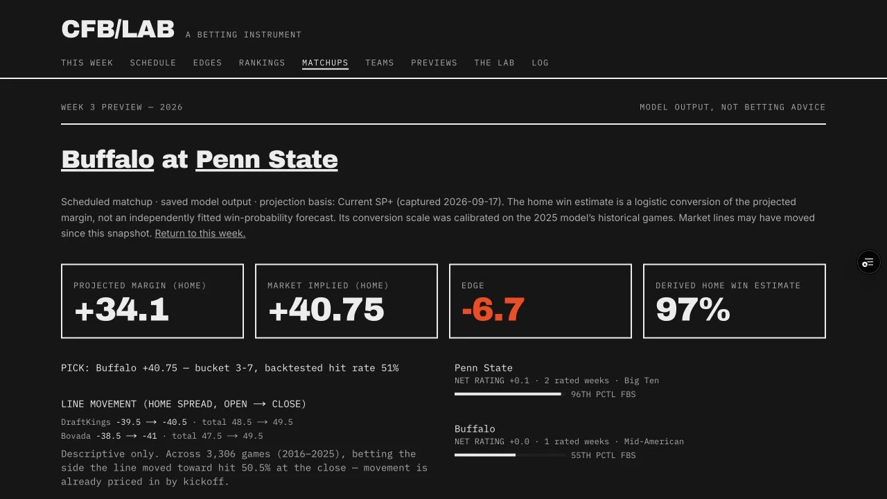
The landing page brings the week's games, my model's projections, and the market lines together. I can look through the slate, find a disagreement, and choose a game to investigate. That became the starting point for my weekly research.
I kept the selected matchup beside its supporting evidence so I could examine the prediction without losing the comparison. A large gap between the model and the market gives me a reason to look closer. The results still have to show whether there was an advantage.
Compare the call with the evidence
I also keep the model's performance and my own betting record in separate views. The model still needs tuning, and the results haven't been great. I wanted a place to keep track of those results and go back over the calls that didn't work out.
Look more closely at the teams
I added the full 2026 schedule and individual team profiles so I could move from a game into the teams behind it. As I learned more, I added different rating systems to compare how they assessed the same programs.
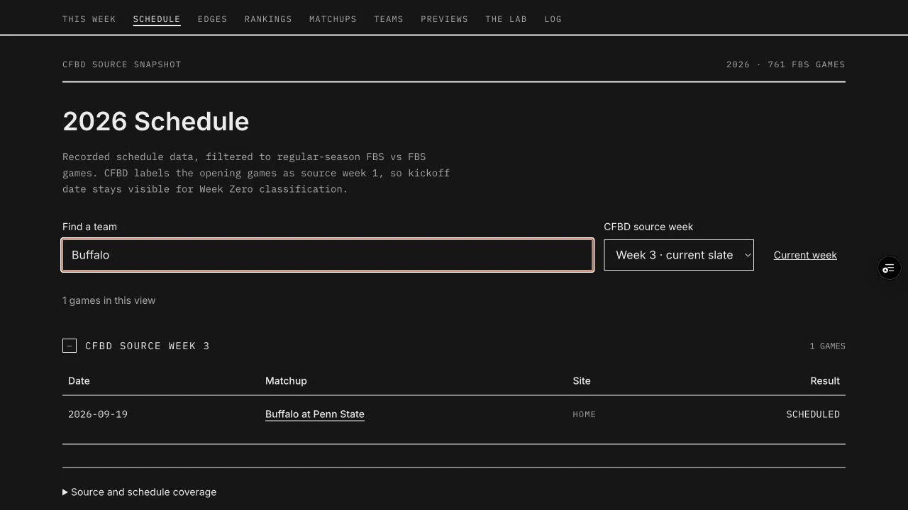
Buffalo gives this flow a concrete starting point. From the schedule, I can open the Penn State game, then follow Buffalo into its profile. The game asks how the teams compare this week. The profile helps me step back and look at how Buffalo has played over time.
Follow a game into the team behind it
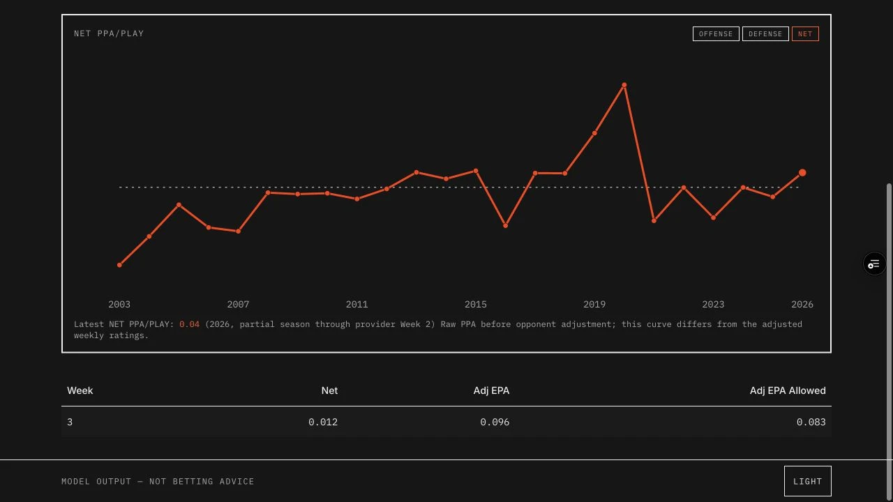
Putting those views together helped me work through an important distinction: a team's history and this week's forecast answer different questions. I kept the raw curve separate from the ratings that account for opponent strength, with the partial-season label beside the chart. Otherwise, similar-looking numbers could invite a comparison they cannot support.
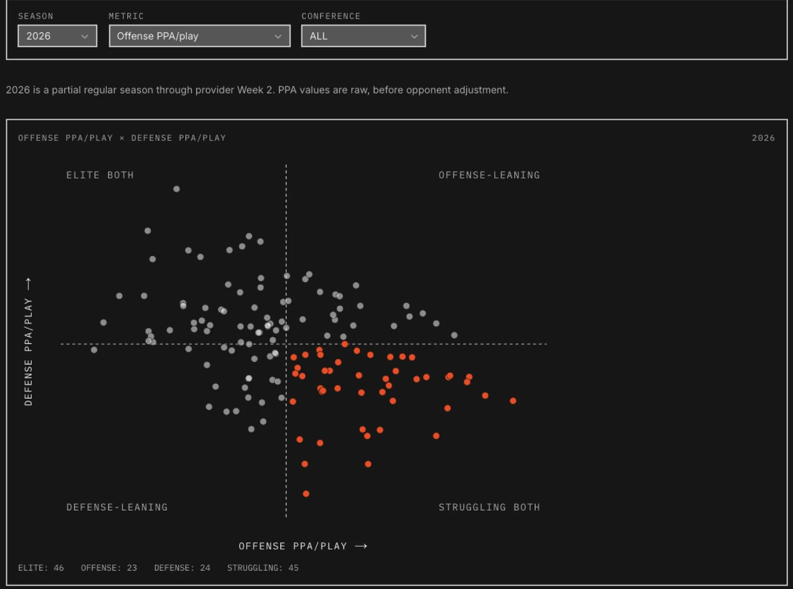
The season explorer gave me a way to see teams together on a chart. It puts offense and defense on separate axes, with filters for season and conference. I can look for a pattern across the field, then narrow the comparison to one conference.
The whole field, then your conference
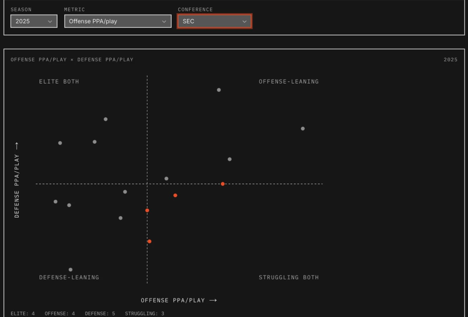
I connected the filters, chart, and sortable table so I could move from a visual impression to the actual values. Working on that connection was a chance to practice data visualization with a subject I already wanted to spend time exploring.
What if these two teams played?
I also wanted to compare teams that weren't scheduled to play each other. That became the hypothetical matchup tool. I can choose two teams, compare their strengths, and change the venue to see how the projection responds.
Choose the teams. Change the venue.
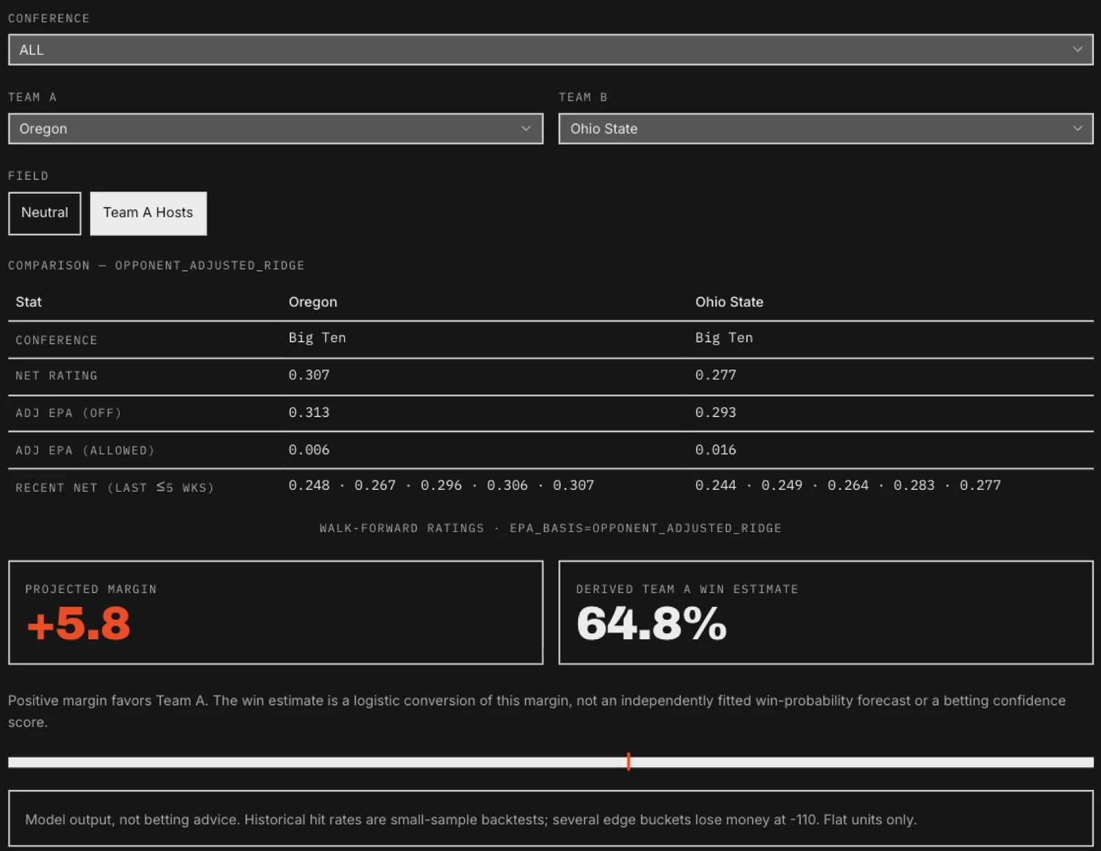
I brought the team comparison and prediction into the same view. Changing the venue makes the home-field assumption visible, and the team statistics give me something to examine alongside the result. These hypothetical games stay separate from the schedule and its market lines.
A place for the next question
The Lab grew as I tried different ways of researching the game. Backtests, rating comparisons, and detailed statistical views each gave me another way to examine what I was seeing. The collection reflects the questions I kept coming back to.
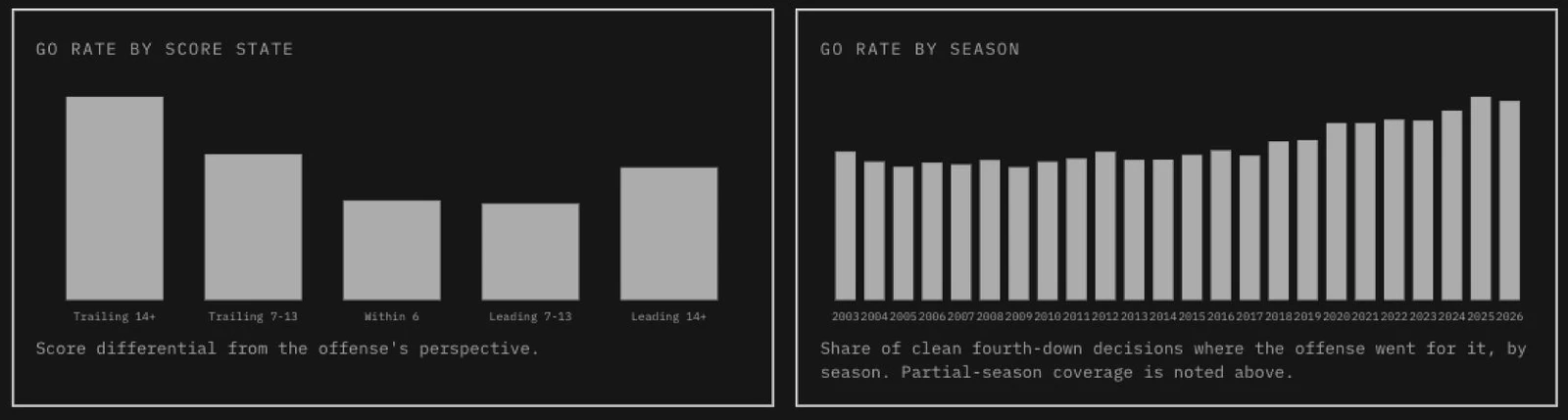
The fourth-down explorer is one example. It lets me look at how often teams go for it in different score situations and how that behavior has changed over time. Historical play data becomes something I can explore through charts and a searchable team table.
The game looks different when you change the question
Season previews gave me a different challenge. I wanted to take a season's worth of information and turn it into detailed research reports I could return to. That meant deciding what mattered and organizing it into something readable.
Turning research into something I could return to
The useful shift was from exploring one statistic to organizing a season's research around a team. A report needed to make the assumptions understandable as well as give me a conclusion to revisit. That is the part of synthesis I wanted to practice.
Scope
The public preview index reported "No season previews staged for this build" when checked on 17 September 2026. An actual report was unavailable to capture, so this account of the intent is not accompanied by a verified report example.
I wanted all of this in one place I could keep developing, without paying for another research service. The schedule, team research, experiments, and results became parts of the same personal workspace.
Being confident is something to test
Picking the winner and estimating a win probability are different tasks. If a model repeatedly says 75 percent, I want to know whether those teams win about three games in four. That question became the calibration view.
Compare the confidence with what happened
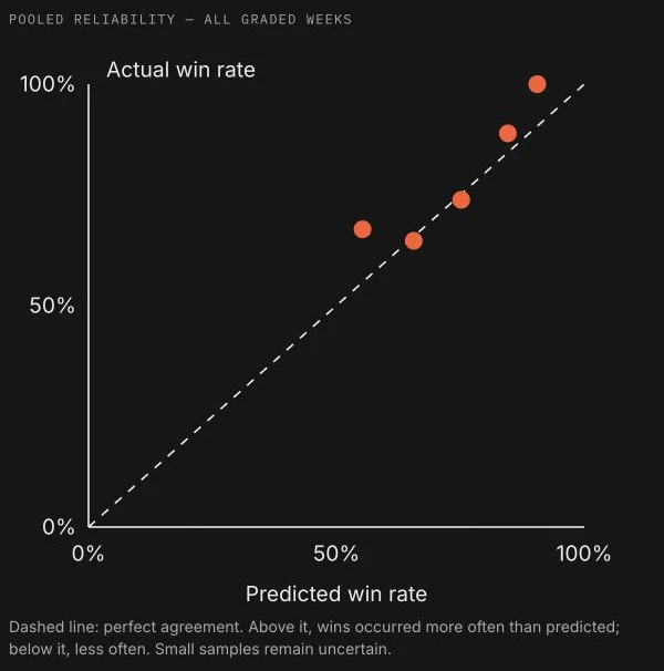
The chart is paired with a table of probability ranges, game counts, predicted rates, actual rates, and the gap between them. Expand a week to inspect its contribution. Keeping the sample size beside the percentage matters: a bucket with six games should not look as settled as one with more than a hundred.
Brier score and log loss add another way to question the model. Both evaluate the probabilities; log loss penalizes confident mistakes more strongly. The interface explains those measures alongside winner accuracy, without treating any of them as profit.
Different football questions need different models
I learned to separate a description of what a team has done from a prediction of what it might do next. The opponent-adjusted efficiency board describes completed play. A separate local SRS workflow estimates team strength from scoring margins and opponent strength, with prior-season carryover, venue adjustments, a cap on large margins, and separate overtime treatment.
The probability model combines several statistical approaches to estimate how likely a team is to win. Twelve statistical families each contribute offense and defense values for both teams. That makes 48 adjusted inputs; talent and Elo for each team bring the total to 52 continuous inputs. Week and conference are additional categorical fields.
Following the supplied Model Training Pack's recipe, logistic regression, XGBoost, and random forest feed a logistic combining model. A separate margin workflow predicts a point difference. The hypothetical matchup screen converts its margin to a win estimate, so I keep that conversion distinct from the trained probability model.
External ratings need the same care. The research importer keeps provider variants and capture times, matches team identities, and preserves each source's venue convention. Adding home advantage twice, or treating a season-end rating as a pregame observation, would produce a plausible-looking comparison with the wrong meaning.
Keep the question attached to the number
Label descriptive efficiency, point-scale strength, projected margin, and win probability separately. A new model should not quietly replace the meaning of a familiar ranking.
A model must not know how the game ended
The project's recorded audits found that post-game Elo had inflated an earlier backtest. That made the timing of a value as important as the value itself. A Week 6 projection must not use plays from Week 6 just because they are present in today's dataset.
The shared Python cutoff selects only earlier regular-season weeks. Postseason has its own rule, using the completed regular season rather than mistaking a bowl's week-one encoding for the season opener. Missing coverage returns a named reason so the caller can refuse the result or disclose an approximation.
Archived predictions preserve what was recorded before kickoff. Historical reruns remain a separate kind of evidence, especially when the source data has since been corrected or the seasons have already informed development. This distinction changed how I presented results and what I was willing to claim about them.
The research has to survive the next refresh
The documented refresh workflow imports completed games and plays, rebuilds the dependent statistics, preserves the outgoing forecast card, and prepares the next slate. Python writes the data that the Next.js application publishes as static JSON. Training and API credentials stay outside the browser.
Captures carry timestamps and hashes. Before a build, freshness checks compare the source receipts with the derived outputs. The published freshness record can expire in the browser even if no new deployment arrives, making a missed update visible.
A process lock prevents overlapping refreshes from rewriting the same generated files. Failed runs restore local generated state, while preserving raw captures and audit records. Deployment has its own check that compares the published JSON with the local build. A successful upload and a verified update are separate facts.
What I learned by building it
I directed the product and developed it with coding agents. My work includes the interface, public API integrations, Python rating and modeling workflows, and implementation review. Building the application gave me a reason to learn what happens to the data before it reaches the screen.
Python prepares the data, and SQLite and static JSON carry it into the Next.js and React application. Behind the charts are opponent-adjusted statistics, SRS and Elo ratings, and separate models for margins and probabilities. Learning those distinctions helped me decide how to describe the numbers in the interface.
The CollegeFootballData packs remain the foundation, and the opponent-adjustment work uses Bud Davis's published ridge-regression method. I extended those starting points into the research workflows and application shown here.
A missing statistic could change whether I could make a comparison. A model's limitations could change the words I used around a result. Working through those details brought the data work and my design practice together.
The model still needs work. I now have a place to investigate football questions, keep track of the answers, and try something else when an approach doesn't hold up. Building it has let me follow my design decisions further into the software that makes them work.
Results
- A personal research application connecting weekly games, team comparisons, visual exploration, and model evaluation.
- Hands-on work across product design, Python modeling, data integration, and AI-assisted implementation.
Evidence limit
Screens and interactions reviewed on 17 September 2026. The data pipeline was reviewed separately in source, not rerun for this case study. The captures show dated model outputs, not current recommendations or evidence of improved prediction accuracy.
Related work
AstraZenecaFlagship engagement
Designing and building AI workflows at AstraZeneca
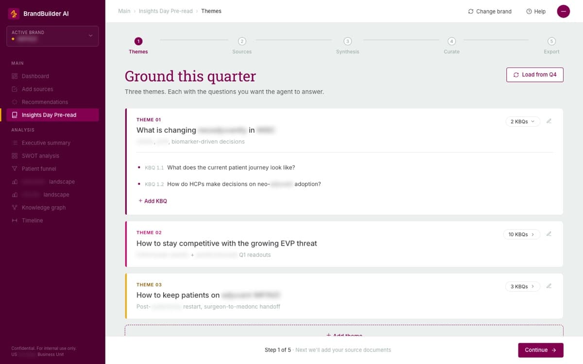
At AstraZeneca, I worked across compliance tools, AI assistants, medical-content workflows, and a shared design system. I combined requirements and interaction design with frontend implementation, then used working prototypes to review decisions with business and engineering partners.
- AI product design
- Design systems
- Frontend prototyping
JanssenSupporting case study
One working system for eighteen pharmaceutical brands
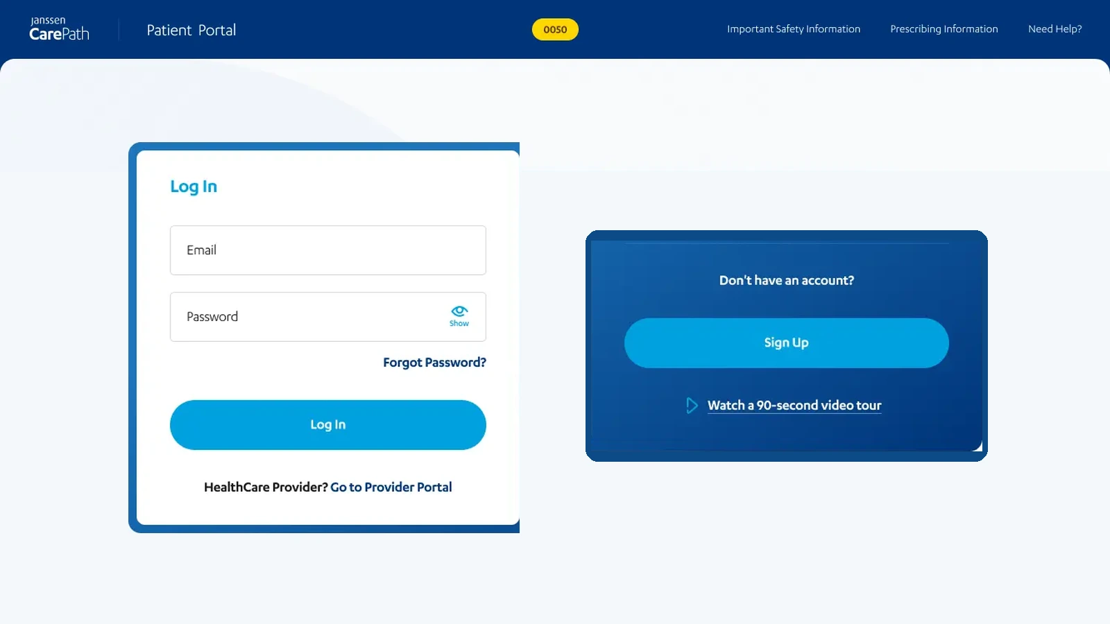
At IBM, I led UX across eighteen Janssen brands and managed two designers working in a shared Figma system. Enrollment variants kept completed details reviewable while changing the questions and steps for each program. Project records list more than 2,000 approved desktop and mobile screens.
- Design systems
- Regulated workflows
- Responsive design
- Design operations