One working system for eighteen pharmaceutical brands
Janssen
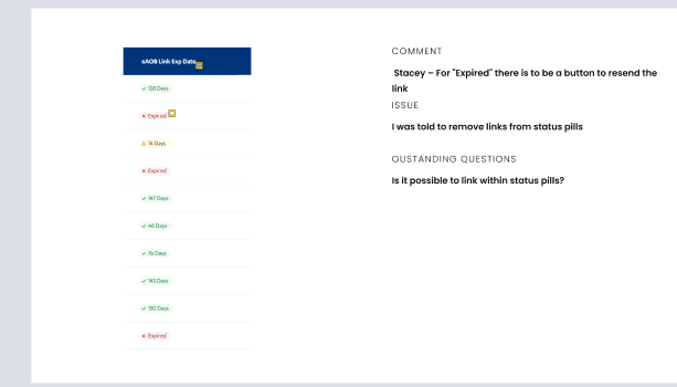
An expired link should tell the person what happened and what they can do next.
My decision
Review the status, resend action and required wording together, then compare the desktop and phone states.
- The design change
- I led UX across eighteen brands and managed two designers. We kept shared patterns and brand-specific copy in the same Figma review.
- What happened
- The team produced reviewed designs and handoff work. Project records list more than 2,000 approved desktop and mobile screens. The artifact shows a design review, not a measured launch result.
- Role
- Lead UX Designer
Facts
- Client
- Janssen
- Employer
- IBM
- Dates
- May 2021 to May 2022
- Scope
- Eighteen pharmaceutical brands
- Team
- Managed two designers
- Working system
- Shared Figma design system
- Output
- More than 2,000 approved desktop and mobile screens
Review regulated copy in context
CarePath flows combined interaction requirements with brand copy, legal language, and FDA review. The team needed to review required copy in the state and layout where a person would encounter it.
I led UX at IBM and managed two designers through that review cycle. The design team mapped forms, authentication, messages, and claims as explicit screen states so the interaction, responsive layout, and required copy could be reviewed together.
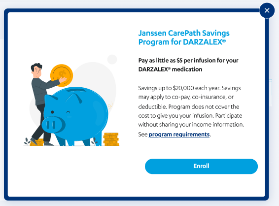
Related desktop and mobile savings designs place program copy beside an enrollment action. Their copy and action wording differ. These are historical design artifacts, not current program or eligibility guidance.
Review the program language with its action

Treat regulated copy as interaction design
Put requirements, copy, and screen state in the same review artifact instead of adding regulated language after the interaction was settled.
Share patterns, preserve brand differences
Eighteen brands shared form and authentication patterns but had different content and program rules. The Figma system kept common interactions together and made each brand's differences visible to reviewers.
Compare form behavior in one sheet
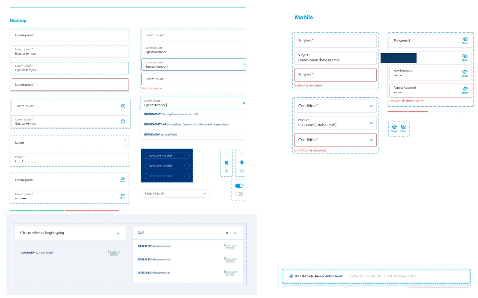
Share the interaction structure
Keep common interaction behavior in the system, then express brand differences through reviewed content and visual treatment instead of forking the flow.
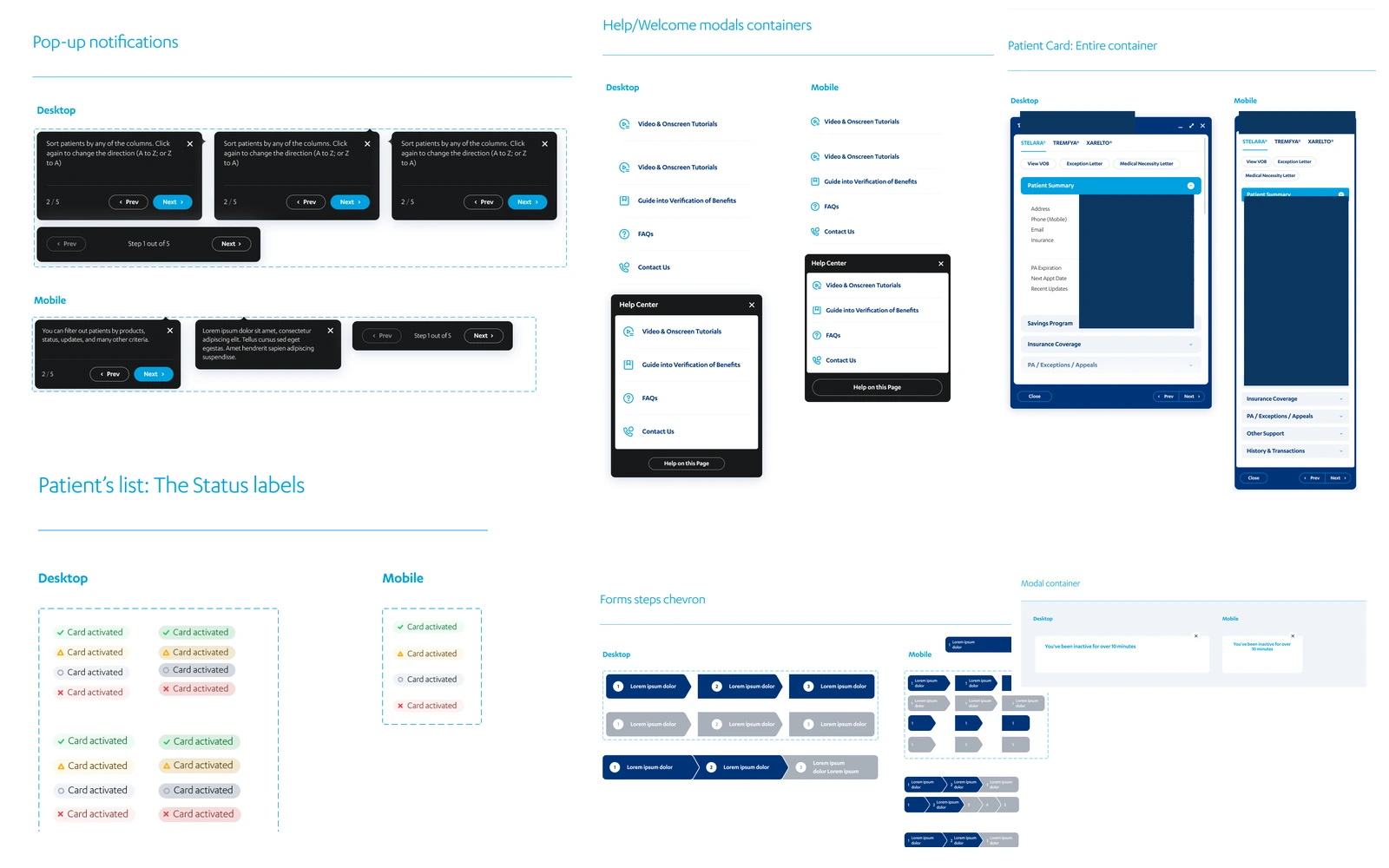
Account access, form validation, messages, and claims changed after a person acted or the system responded. Desktop and mobile layouts also had to preserve the same status and next action.
I led the review work. The system sheets put related states beside one another so reviewers could compare copy, actions, and desktop and mobile layouts.
The same review included password requests, email guidance, and validation. Those designs proposed the return path; they do not establish working email delivery or password enforcement.
See the states side by side
Give every scenario a way into the file
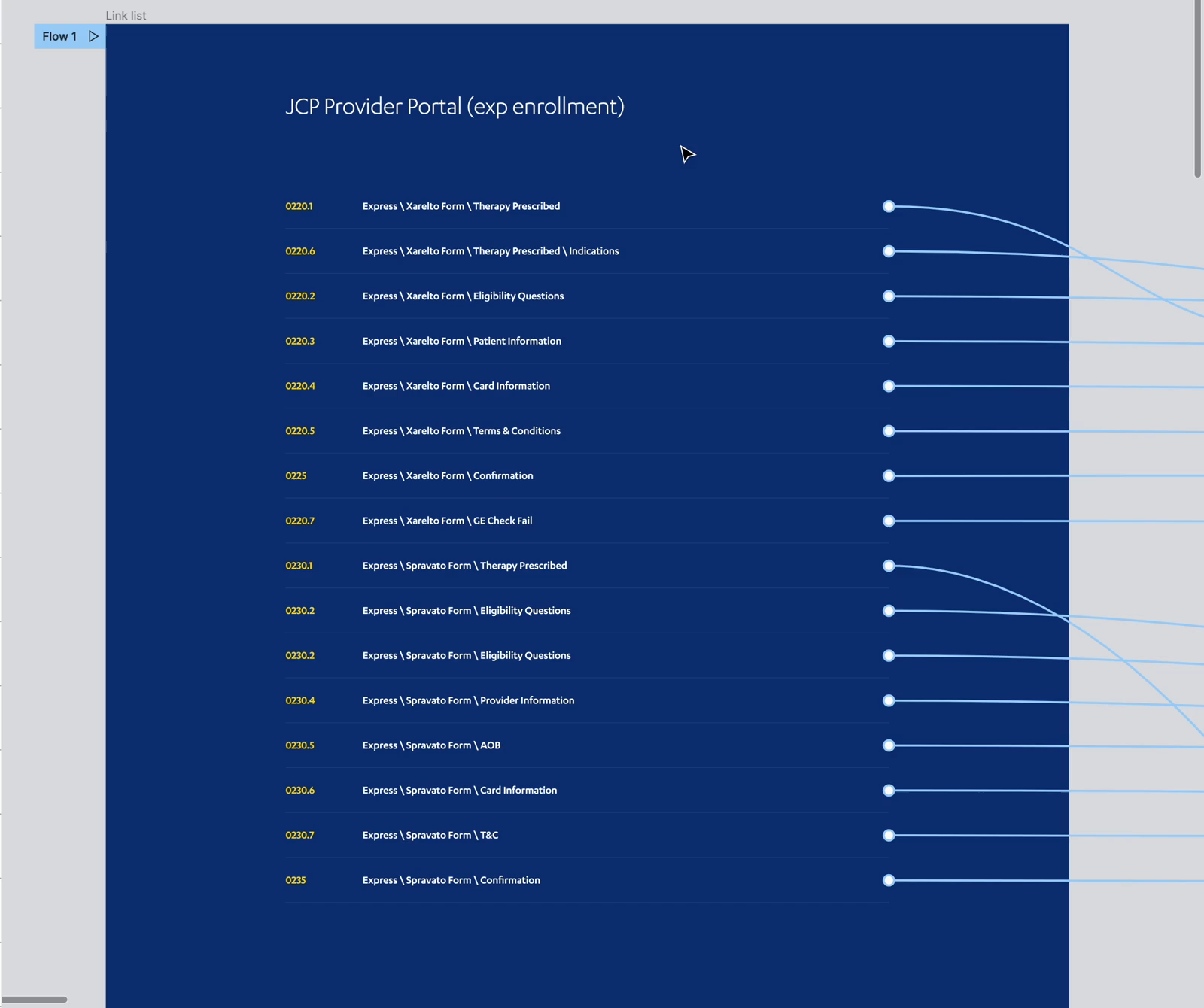
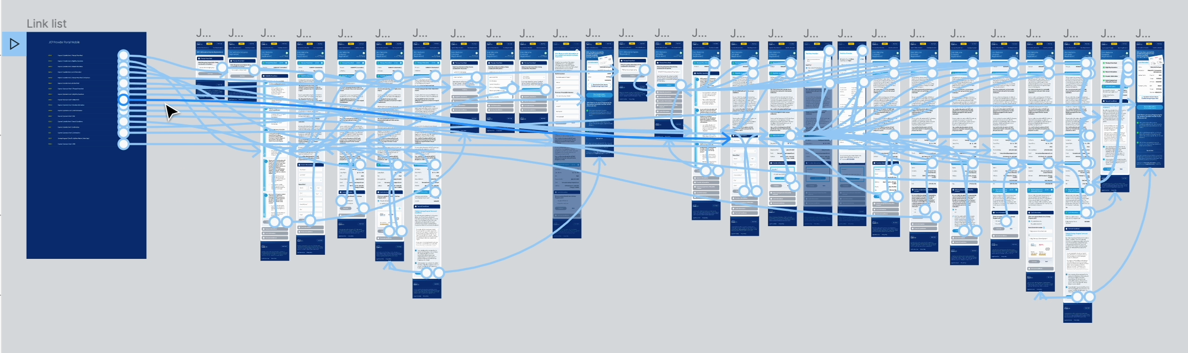
The enrollment files supplied by Intechnic used screen identifiers, named flows, and brand or program labels. In my walkthrough, I explain how I used them to find each step. Provider and patient enrollment each had desktop and mobile pages.
The index connected named scenarios to their proposed screen states. I could start with therapy selection, eligibility, patient information, or confirmation and follow the relevant part of the flow. The identifiers helped me navigate, although their order was not always sequential.
Follow the scenario index into the work
Follow the team's review workflow
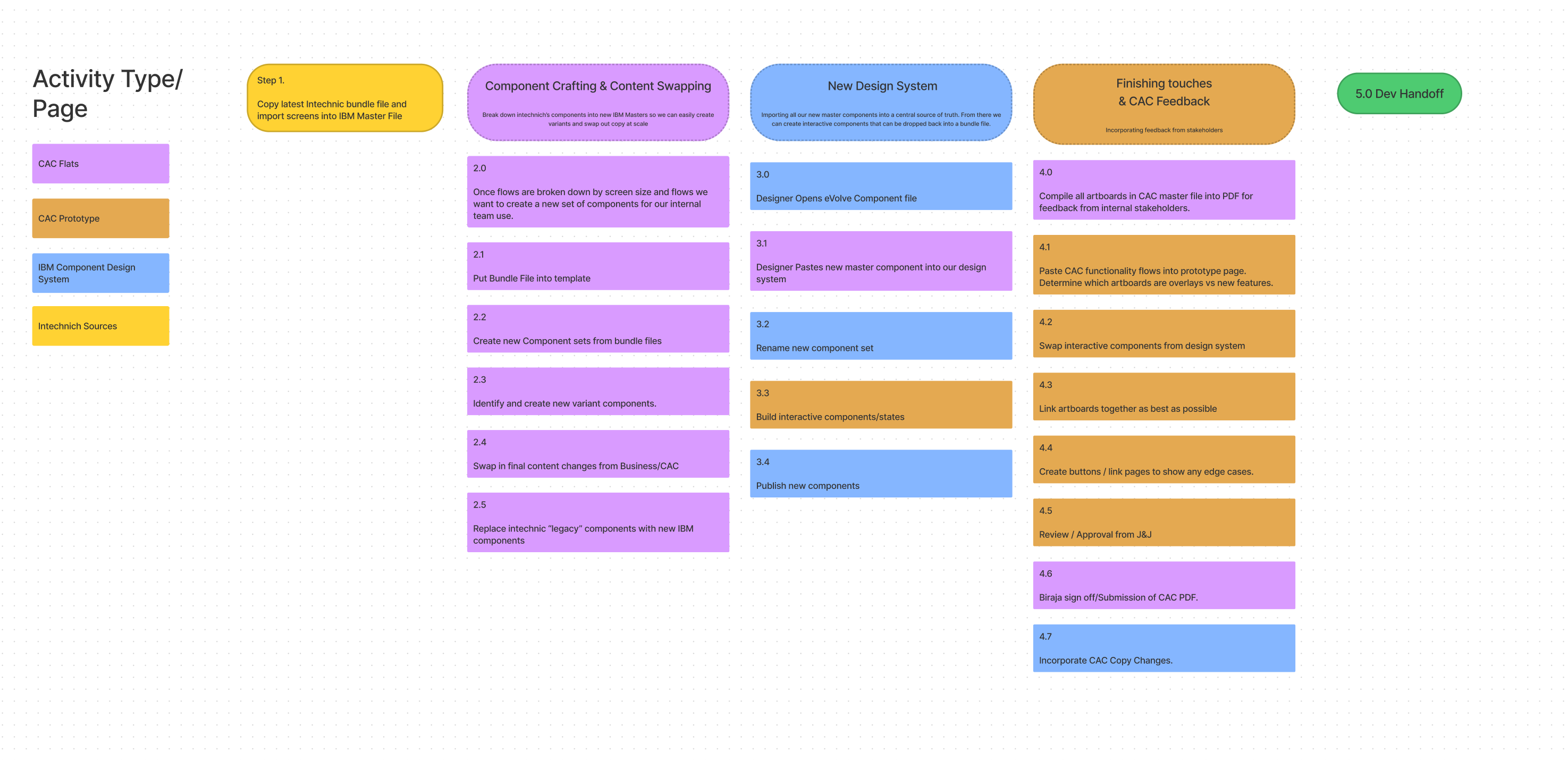
My work on the shared Figma system also involved content changes and stakeholder feedback. The team workflow connects those activities: prepare components from Intechnic source files, apply content changes, build interactive states, and prepare review PDFs before development handoff.
Our component stage made room for variants and final copy. The review stage brought PDF feedback, prototype connections, edge cases, and approval into the same process.
Keep components and review connected
When a status also needs an action
Our review work reached down to the relationship between a status and its next action. This note brings together an expired-link state, the need to resend, and the decision to remove links from status pills. It shows the team working through where the resend action belongs.
Separate the status from the next action
Keep enrollment answers and consent status distinct
Keep the shared structure, vary the requirements
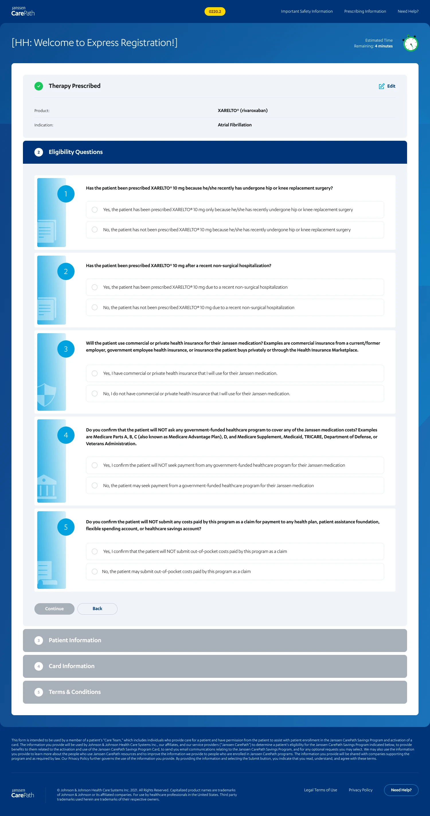
Enrollment made the value of the shared system concrete. The reviewed designs use the same completed, active, and upcoming section patterns across different program requirements. An earlier therapy choice remains visible with an Edit action while eligibility questions occupy the active section.
The screens show several related enrollment variants. They are not a recording of one person completing a single tested flow.
Scope
These design artifacts show proposed states and program variations. They do not establish working insurance verification, issued cards, production release, or measured enrollment results.
See the original eligibility design
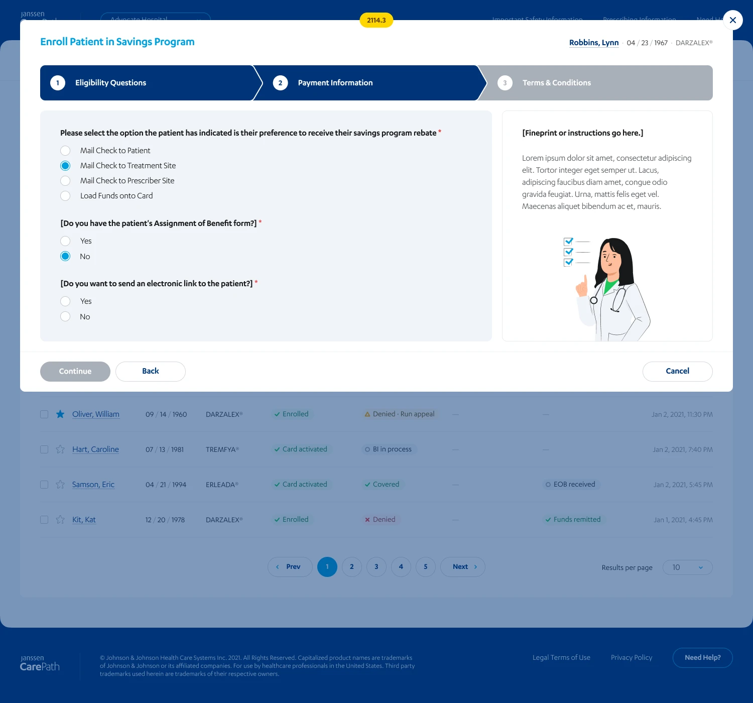
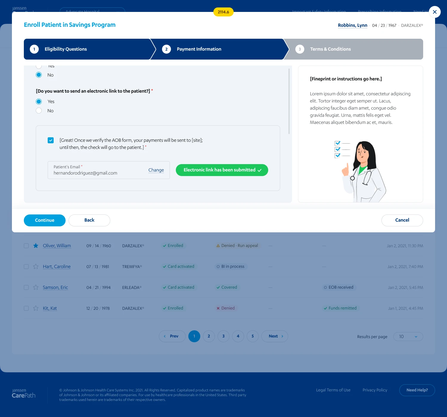
A consent request is not verified consent
A related rebate-enrollment variant makes a consequential distinction. Choosing payment to a treatment site requires an assignment-of-benefits form. If the form is missing, staff can request it through an electronic link. The subsequent design keeps payment directed to the patient until the form is verified.
These screens show the proposed rule and its explanation. They do not establish that links were sent, forms were verified, or payments were routed. The fixture name and email also differ in the follow-up draft.
Keep the pending authorization visible
Keep the patient queue in view
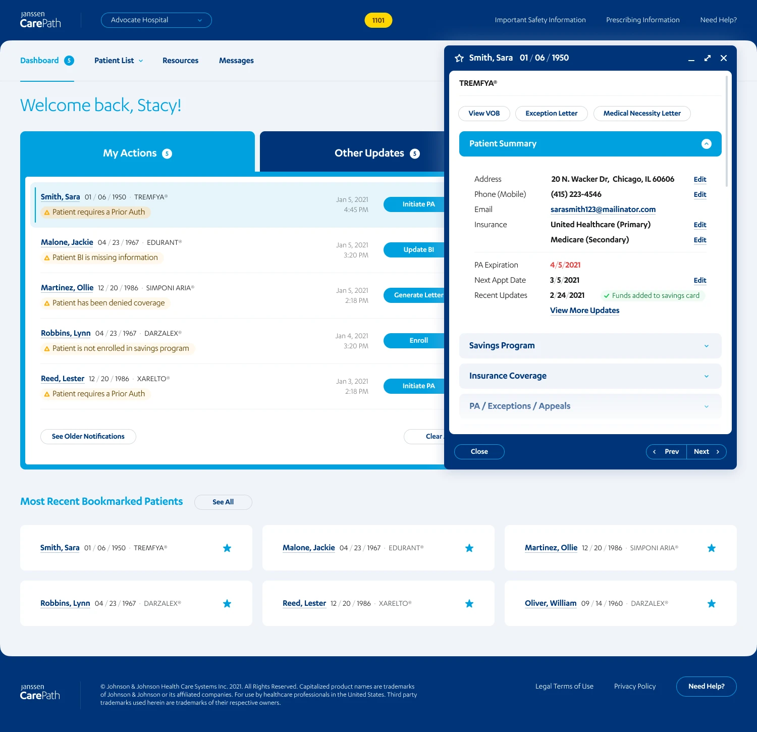
The dashboard separates work needing attention from other updates. Patient views distinguish enrollment, benefit verification, prior authorization, and claims. An open record keeps the selected row visible beside its details and previous/next controls.
Task-specific views and configurable columns kept the relevant status and next action in view. The team reviewed those patterns alongside required program copy in the shared Figma system.
Inspect a record without losing the queue
Keep the record connected to the queue
Open details beside the selected row so staff can inspect a patient and move to the next record without replacing the list.
The original portal screens use fictional demonstration records. They show design states, not real patient information or connected clinical services.
Route a message with incomplete information
The message form asks whether the sender knows the recipient's extension. If they do, one field handles routing. Otherwise, the form asks for therapeutic area and state. Patient association stays beside those fields.
Compare the two routing paths
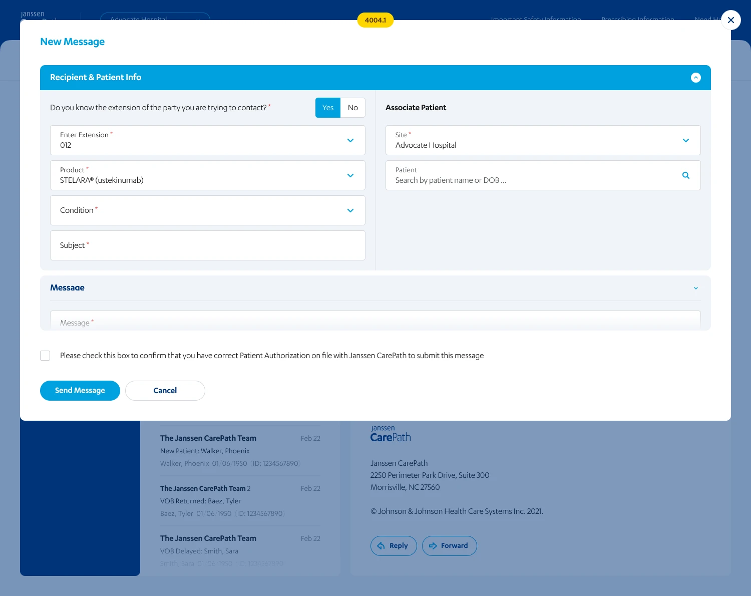
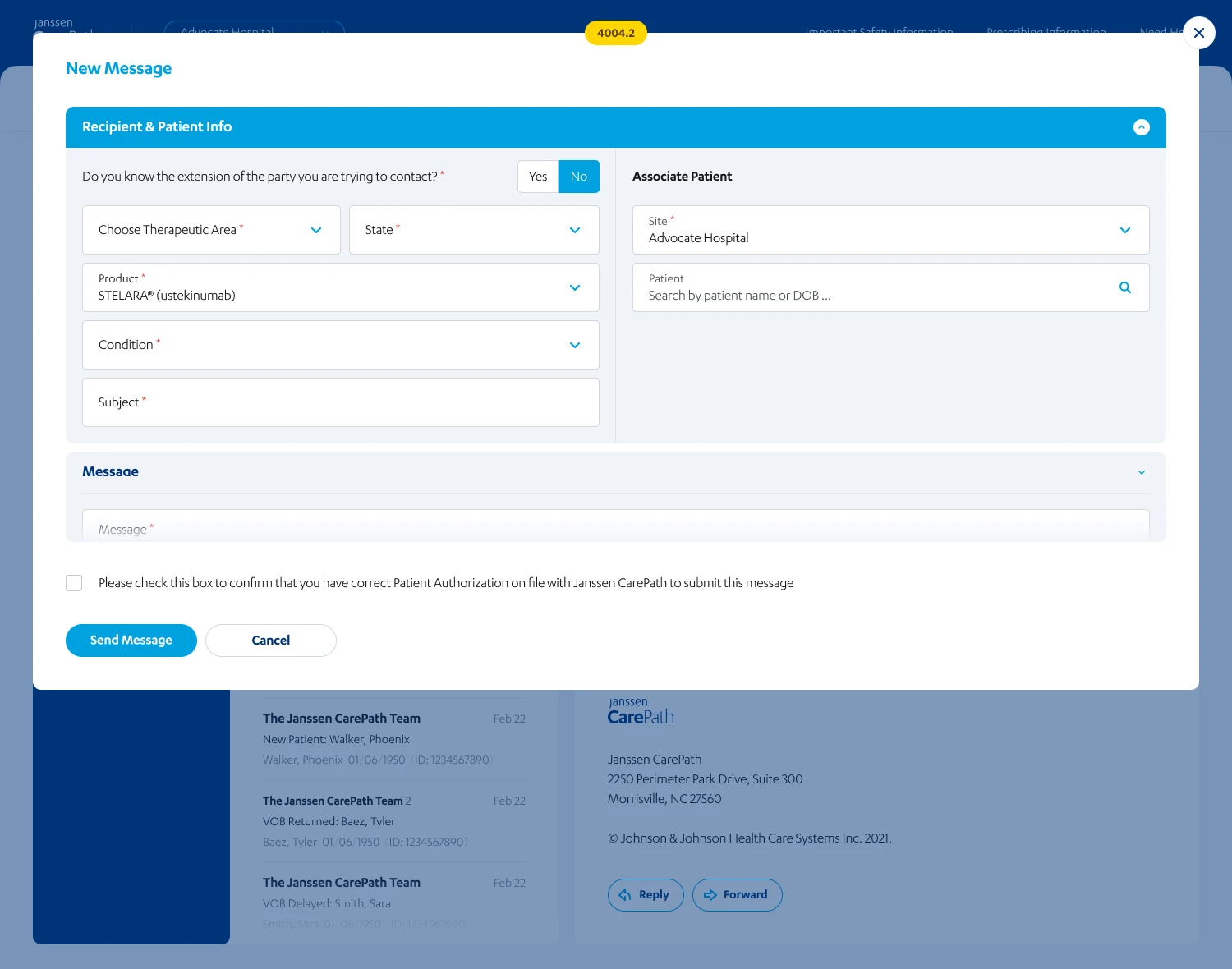
These are proposed routing states, not a tested clickthrough. They do not establish delivered messages or response performance.
What the team delivered
I led UX and the review work, managing two designers in the shared Figma system. The designs brought interaction states, required copy, and desktop and mobile layouts into the same review.
Results
- The project record lists more than 2,000 approved desktop and mobile screens across eighteen brands.
- Janssen extended IBM's engagement.
Evidence limit
Surviving records do not define how variants or revisions were counted. They record that Janssen extended IBM's engagement, but they do not establish what caused the extension or attribute it to me, the design team, or the design system.
Related work
One design system across four DHCS workstreams
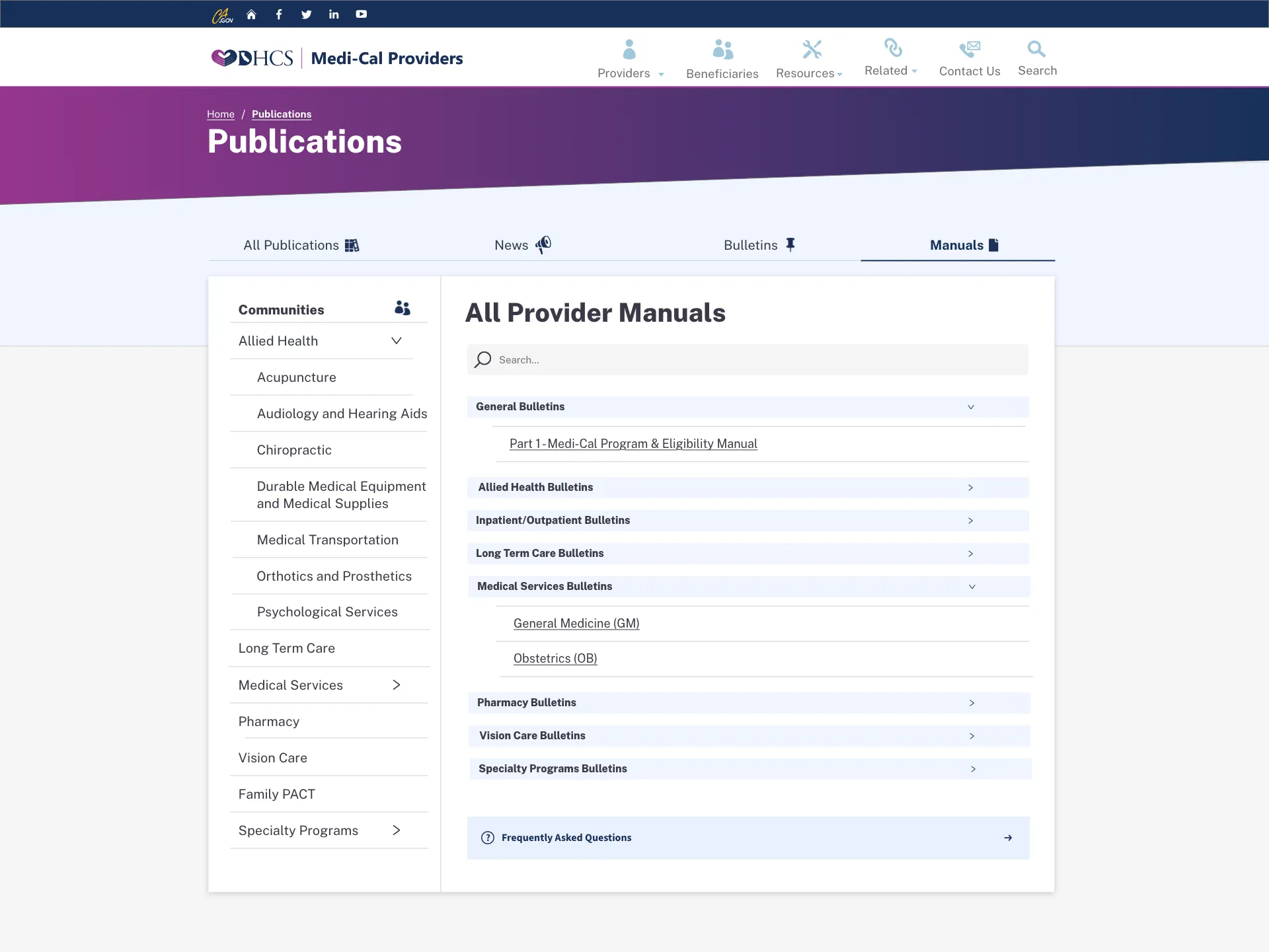
I built shared Figma patterns across four DHCS workstreams, including document navigation, permissions, and portal alerts. Screens, service rules, and review decisions stayed together through handoff.
- Design systems
- Accessibility
- Design-tool transition
- Stakeholder coordination
32 projects. One year.
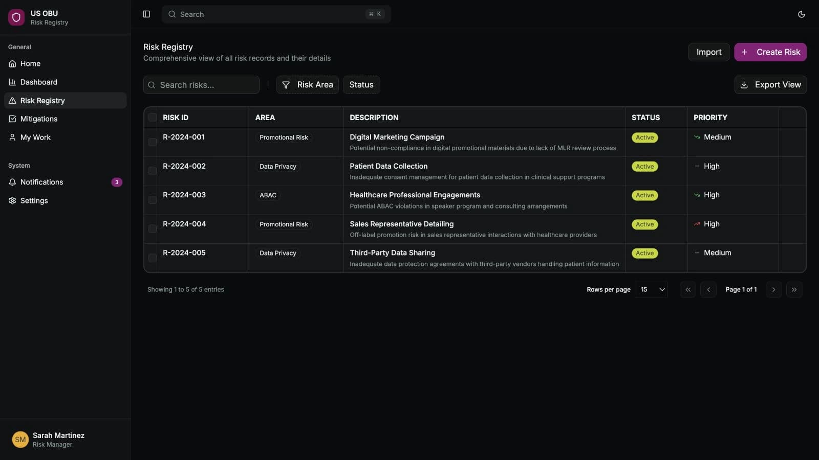
Over a year at AstraZeneca I worked across compliance, field resources, forecasting and medical AI. The risk register, PinkPulse and AI Workbench became working applications. I wrote requirements, designed interfaces, built prototypes and worked with business owners and engineers to carry decisions into software.
- Regulated workflows
- Requirements and delivery
- AI with human review