AstraZenecaPart 5 of 5
More AI prototypes
Five smaller AI products: a forecasting tool, a brand-planning assistant, one front door for many assistants, a conference app, and two assistants for research governance. I designed the interfaces. Other people owned the models, agents, and data behind them.
- Contribution
- Product design, business analysis, and prototype implementation
Facts
- Engagement
- August 2025 to August 2026
- Contract title
- Senior UI/UX Business Analyst
- Responsibilities
- Requirements, interaction design, frontend prototypes, and shared design patterns
- Collaboration
- Business owners, medical specialists, product partners, designers, and model and backend engineers
Make the forecasting workflow visible
Show the assumptions behind a change
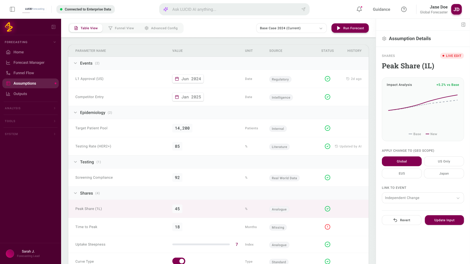
I designed the forecasting frontend and helped narrow the task to loading a forecast and changing its assumptions. Domain colleagues supplied the model; collaborators handled Python integration. The reviewed walkthrough used mock inputs, with the AI layer inactive.
The assumptions workspace showed each input's value, unit, source, status, and history. A detail panel let someone inspect the assumption's scope and update it.
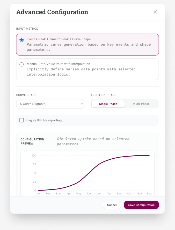
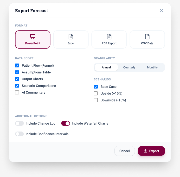
The configuration preview grouped input methods, curve shapes, and adoption phases. The export dialog offered format, data scope, granularity, scenario, and chart choices. Both used example data; model accuracy and the export service remained unverified.
Inspect assumptions, configuration, and output
Run the prototype to check the rest of the workflow
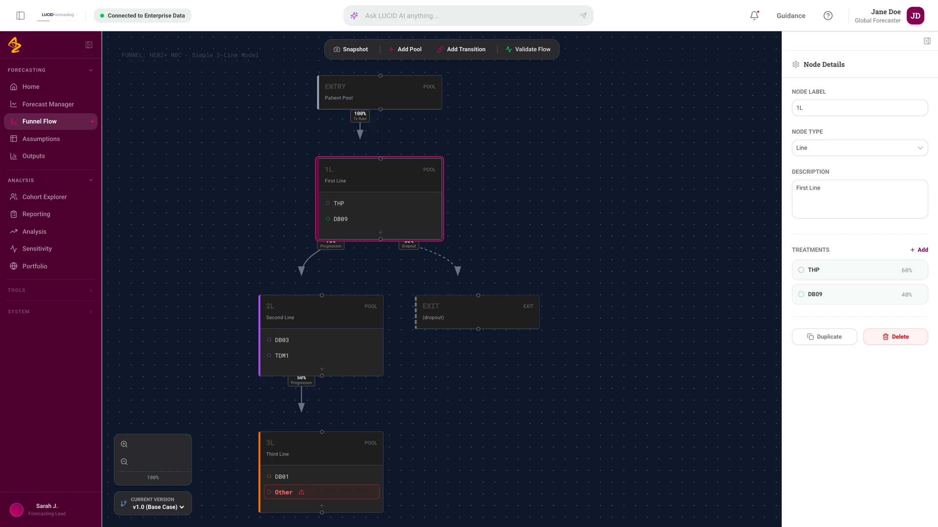
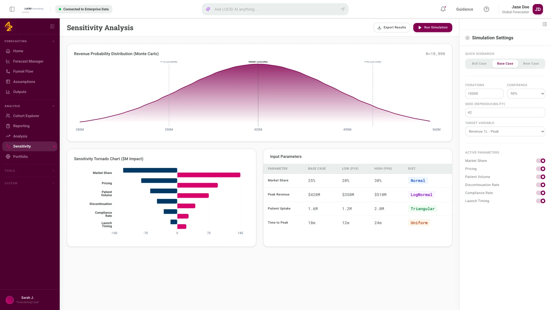
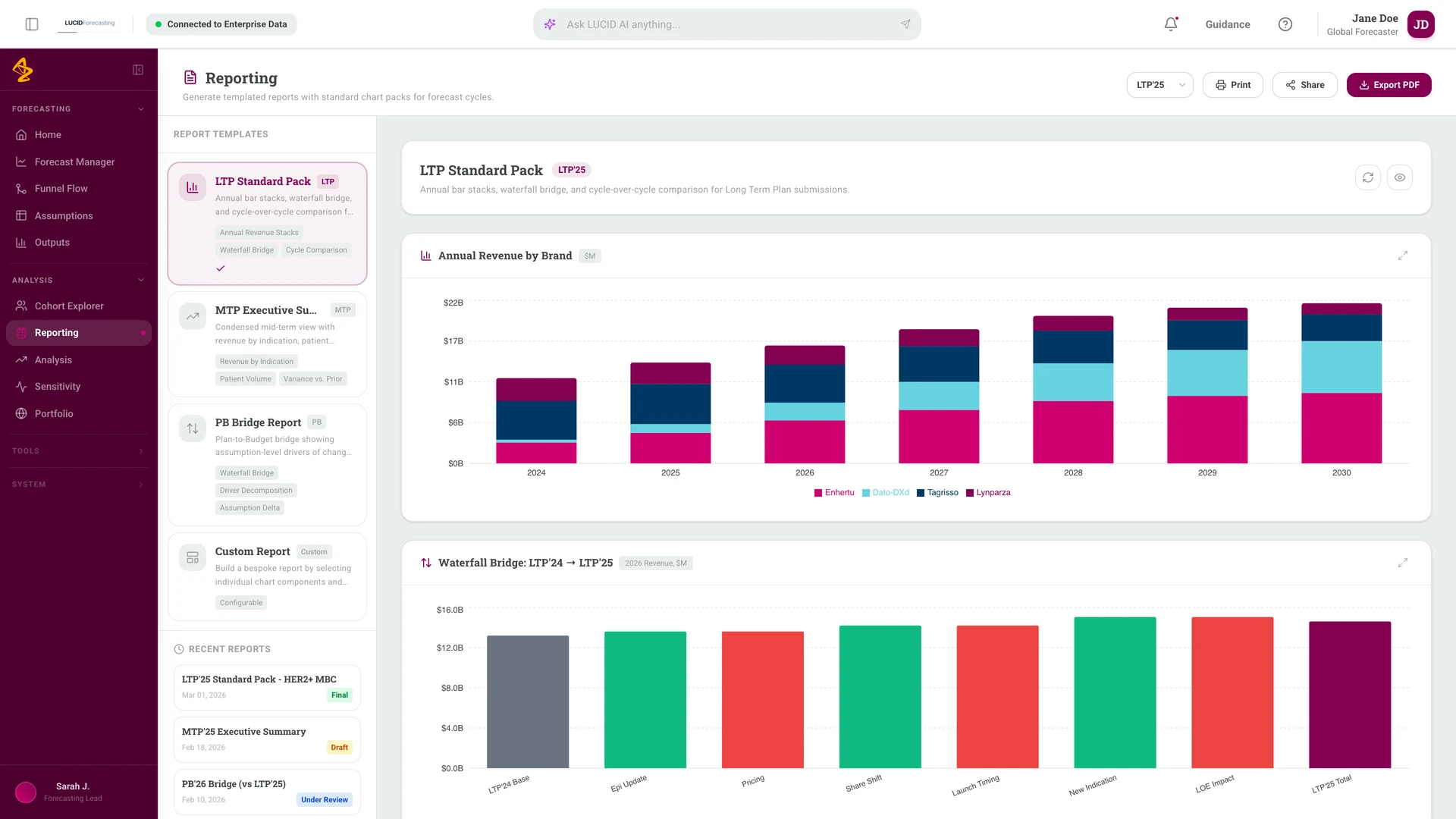
The assumptions screens were only part of what I designed. I ran the exported code bundle locally and captured the screens that carry the rest of the workflow: shaping the patient funnel, testing how much each input moves the answer, and assembling the report a forecast cycle has to produce.
The funnel editor treats the patient flow as nodes I can edit rather than a fixed template. Selecting a pool opens its treatments and progression rates, so the structure and the numbers stay in the same view.
Sensitivity pairs a distribution with a tornado chart, which puts the ranking of inputs next to the spread of results. Reporting starts from named packs tied to a forecast cycle instead of an empty canvas.
Everything in these screens is local sample data defined in the prototype source. No model, simulation, or export service is connected behind them.
Screens captured from the running prototype
Give a planning answer its own shape
Chat was the wrong shape for the answer
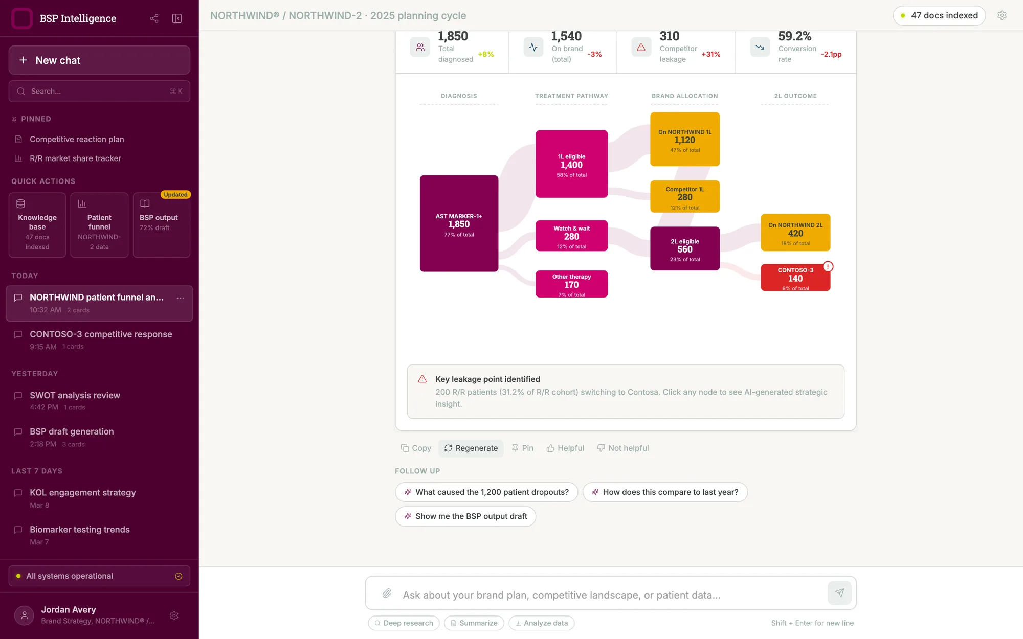
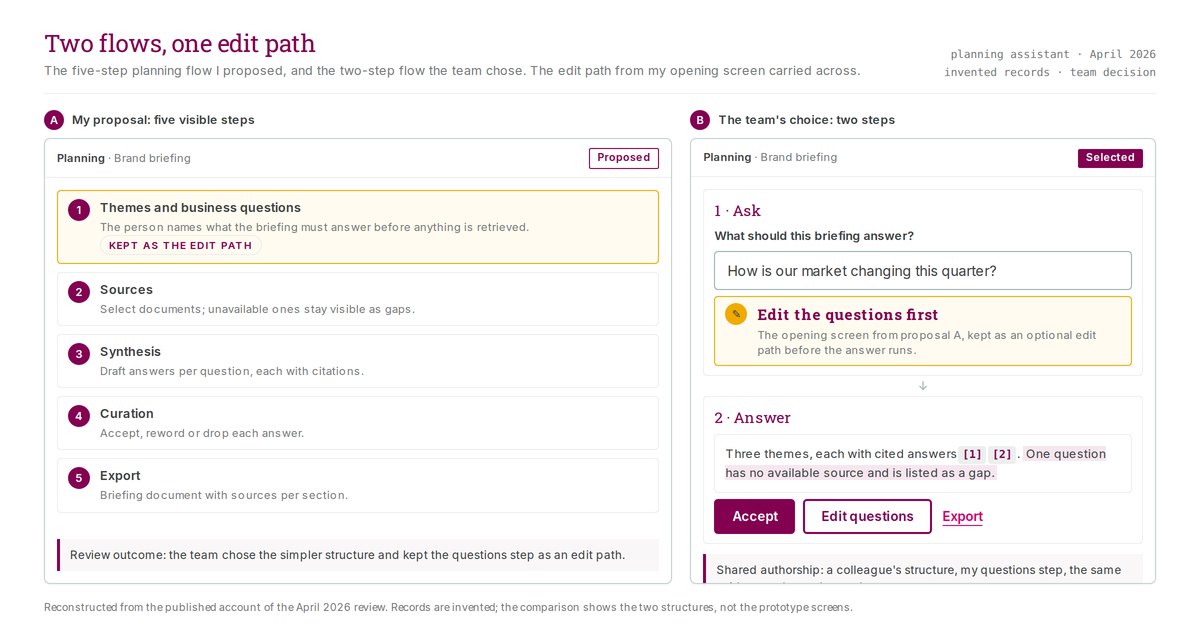
Brand planning questions rarely have one-line answers. Someone wants to know where patients leave a treatment funnel, or what a competitor's move means for the plan. A paragraph of prose is a poor way to read either one.
I designed the assistant to answer in the shape the question deserved. A funnel question returns a funnel. A competitive question returns a side-by-side read with the evidence set beside its implication. A request for the plan returns a draft with its completion state marked on it.
Contribution
I designed the interface and built the prototype. Other people owned the agent's retrieval and training. An engineer held the production frontend and implemented approved changes.
Catalogue the answer formats, then rank them
Rather than design one output and stretch it, I catalogued the formats a planning conversation actually needs and numbered them, then ranked them by how much each one mattered. A strategic ambition timeline and a core insights stack came first. A competitor teardown and a competitive landscape table came next. A numbered agenda for multi-topic questions sat near the bottom. Ranking the formats made the build order a decision rather than a guess.
Make it fast for someone who lives in it
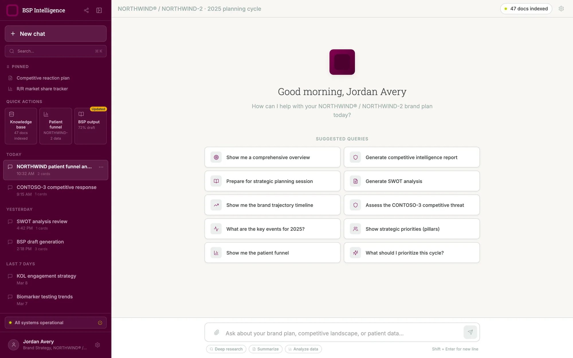
The prototype has a command palette, a sidebar that collapses, a shortcut for starting a new conversation, and a shortcuts overlay behind the question-mark key. A knowledge-base view lists what the assistant has indexed. A source panel opens beside an answer so someone can check what it drew on before trusting it.
Scope
This is a prototype. It shows the interface and the intended behavior, not a released application, adoption, or a measured result.
Where a planning session starts
Two questions, two shapes of answer
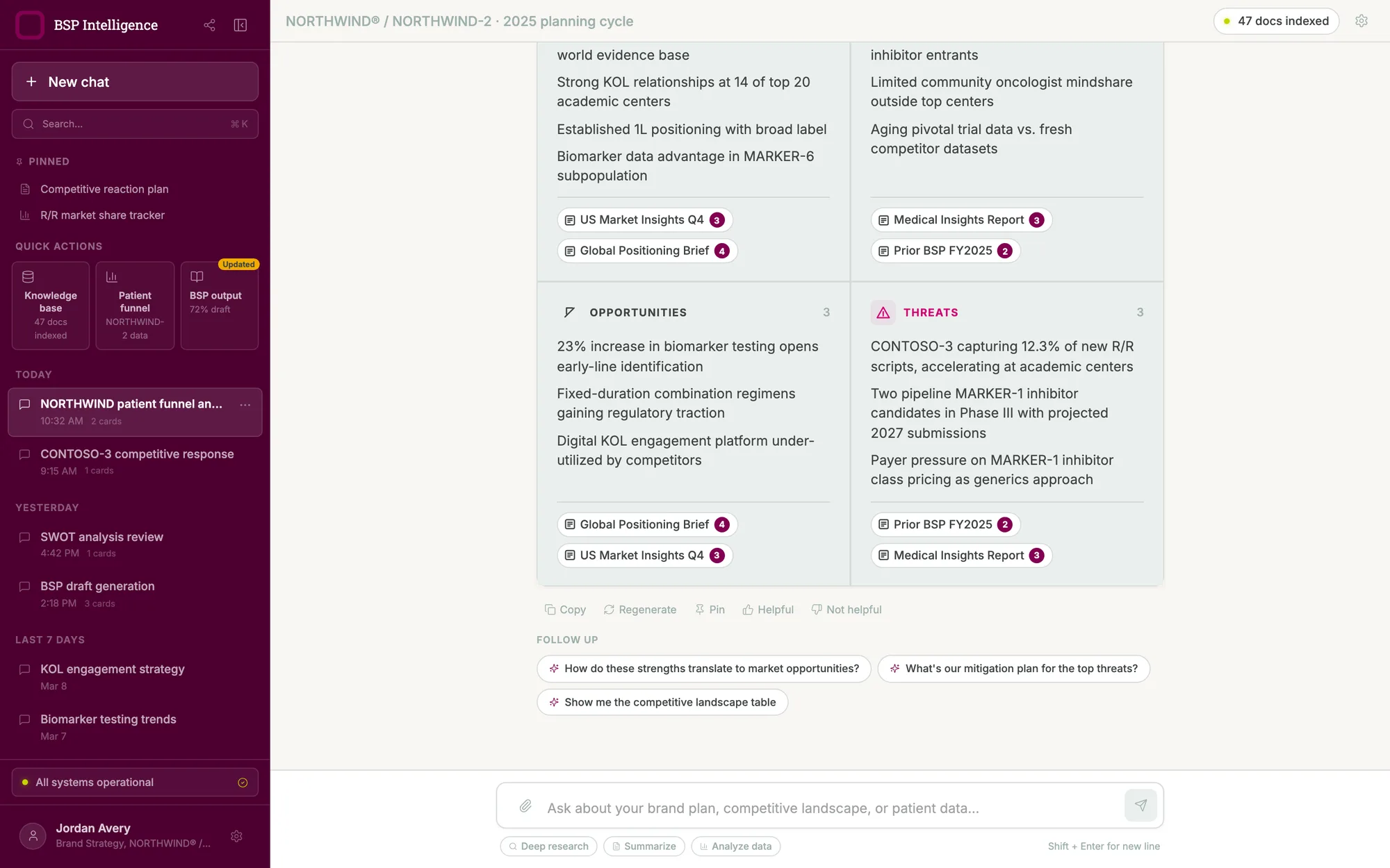
Where a planning question starts
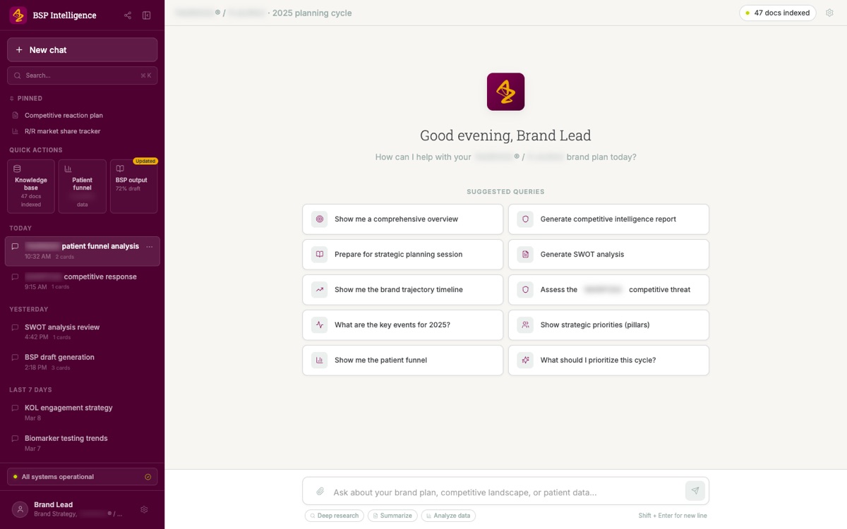
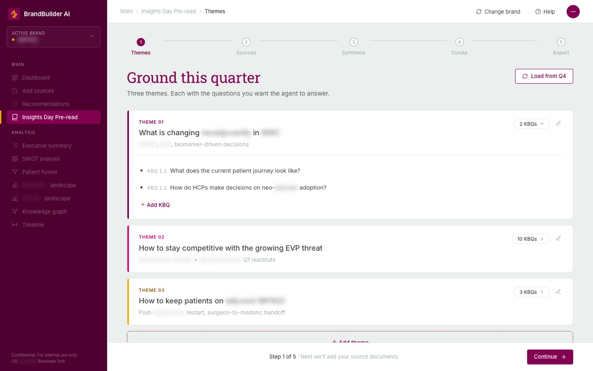
What the corpus holds, and the structure the team chose instead
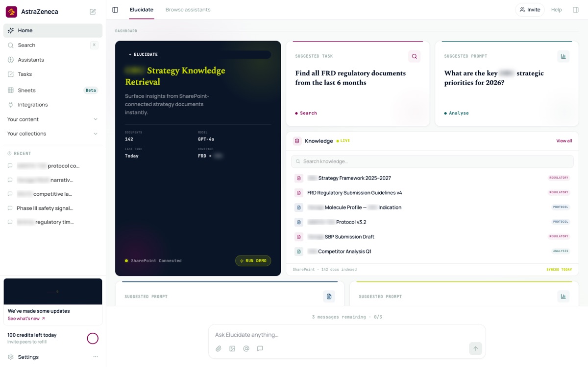
Put several assistants behind one front door
Every assistant arrived as its own product
Teams across the business unit were building their own assistants. Each one came with its own layout, its own idea of where sources belong, and its own chrome. Anyone who used two of them had to learn two products.
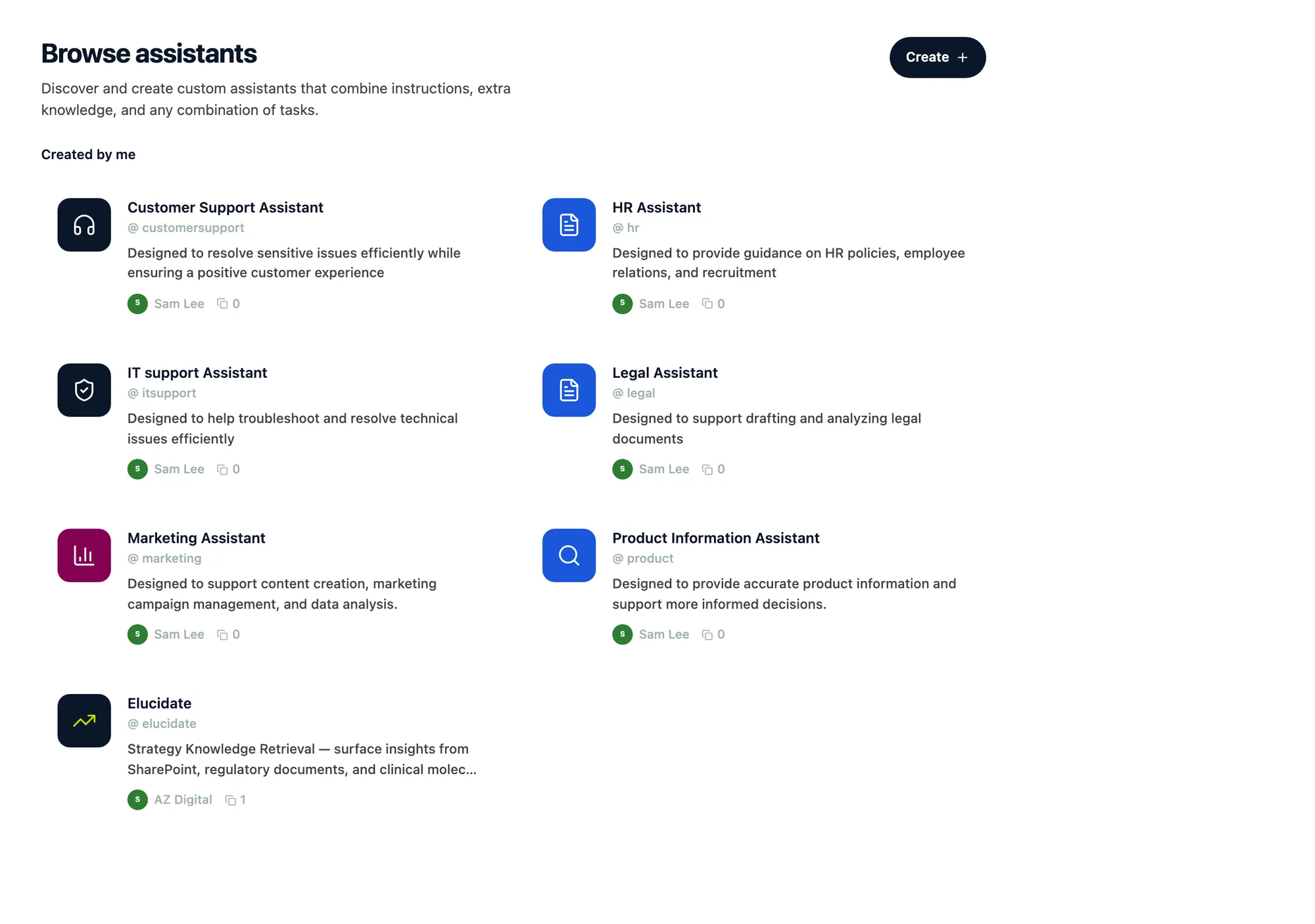
I designed a single shell they could share. A directory where someone browses the available assistants and sees what each one does. A landing page for an assistant that states its capabilities and offers starting prompts before the person commits to a conversation. Then a conversation view that reads the same way whichever assistant they opened.
Say where the knowledge came from, and keep saying it
In this setting provenance is the trust. I put a persistent status bar under the header showing whether the connected document source is reachable, when it last synced, and the knowledge cutoff date. It reads like an instrument panel on purpose, set in a monospace face, because it reports machine state rather than speaking to the reader. A stale source matters when the answer feeds regulated work, and the interface should say so before someone discovers it later.
Make citations clickable and sources selectable
Answers carry numbered citation anchors, and selecting one highlights the matching entry in the source sidebar. A source panel lets someone include or exclude what the assistant draws from before asking. The answer arrives in three phases, a skeleton, then streaming text, then the resolved response with its citations attached, so the wait shows progress instead of a spinner.
Scope
This is a prototype. The retrieval behavior it depicts was not connected to a live service, and no release or measured result is claimed.
One directory for every assistant
The shared home, and a keyboard-first version of it
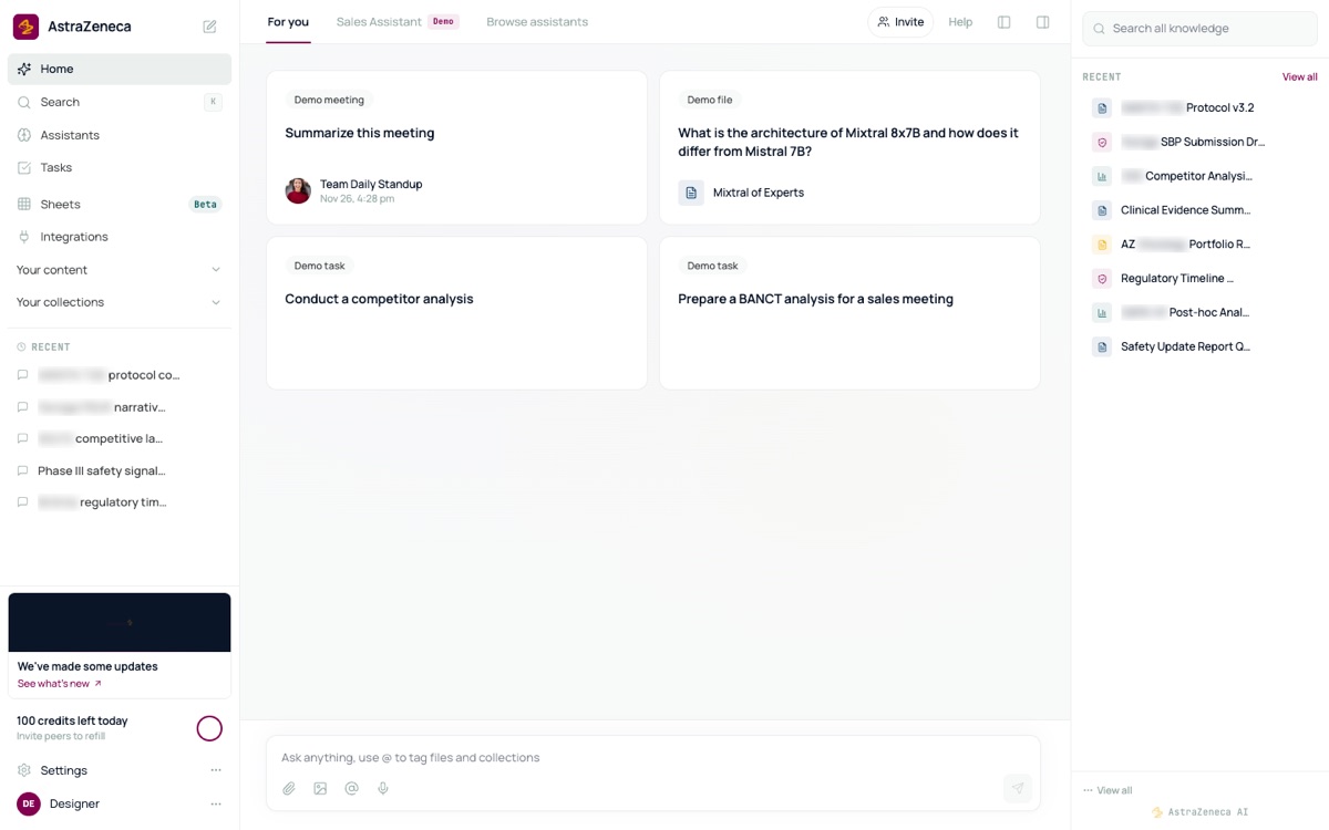
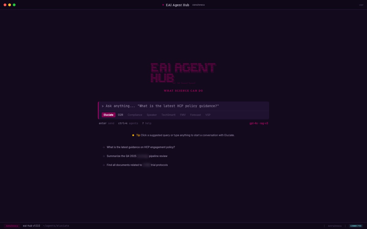
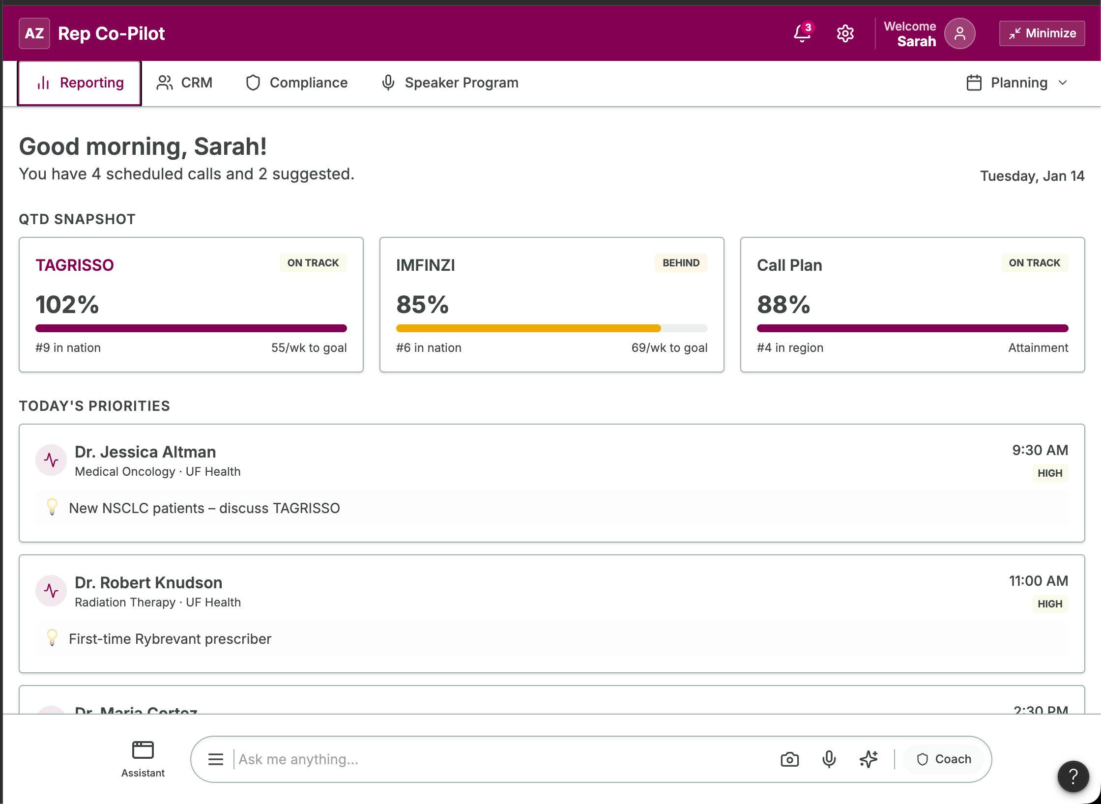
The same door for a reviewer and for a field team
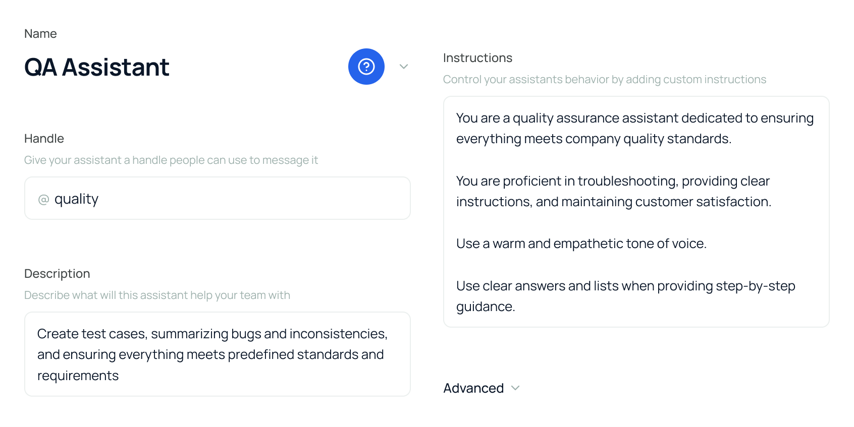
Make an assistant's configuration visible
Build an event app around the team you work on
Most of a conference schedule is irrelevant to any one person
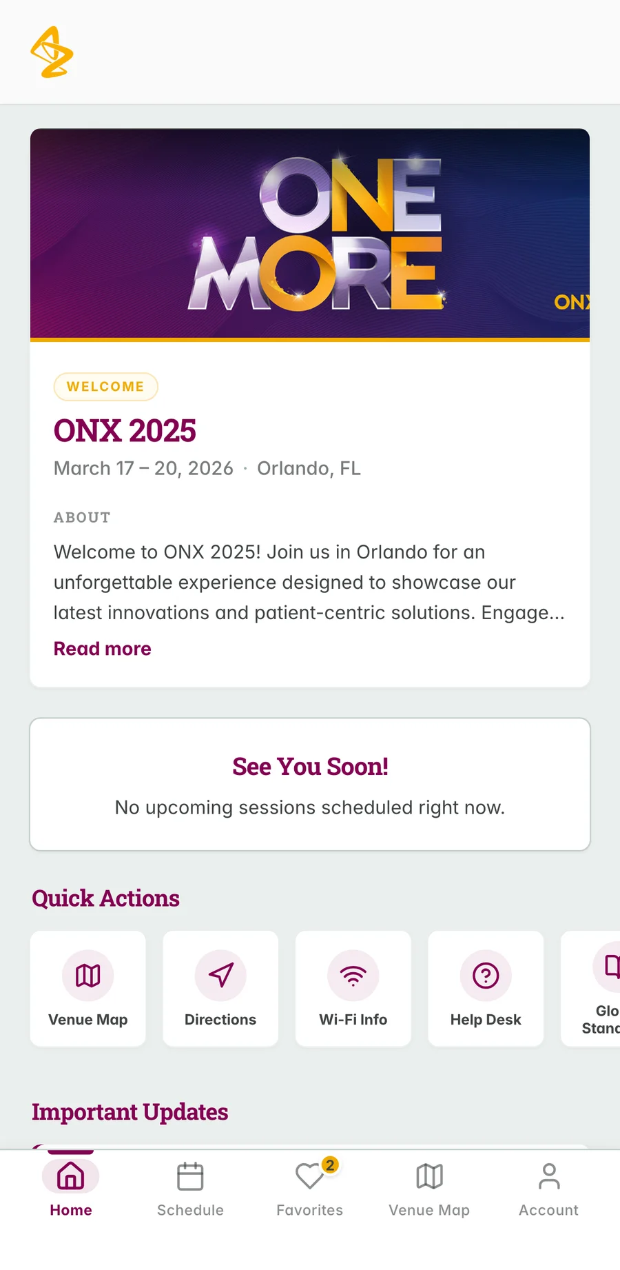
An internal oncology conference needed an app for the people attending it. The schedule was large, and most of it did not apply to any individual attendee.
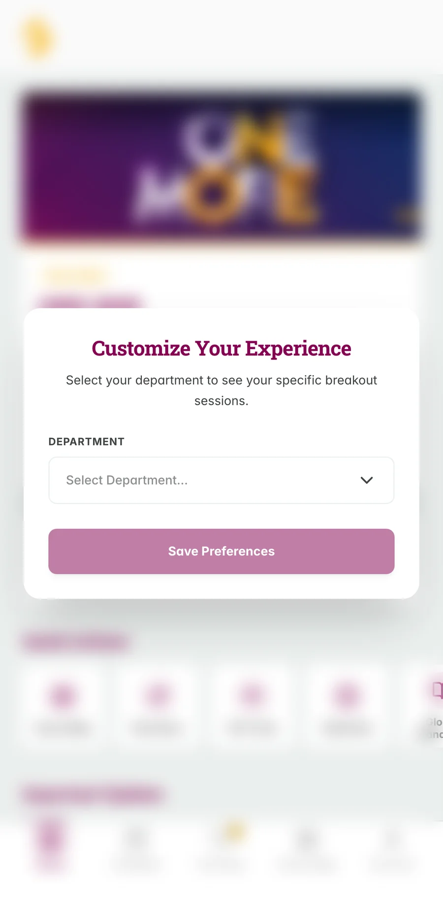
Onboarding asks which team the person works on. That single answer shapes everything afterwards. Sessions relevant to their team come forward, and they can mark interests to assemble their own schedule. A map view handles the part of any conference nobody enjoys, which is finding the room.
Ask one question at onboarding, then actually use the answer
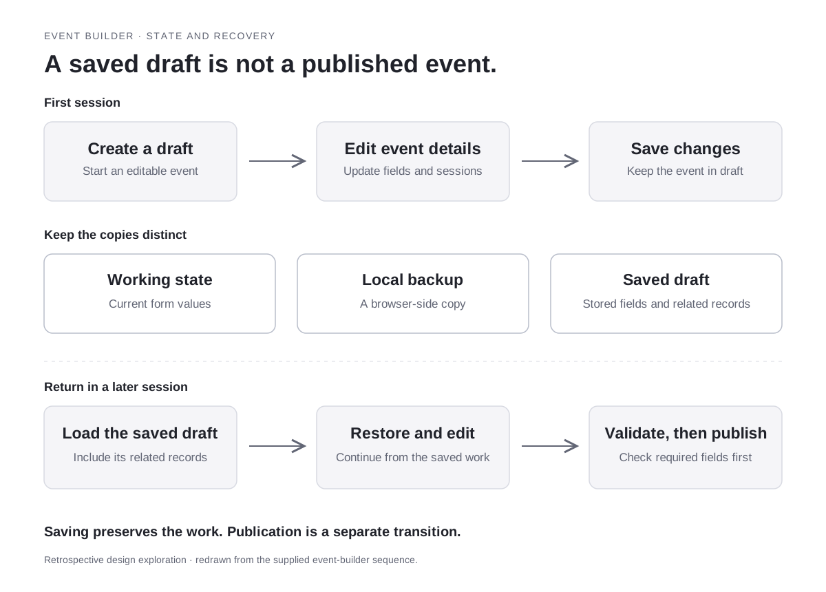
Event apps often collect preferences and then ignore them. I kept onboarding to the single question that changes the rest of the product, and let people revise it later from their account. The schedule, the interest list, and the session detail all read from that one answer. A companion admin dashboard covers the organizers' side of running the event.
Scope
This is a prototype built with sample programme data. No attendance, engagement, or release result is claimed.
The one question, and what it changes
The organisers' side, and what a draft actually is

Move a research proposal through its governance
The work is routing, chasing, and writing it up
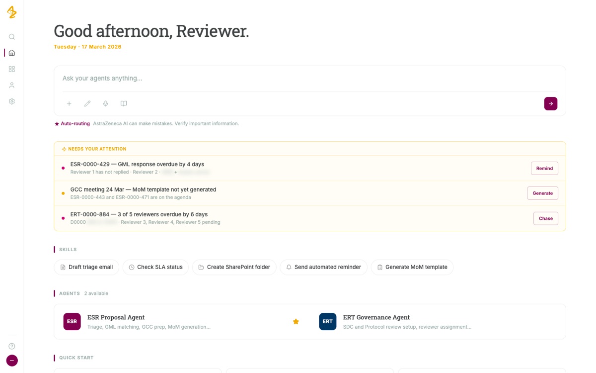
Externally sponsored research proposals move through a review committee on a clock. Someone has to route each new proposal to the right medical lead, keep the pipeline visible, prepare the committee's papers, chase reviewers who have gone quiet, and write up the decision at the end.
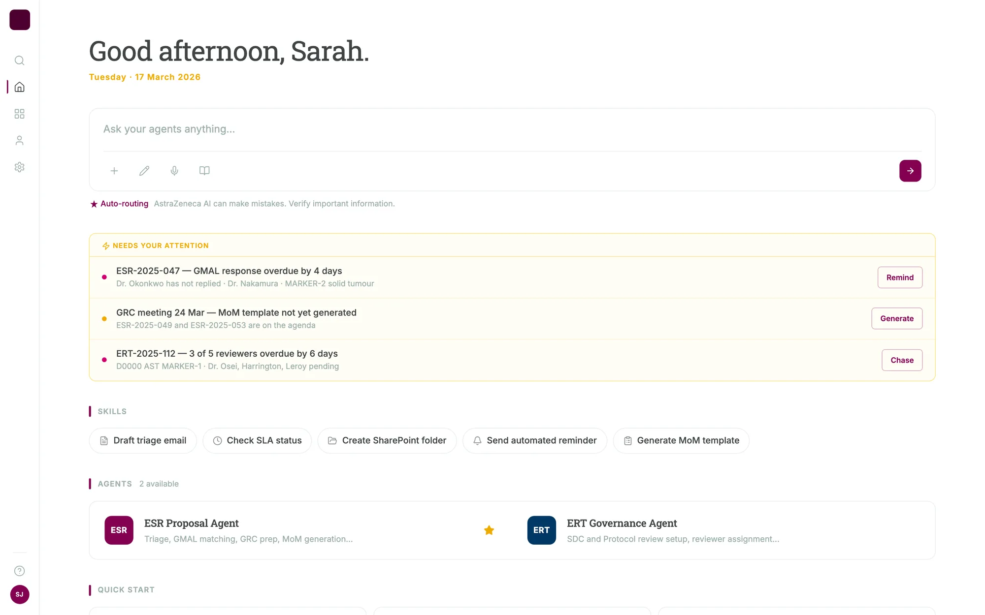
I designed two assistants for that work, one for the proposal pipeline and one for the review governance. Both open on concrete starting tasks rather than an empty box. Show what is active and where it stands. Triage a new proposal. Draft the minutes for the next committee meeting. Name the proposals at risk of missing their deadline.
Give every answer its next action
A status answer that ends in a status is only half useful. Each response carries the actions that follow from it, sending the reminder, generating the minutes, exporting the list, so someone can finish the task in the place where they asked the question.
Scope
This is a prototype populated with sample records. It shows the proposed interface and task flow, not a released system or a measured improvement in review time.
Open on what needs attention
Results
- I designed the Lucid forecasting frontend and ran its exported code locally to check the rest of the workflow.
- I designed and built a brand-planning assistant prototype whose answers take the shape of the question, such as a funnel or a side-by-side comparison.
- I designed a shared assistant shell, a conference app, and two research-governance assistants with visible sources, citations, and next actions.
Evidence limit
These are prototypes with sample data. They do not show a released application, adoption, model accuracy, or a measured result. No model, simulation, or export service is connected behind the Lucid screens.