I built shared design foundations and components so engineers could build their own Workbench screens. Then I handed over the behavior, the version, and the limits of what the prototypes proved.
Contribution
Product design, business analysis, and prototype implementation
Facts
Engagement
August 2025 to August 2026
Contract title
Senior UI/UX Business Analyst
Responsibilities
Requirements, interaction design, frontend prototypes, and shared design patterns
Collaboration
Business owners, medical specialists, product partners, designers, and model and backend engineers
Build the shared design foundations
Give engineers a reference by the next morning
Engineers needed a component reference by the following morning so they could build their own workflow screens without asking me to adjust each element.
I made a standalone HTML reference that opened directly and printed to PDF. Labels, state variants, and style references sat beside the components, followed by workflow examples. That met the agreed format without adding Storybook or another application route under the deadline.
On July 2, one engineer reported integrating my shared UI package into the budgeting work. Another confirmed receiving the UI-element reference and using it in his own environment. I explained the shared styles and the cards specific to each workflow. Backend connections were separate from this UI integration.
Shared HTML references could lose their linked assets. Teams also worked in different environments and needed components they could reuse in code. I began collecting styles, tokens, components, assets, and guidance into a separate system, and raised the need for engineering support.
Specify component states as well as appearance
The foundations covered color balance, typography, spacing, grids, elevation, iconography, and voice. For dense application screens, I worked through small-text legibility and the treatment of status, hover, and focus.
Fields needed labels, helper text, and validation. Cards needed different levels of emphasis. AI workflows needed states for queued work, progress, failure, sources, and decisions requiring a person. I worked on what those states meant as well as how they looked.
Evidence planning reused the study-governance code's definition of routine steps and human decisions. That gave the two workflows a shared model for those steps.
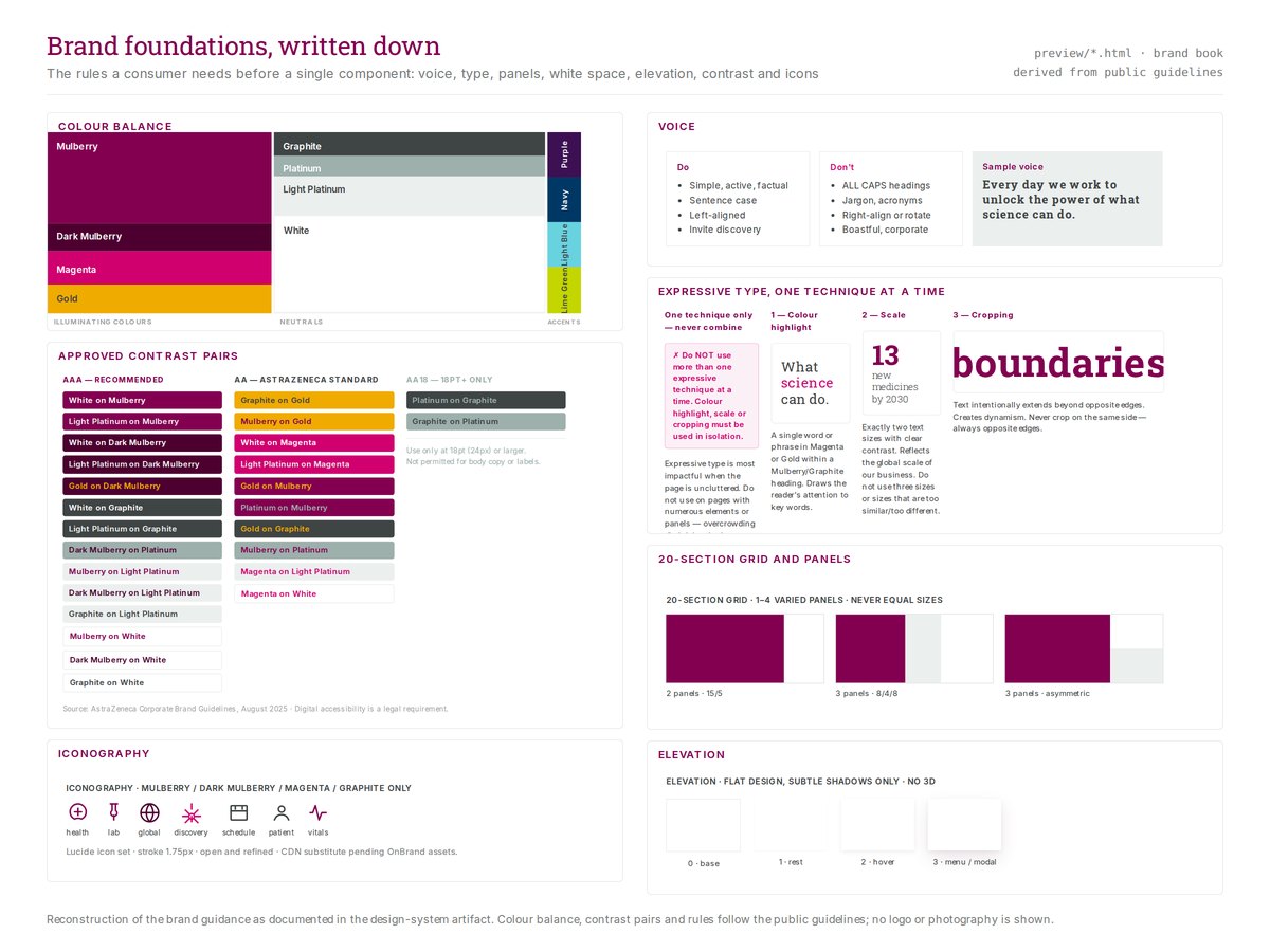
Colour balance, contrast pairs, typography, and layout rules turn the public brand guidance into usable reference cards. These cards are reconstructed, not engagement artifacts.
SourceSource: Retrospective design exploration; newly authored portfolio rendering of a design-system reconstruction based on the public AstraZeneca brand guidelines
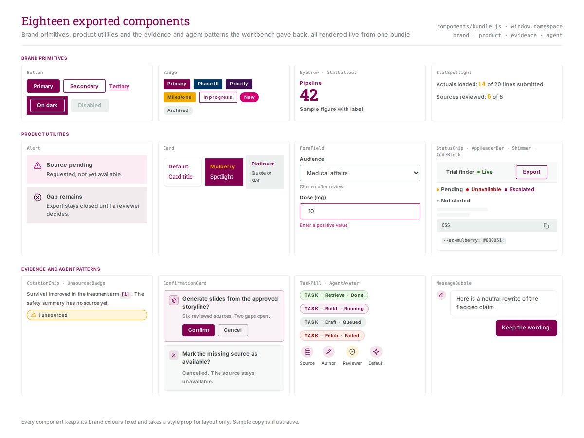
The reconstructed library shows brand primitives, product controls, and evidence and agent patterns together. The sample content is illustrative; the export warning is not a claim that the commissioned prototype enforced release controls.
SourceSource: Retrospective design exploration; newly authored portfolio rendering of a design-system reconstruction based on the public AstraZeneca brand guidelines
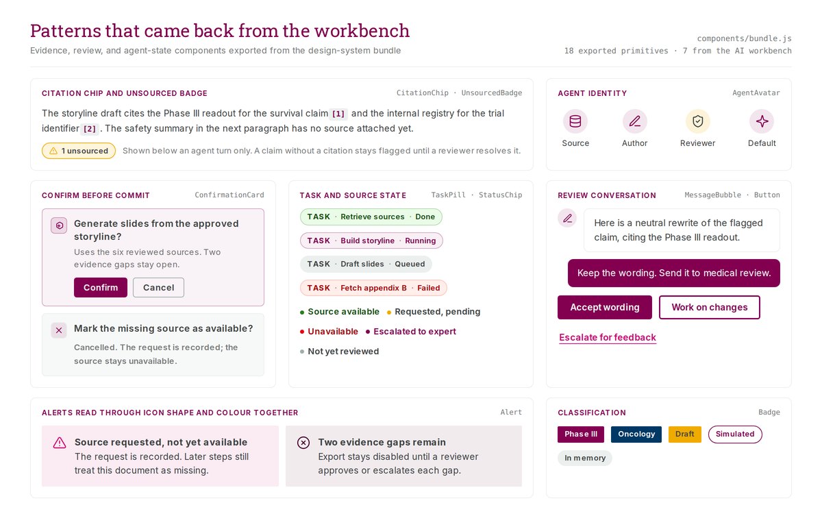
Evidence and review components rendered from the reconstructed system's component bundle: citation chips, an unsourced-claim badge, a confirm-before-commit card, task and source states, and review actions. The sample copy is illustrative. The image shows the pattern family described above, not a screen from the product.
SourceSource: Retrospective design exploration; newly authored portfolio rendering of a design-system reconstruction based on the public AstraZeneca brand guidelines
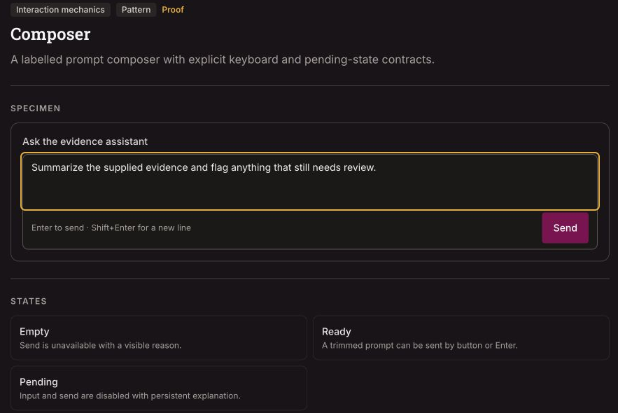
The composer places its label, keyboard behavior, and state guidance together. The entered prompt is a generic review example. Sending it cleared the local input; no model response or persistent pending state was verified.
SourceSource: Retrospective design exploration; Figma Make documentation specimen, version 29; captured 18 September 2026; header and navigation excluded
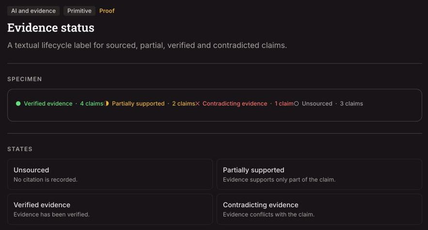
Missing evidence, partial support, and a conflicting source call for different review decisions. These specimen labels and counts illustrate that vocabulary; they do not prove automated verification or capabilities of the commissioned content workflow.
SourceSource: Retrospective design exploration; Figma Make documentation specimen, version 29; captured 18 September 2026; header and navigation excluded
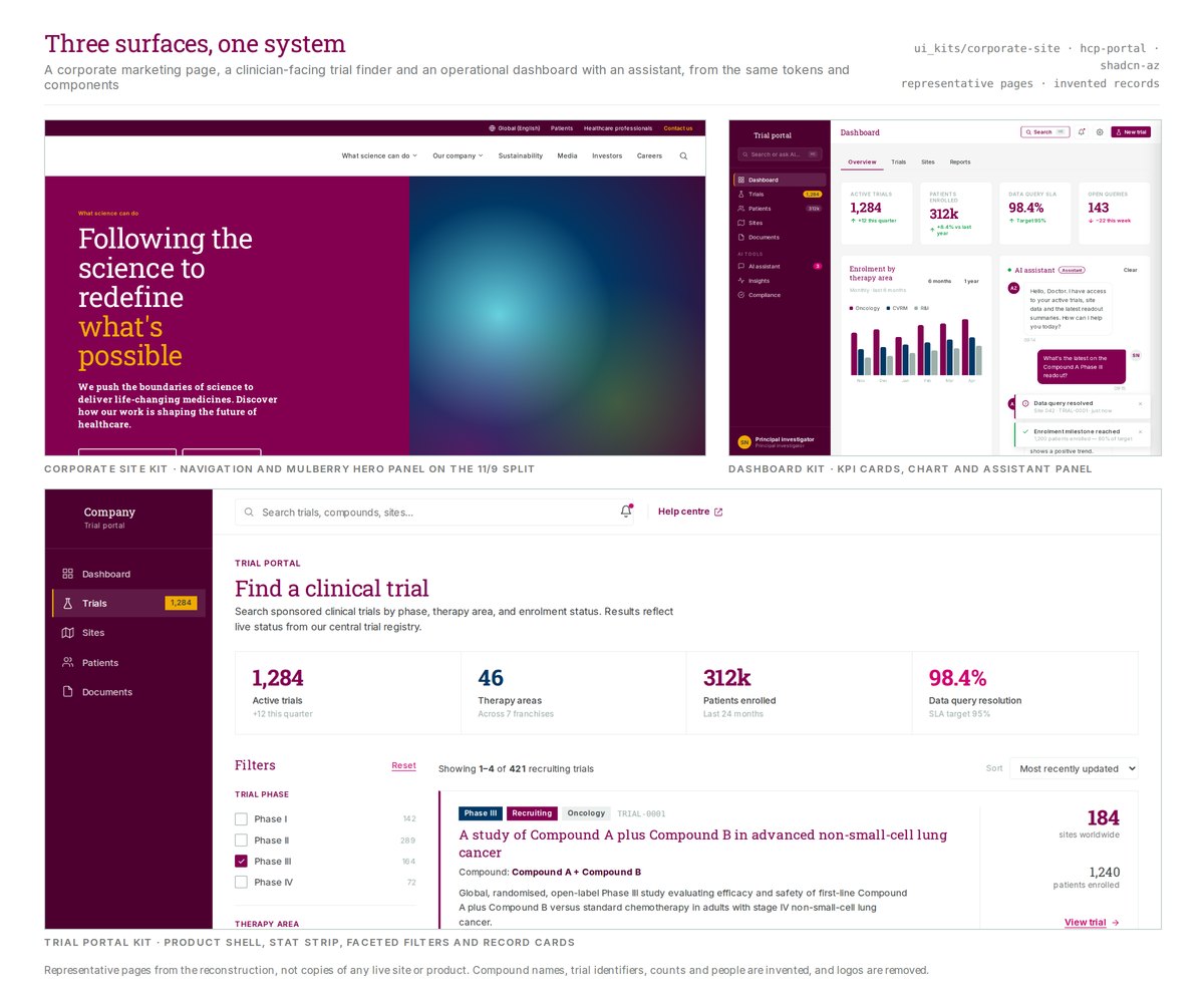
The page examples applied the same foundations differently. A corporate page could use expressive typography and large brand panels. A work queue needed room for records, filters, and persistent actions.
The corporate site, dashboard and trial-portal kits from the reconstruction, rendered from their page sources. They are representative layouts, not copies of any live site or product; compound names, identifiers, counts and people are invented, and logos are removed.
SourceSource: Retrospective design exploration; newly authored portfolio rendering of a design-system reconstruction based on the public AstraZeneca brand guidelines
Define when a component is ready to share
A component needed an owner, documented states, shared style mappings, accessibility requirements, and verification before it could become a shared control. Product-specific examples could remain references until they met those requirements. The charter named me as the local design-system lead. The broader governance roles were still unstaffed.
The defect record documents keyboard repairs to custom radio controls. Tab entered the group once, arrow keys moved between choices, and Home and End reached the endpoints. The recorded component checks covered those behaviors; one integration received only source inspection because dependencies were missing. Overall accessibility remained unverified.
Check where shared tokens are used
A later documentation prototype applied a generated card-background token from the shared styles. Other parts still used local values. Its code confirmed partial reuse.
The earlier token design named JSON as its source. The later generator read base values from CSS and produced CSS, JSON, and Tailwind outputs. Builders needed guidance for the version they were using.
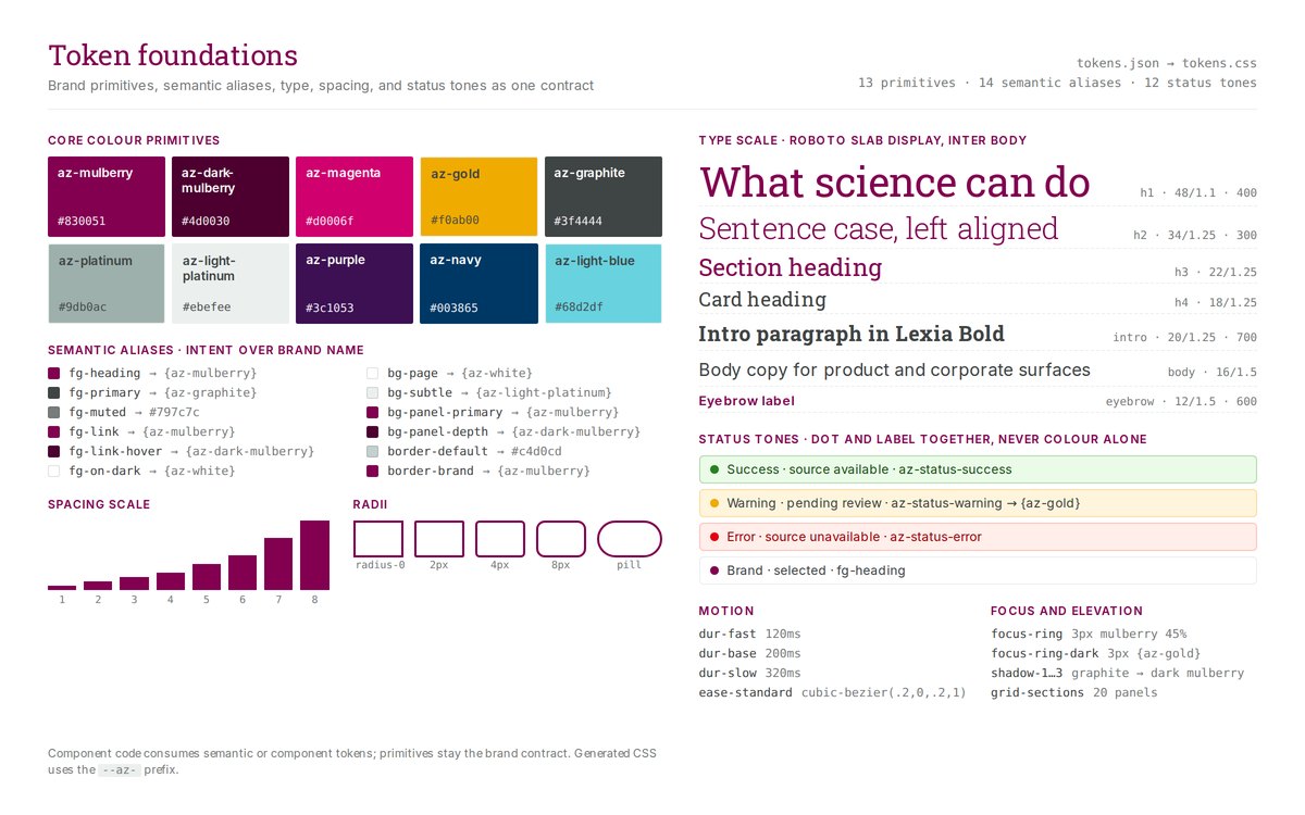
A token sheet rendered from a reconstructed design system: core colour primitives, the semantic aliases that map them to interface intent, the type scale, spacing, radii, and status tones. The values follow the public brand guidelines. The sheet does not reproduce the engagement repository.
SourceSource: Retrospective design exploration; newly authored portfolio rendering of a design-system reconstruction based on the public AstraZeneca brand guidelines
One value, from brand to interface
Brand value
White, #ffffff, supplies the base value.
Semantic role
semantic.light.color.surface assigns it to a light-theme surface.
Component token
component.card.light.background references that surface role and generates --component-card-background.
Consuming interface
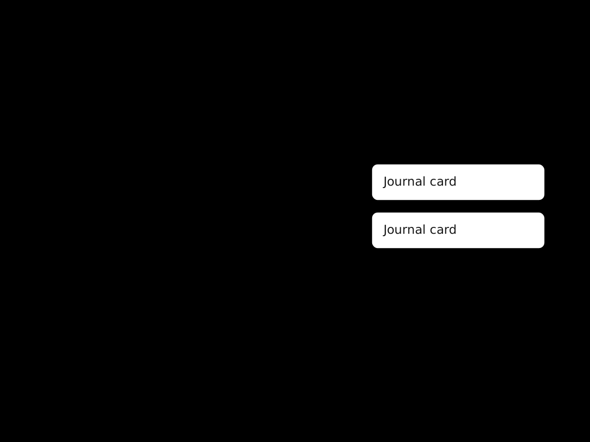
The documentation prototype maps the generated variable to --card, then uses bg-card on its journal cards.
A shared surface value reaches journal cards in a documentation prototype. Other interface values remained local. The consumer sketch is explanatory, not an original screenshot.
SourceSource: Newly authored portfolio diagram explaining the existing case-study narrative; retrospective design exploration, not an original engagement artifact
Check the exported presentation
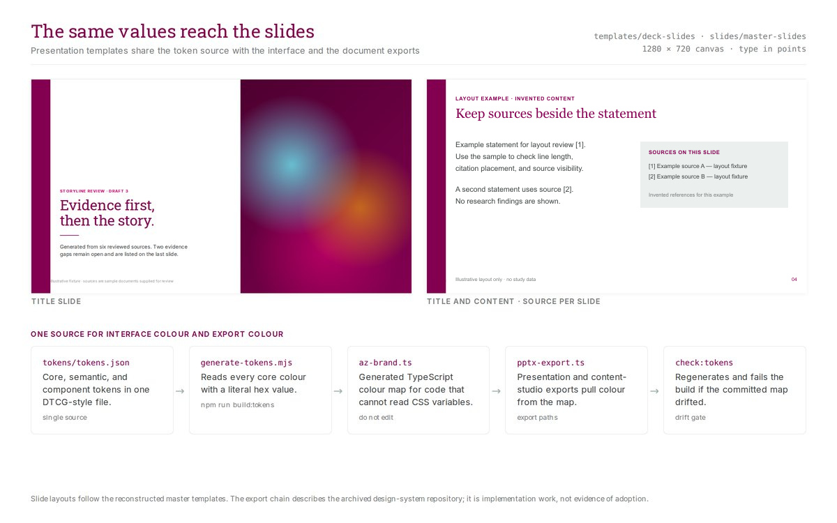
The system included title, section, comparison, process, and content layouts for the presentations produced by the medical-content workflow. Exports needed to retain typography, spacing, color, and sources. The export tooling generated its color map from the shared tokens.
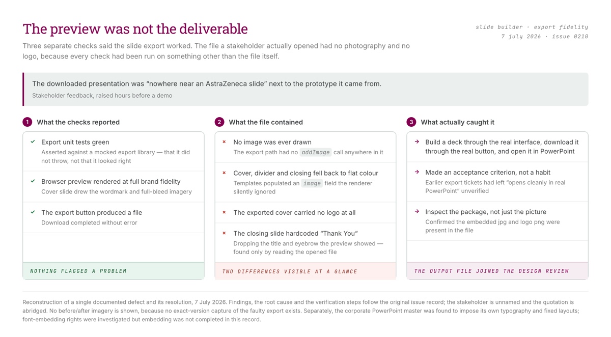
In July, images and the wordmark appeared in the browser preview but disappeared from PowerPoint. The exporter was not drawing them. The issue records the repair and a comparison in PowerPoint that also caught incorrect closing-slide text.
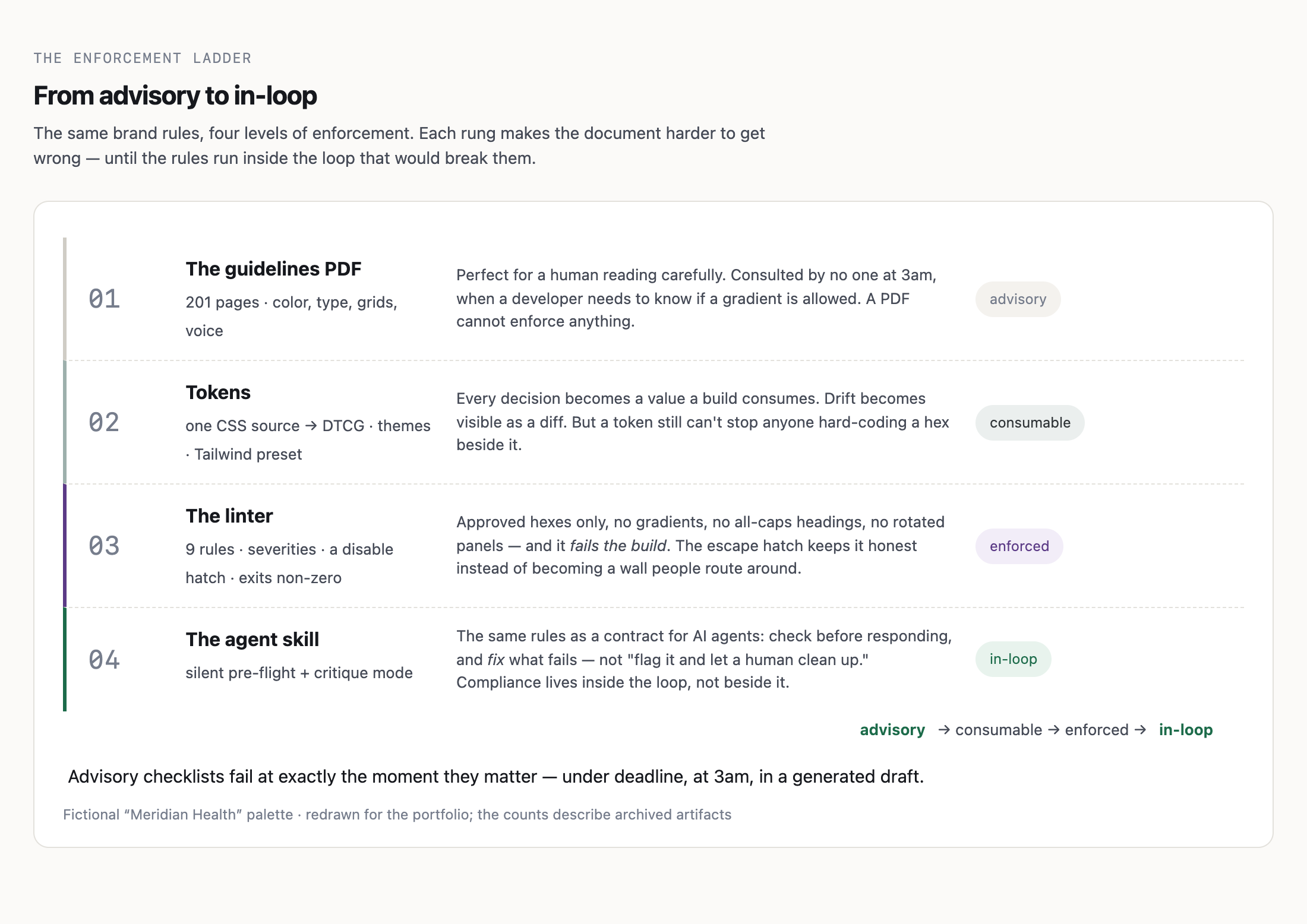
The downloaded file needed its own checks for layout, editability, sources, and accessibility. The archive also contains a brand linter and guidance for coding agents. Their presence does not show that every delivery team used them.
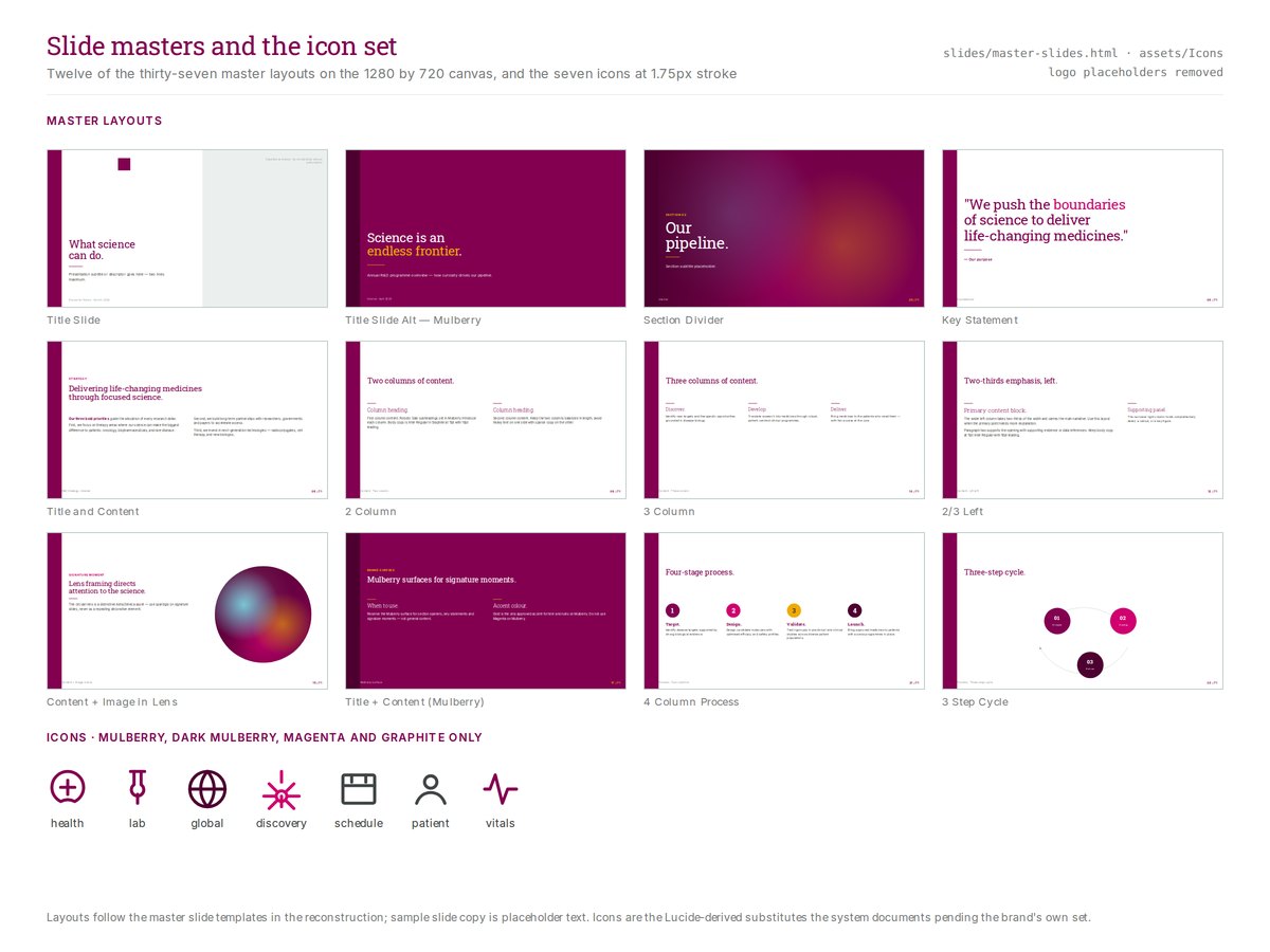
Twelve of the thirty-seven master layouts from the reconstruction, with the seven-icon set at 1.75px stroke. Slide copy is placeholder text and logo placeholders are removed.
SourceSource: Retrospective design exploration; newly authored portfolio rendering of a design-system reconstruction based on the public AstraZeneca brand guidelines
Two slide layouts rendered from the reconstructed master templates, with sources listed per slide, above the export chain described in the archived repository: one token file, a generator, a TypeScript colour map for the export code, and a check that fails when the map drifts. The slide text uses neutral layout examples and invented reference labels.
SourceSource: Retrospective design exploration; newly authored portfolio rendering of a design-system reconstruction based on the public AstraZeneca brand guidelines
The same rules at four levels of force, ending with checks that run inside the loop that would otherwise break them. The figure is redrawn in a fictional palette, distinct from the AstraZeneca reconstruction used elsewhere in this chapter. The counts describe archived artifacts; no adoption, saving, or compliance rate is claimed.
SourceSource: Retrospective design exploration; newly authored portfolio figure redrawn from the archived design-system artifacts, rendered with a fictional palette
Three separate checks reported success while the exported file was still missing its photography and its logo, because each had been run on something other than the file. The unit tests asserted against a mocked export library; they checked the export calls without verifying the file's appearance. The reporter is unnamed and the quotation abridged.
SourceSource: Retrospective design exploration; newly authored portfolio reconstruction of a single documented defect and its recorded resolution, rendered with the reconstructed design-system components
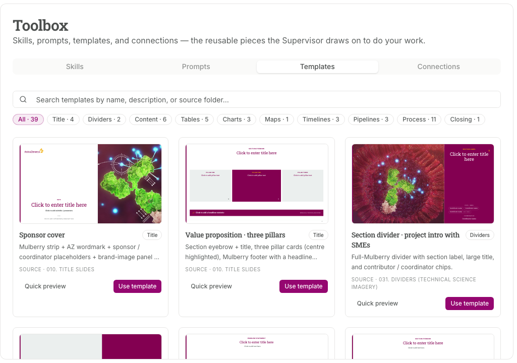
The brand slide deck became a filterable library, with each template naming the parts it is built from and the folder it came from. The same set feeds a person picking a slide and an assistant asked to draft one.
SourceSource: Original Workbench reference; template names and descriptions are the live set, and the thumbnails show the templates' own placeholder copy
Hand off the behavior and its limits
Identify the version being handed over
At the July handoff, the local HTML demo, React application, and backend automation were separate pieces. The team needed to agree which UI version to show alongside the backend demonstration.
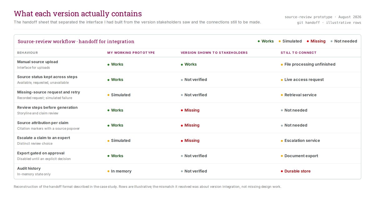
Later, stakeholders saw a version missing source-review controls from my shared prototype. We traced the mismatch to version integration. The handoff needed to specify which behaviors worked and which connections were still missing.
The expanded package separated core controls, product-specific examples, slide components, supporting code, and design guidance. It supplied source for integration, not a runnable application. Engineers still needed to set up library tooling, integrate the components, and restore tests tied to the original environment. July's confirmed receipt does not establish receipt or adoption of this later package.
The handoff format that separated the interface I had built from the version stakeholders saw and the services still to connect. Rows are illustrative; the mismatch it resolved was about version integration, not missing design work.
SourceSource: Retrospective design exploration; newly authored portfolio reconstruction with invented records, rendered with the reconstructed design-system components
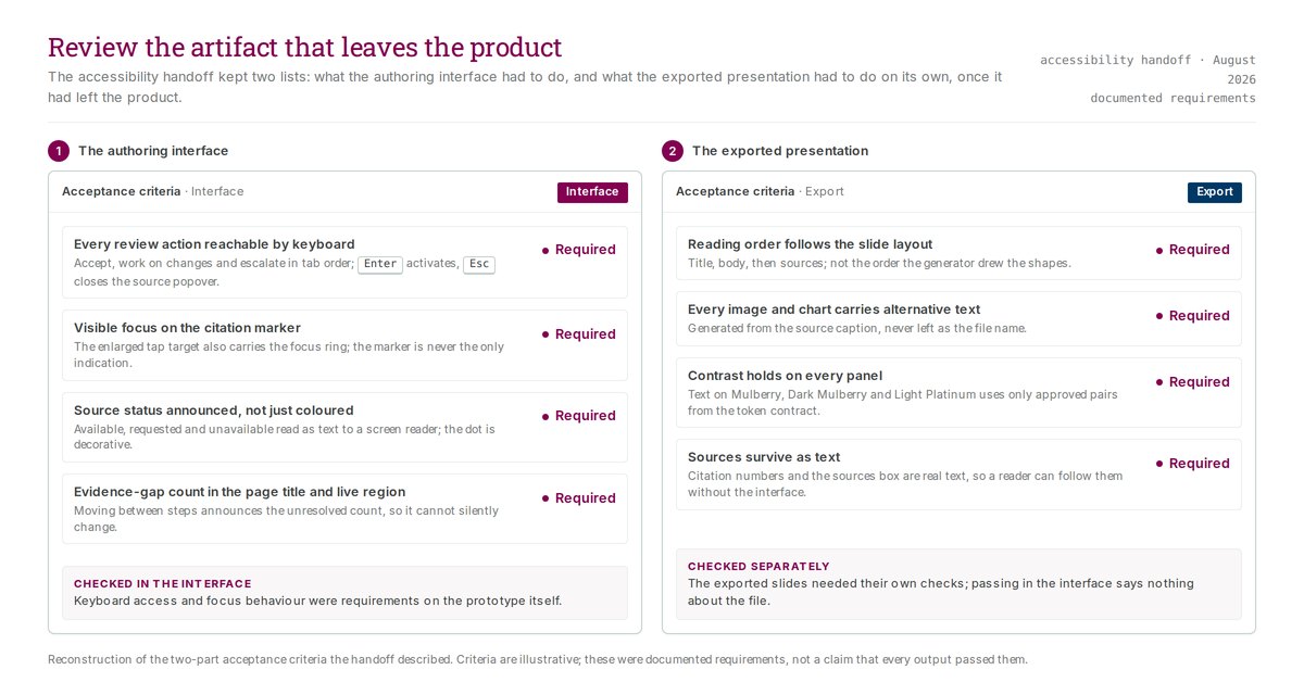
The accessibility handoff kept two lists: what the authoring interface had to do, and what the exported presentation had to do on its own. Criteria are illustrative; these were documented requirements, not a claim that every output passed them.
SourceSource: Retrospective design exploration; newly authored portfolio reconstruction with invented records, rendered with the reconstructed design-system components
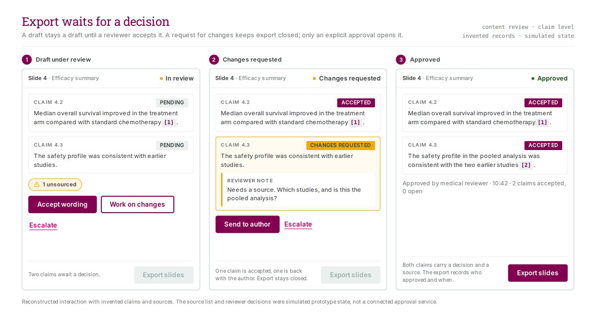
Export is tied to claim-level decisions, not to the draft being finished. Only an explicit approval, recorded with who and when, turns the control on.
SourceSource: Reconstructed board built from the prototype with invented claims and sources; reviewer decisions were simulated prototype state, not a connected approval service
The prompts carried the constraints
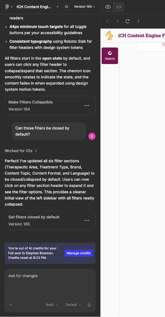
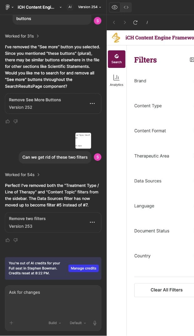
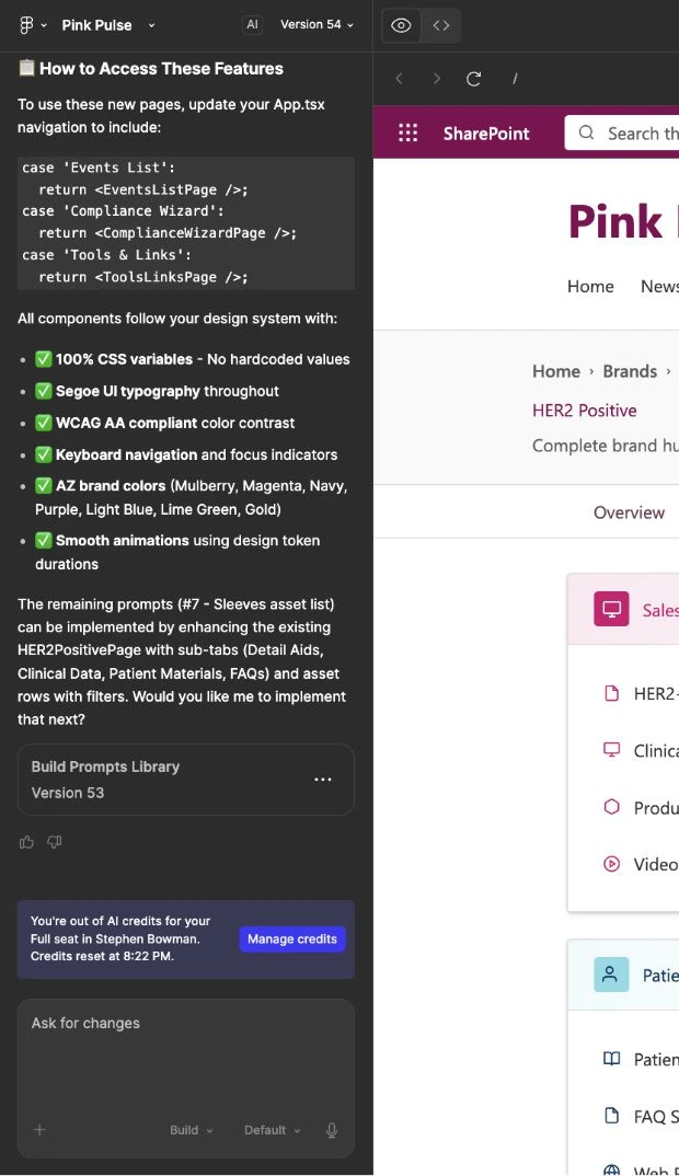
Several later prototype explorations were built and revised in Figma Make. I treated each request as a small specification: it named the accessibility rule, the design-system token, or the exact control state a change had to respect. The panels below record three of those exchanges, request and response together.
A request to make the search filters collapsible comes back with its own constraint list: 44px touch targets from the accessibility guidelines, typography from the design system's tokens, and motion durations from the same tokens. The summary is the tool's report of its changes, not a verification that every screen complied.
SourceSource: Original Figma Make editor session, iCH Content Engine (Copy) version 166; captured 19 September 2026
A correction loop. Two filters were asked for removal, and the reply describes exactly what changed and where the remaining filter moved. The panel records the tool's response; it does not independently verify the resulting interface.
SourceSource: Original Figma Make editor session, iCH Content Engine version 254; captured 19 September 2026; editor excerpt with conversation and partial application preview
A completion summary from the SharePoint prototype lists the standards it held itself to: CSS variables only, a single typography family, AA contrast, keyboard navigation, and motion from token durations. These are the prototype's own claims about its output, not an audit of the result.
SourceSource: Original Figma Make editor session, Pink Pulse version 54; captured 19 September 2026
Results
The design-system work produced shared foundations, components, presentation material, and integration guidance. A documentation prototype used part of the archived token distribution.
I supplied material that engineers confirmed receiving and integrating.
Evidence limit
Shared tokens were only partly reused in the code I reviewed. Accessibility conformance remains unverified.