AstraZenecaPart 3 of 5

Designing the AI Workbench

In May 2026 my focus moved to the shared AI Workbench, which brought several AI-assisted tasks into one workspace. I designed a view for each task, built the content-review flow with AI assistance, and worked with medical specialists on review gates and terminology.

Contribution
Product design, business analysis, and prototype implementation
Facts
Engagement
August 2025 to August 2026
Contract title
Senior UI/UX Business Analyst
Responsibilities
Requirements, interaction design, frontend prototypes, and shared design patterns
Collaboration
Business owners, medical specialists, product partners, designers, and model and backend engineers

Make the Workbench understandable

A different assignment, the AI Workbench

In May, my focus shifted toward the shared AI Workbench as the risk-register ownership transition began. The Workbench brought several AI-assisted tasks into one workspace, including budgeting, study review, and medical writing. Each needed its own way to inspect and act on the result.

A shared starting point for different tasks
View original
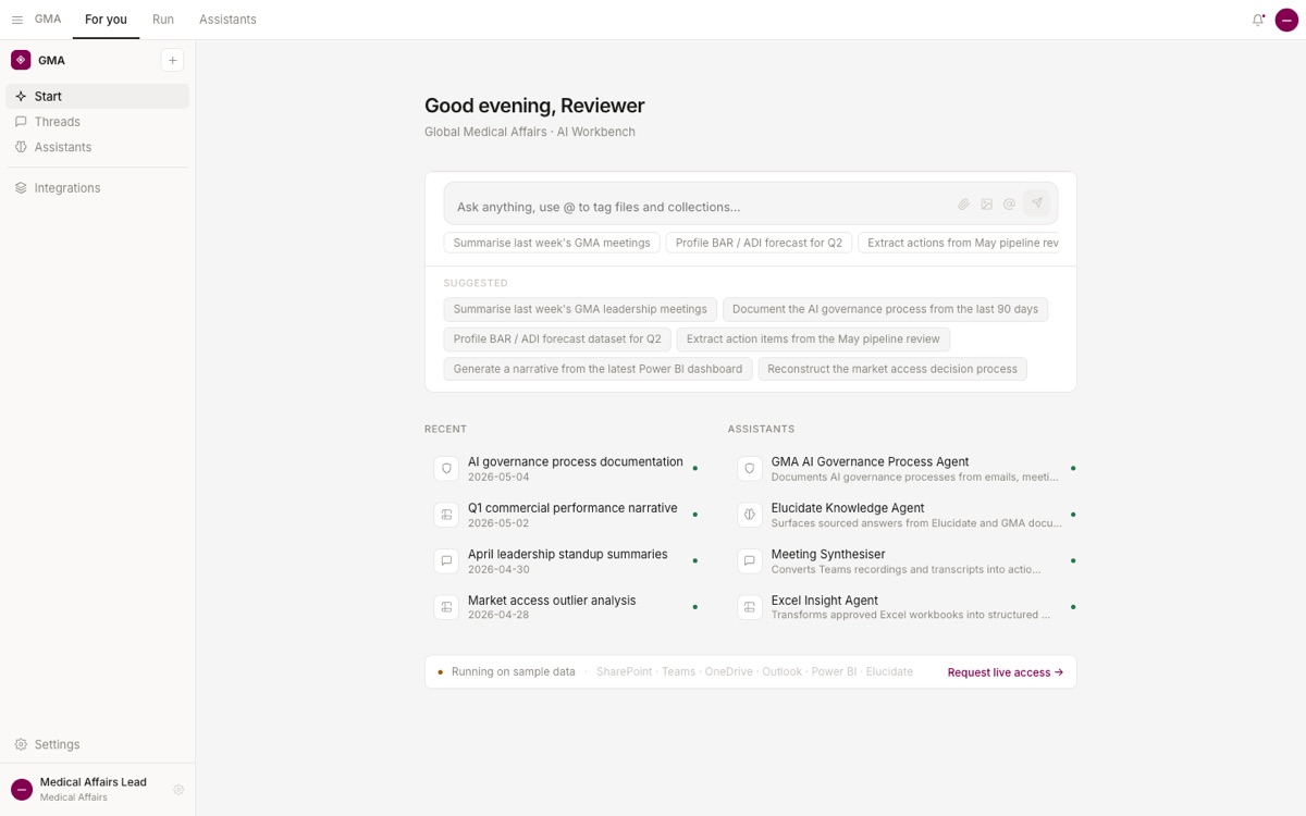
GMA Workbench prototype with a task input, suggested prompts, recent work, and a list of assistants.

The Workbench was a separate assignment. This prototype gives people a shared starting point; the next screens show how I adapted the experience to individual tasks.

Source: Original prototype screenshot supplied by Stephen Bowman; sample data

Give each task the view it needs

Leadership wanted people to start work with a chat request. Engineers already had budgeting and study-governance prototypes. I asked to see those flows before building the interfaces. In the design sessions, I pushed to show the decisions people still had to make after the request.

I adapted my colleague's budgeting interaction into the Workbench. A request opened proposed spending by month, where someone could compare values and question a line.

The study-governance team started with a morning queue. Opening a study showed its case file and next action, with routine activity separate from decisions requiring confirmation. I built that view from the engineer's existing scenarios and workflow.

For medical writing, the revised prototype replaced a static reader and separate review panel with an editable document. Citation chips and comments sat beside the relevant sentence. A writer could accept a proposed rewrite there. The team deferred a full rich-text editor; its extra formatting and collaboration features were beyond the demonstration's scope.

Chat could start the work, but the table, queue, or document held what the person needed to inspect. I designed that shared experience with colleagues who supplied domain logic and engineering integration.

A table, a queue, and a document

View original
Illustrative comparison: a budget table compares monthly values, a study queue pairs records with actions, and a document places a source and review beside a draft statement.

Simplified examples show how the working view changes with the task. Records and values are invented. These are layout explanations, not running application screens or a before-and-after sequence.

Source: Retrospective design exploration; new explanatory diagram, 19 September 2026; fictional records and values

Cut the steps in evidence planning

The evidence-planning prototype made people score, search, and create in sequence. It felt like a quiz. I asked to cut the steps. The first revision made them available as tabs and checked for duplicates while someone typed.

After the July demo, I revised the flow again using a domain colleague's demonstration to clarify the fields and process. One request produced a draft evidence gap. Before submitting, the person could review it alongside suggested changes and similar records.

The duplicate check moved into that decision. A very close match offered editing the description or using the existing record, with no option to submit the unchanged duplicate.

I built this revision with AI assistance and sample data. It had no live similarity service, and the records contain no measured usability improvement.

A separate field-assistant assignment

The field assistant used the same question-entry controls for reporting and customer-relationship work. I changed the suggested tasks to suit each.

The whole frame at once
View original
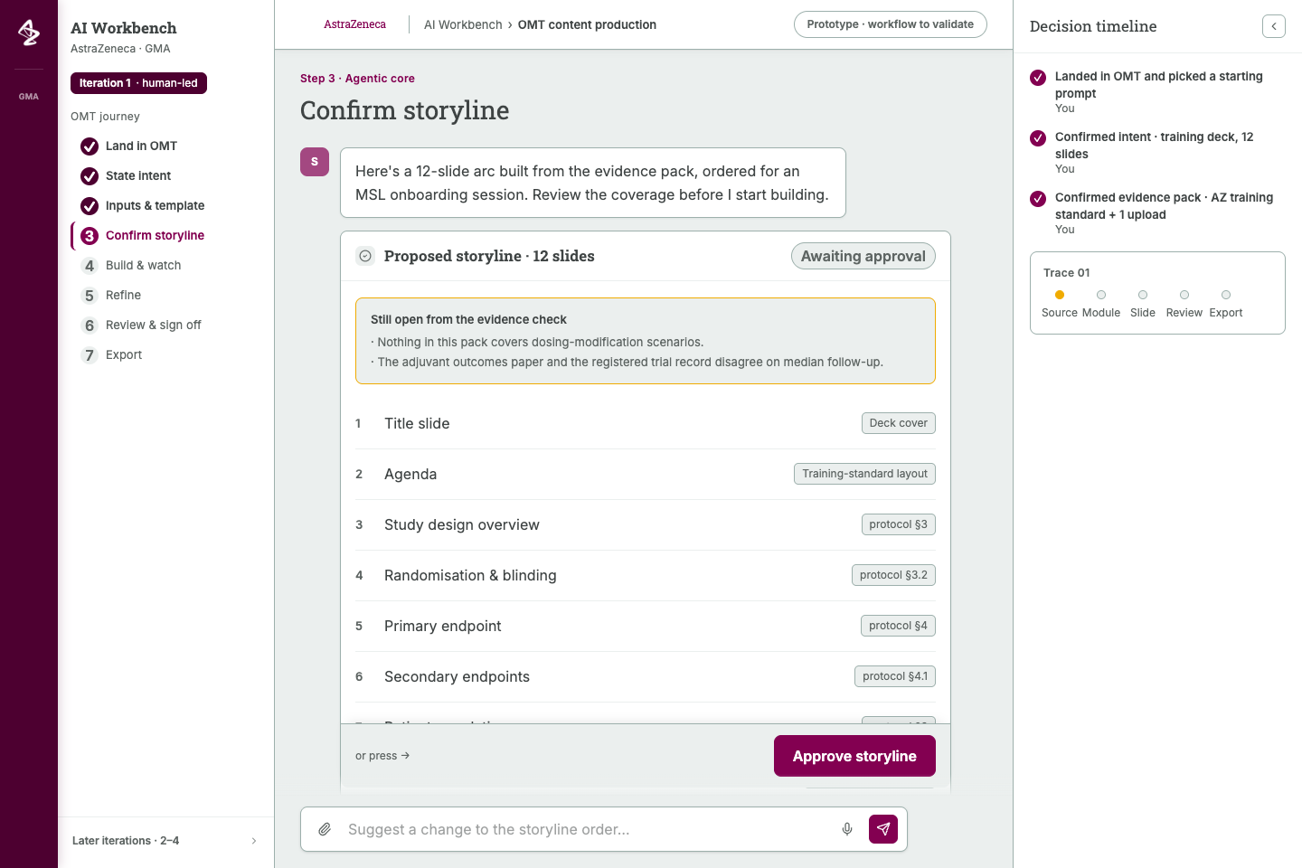
A Workbench screen at the confirm storyline step. A seven-step journey rail runs down the left, the centre shows a twelve-slide proposed storyline awaiting approval with two unresolved evidence items above it, and a decision timeline on the right lists who confirmed what.

The workspace kept three things on screen at once: where the task stood, what the agent proposed, and which decisions a person had already made. The storyline could not pass until someone approved it.

Source: Original Workbench prototype at the confirm storyline step; invented deck content and sample source references

View original
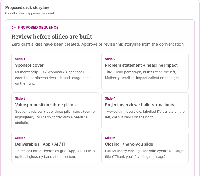
A proposed deck storyline panel reading zero draft slides and approval required, with the six proposed slides shown as a two-column grid of description cards.

The same storyline stated as a count: zero drafts exist yet. Saying plainly what the agent had not done mattered as much as showing what it proposed.

Source: Original Slide Builder prototype, proposed sequence panel; invented deck content

Giving an assistant a job, in four steps
View original
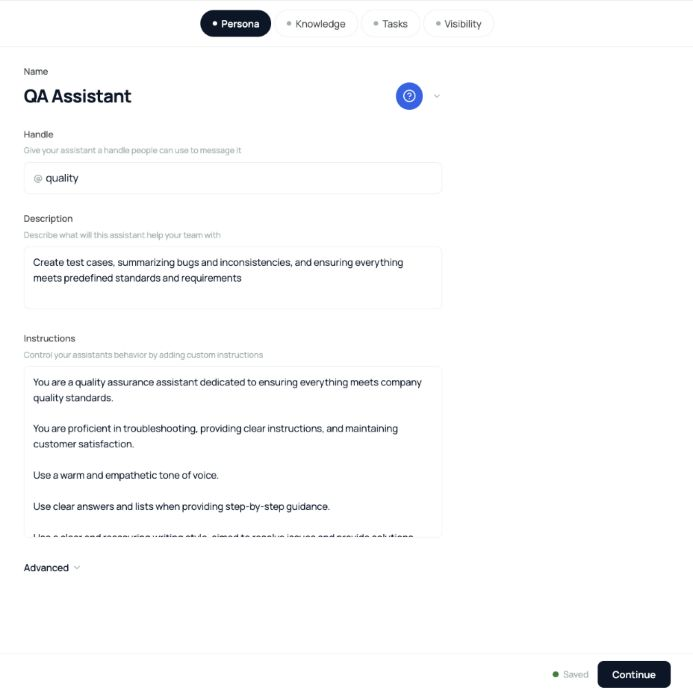
Assistant configuration detail with Persona, Knowledge, Tasks, and Visibility steps. The selected Persona step contains a QA Assistant name, handle, description, instructions, an Advanced control, and a Continue action.

Detail from the supplied unified-assistant prototype, captured in September 2026. A generic QA example separates the assistant's identity and instructions from knowledge, tasks, and visibility. This current file version is not evidence of the earlier backend integration or a released configuration service.

Source: Original Figma Make prototype detail, version 127; captured 18 September 2026

View original
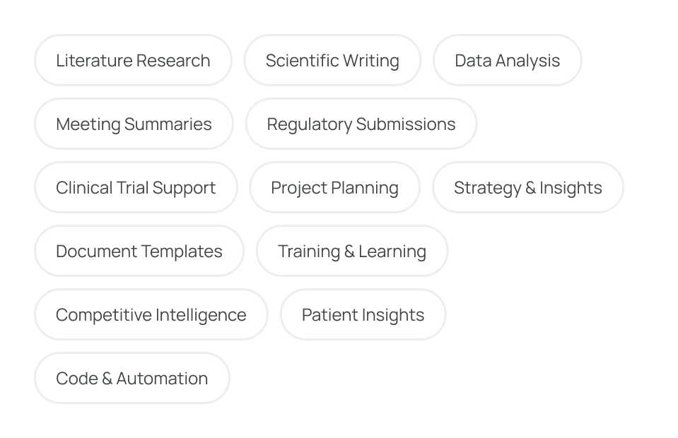
Task-selection chips for literature research, scientific writing, data analysis, meeting summaries, project planning, and other recurring workflows.

Original prototype detail. Task choices give someone a concrete starting vocabulary for configuring their workspace. The available choices show the proposed interface, not verified support for every task.

Source: Original prototype detail, MED AI LABS version 59; exported from Figma, 18 September 2026

View original
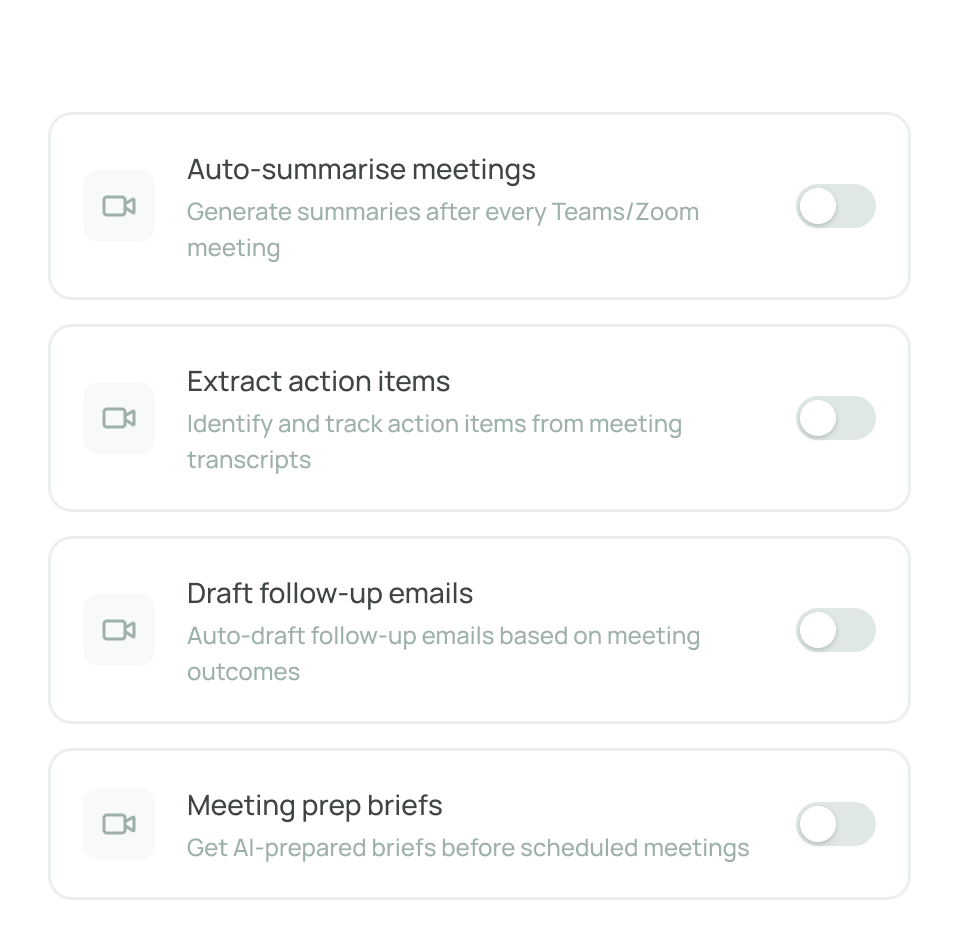
Four meeting-preference rows with separate switches for summaries, action items, follow-up email drafts, and meeting preparation briefs; all switches are off.

Original prototype detail. Separate switches make each proposed meeting behavior explicit. These are configuration controls in a demo; the image does not establish calendar access, meeting capture, or automated email delivery.

Source: Original prototype detail, MED AI LABS version 59; exported from Figma, 18 September 2026

Show the plan, then cite the answer
View original
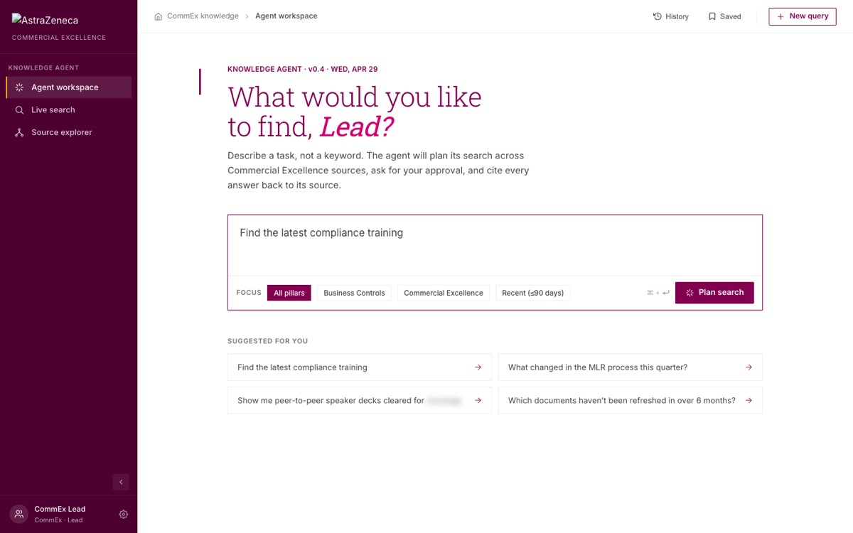
A knowledge agent workspace with a task-shaped query box, focus filters for source pillars, a plan search button, and four suggested starting queries.

The opening screen asks for a task, not a keyword, and says up front what the agent will do with it: plan the search, ask for approval, and cite every answer.

Source: Original prototype, version 0.4; sample queries and sample user, with one product name redacted

View original
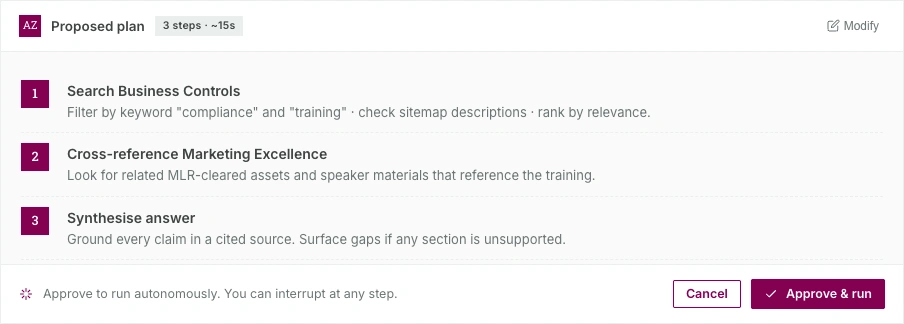
A three-step proposed plan card with an estimated run time, a modify link, and cancel and approve and run buttons.

The agent shows its plan and waits. Each step says which sources it will read and what it will do with them, the plan can be edited before it runs, and the run can be interrupted partway.

Source: Original prototype; sample query and invented search steps

View original
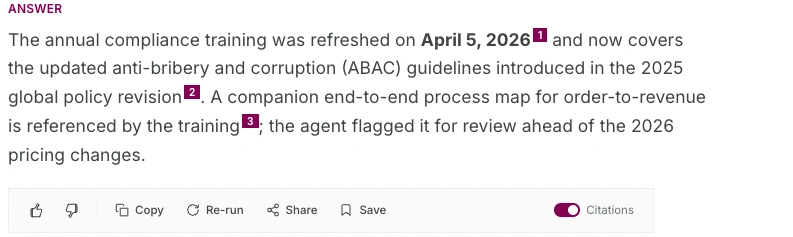
An answer paragraph with three numbered citation markers set inline, above a row of actions and a citations toggle switched on.

Every claim in the answer carries a numbered marker back to the document it came from, and the markers can be turned off for reading. The source belongs to the sentence rather than to a list at the bottom.

Source: Original prototype; sample answer and invented dates

View original
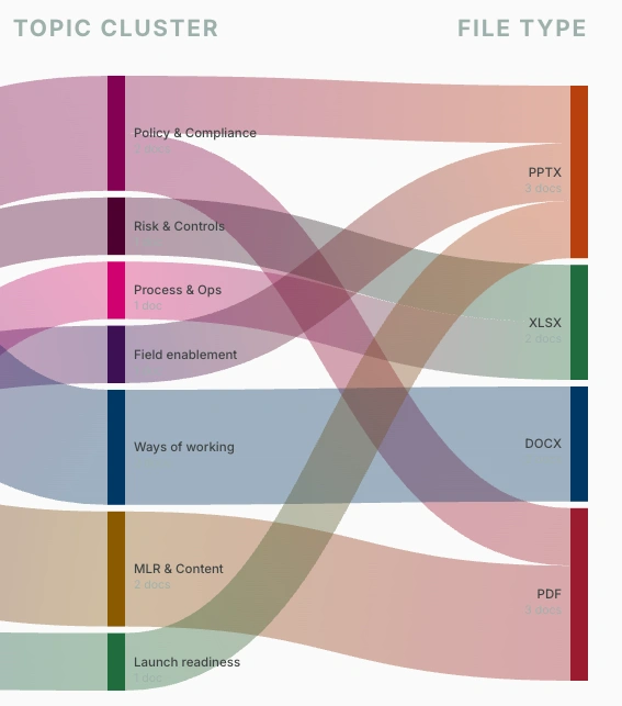
A flow diagram linking seven topic clusters on the left, such as policy and compliance and MLR and content, to four file types on the right.

A view of what the indexed sources actually hold, by topic and by file type. Someone deciding whether to trust an answer can see where the material is thin before they ask.

Source: Original prototype; sample document set of roughly a dozen files

Naming the work, and renaming it

View original
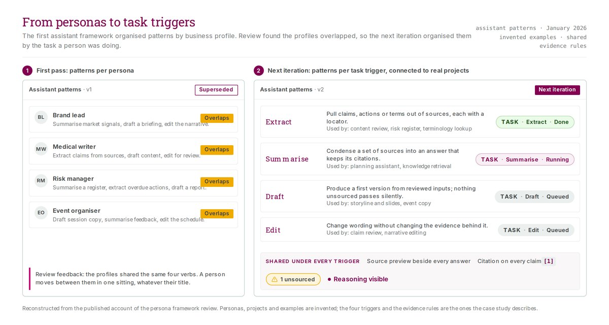
Two panels side by side. The superseded first pass lists four personas, each marked as overlapping. The next iteration lists four task triggers with a task chip, a run state, and a shared set of evidence rules beneath them.

The first framework sorted assistant patterns by job title, and review found the profiles said the same four things. I reorganised them around the task a person was doing, so the evidence rules could sit under every trigger.

Source: Reconstructed for the portfolio from the published account of the framework review; personas, projects, and examples are invented

View original
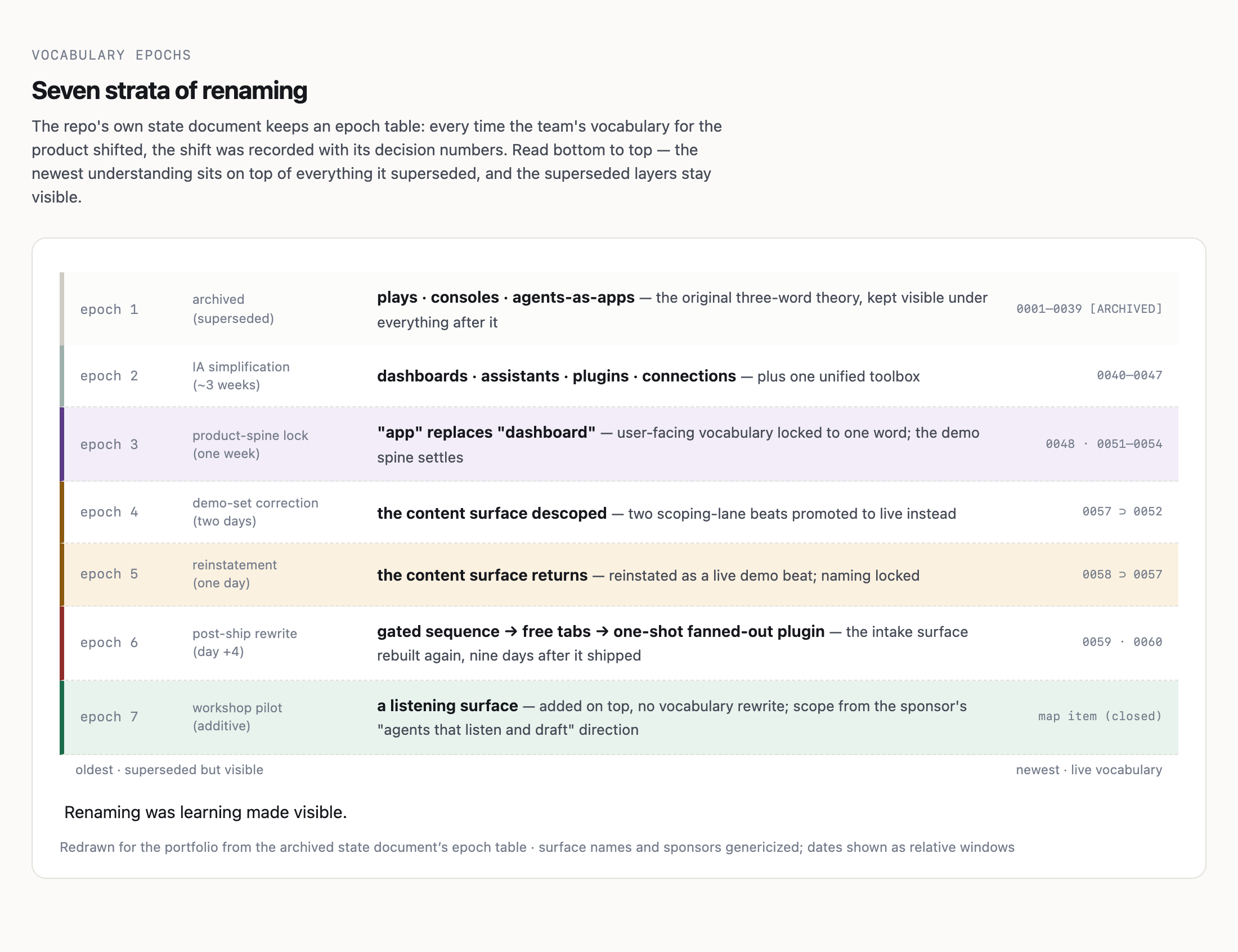
A seven-layer diagram read from bottom to top. Each layer names a period, how long it lasted, the vocabulary shift it introduced, and the decision numbers behind it, with superseded wording at the bottom and live wording at the top.

Every time the team's words for the product changed, the change was written down with its decision numbers and the superseded layer was left visible. Keeping the old names on the record is how we could tell a rename apart from a rethink.

Source: Redrawn for the portfolio from the project's archived state document; surface names and sponsors genericized, dates shown as relative windows

The same rule, spoken instead of typed
View original
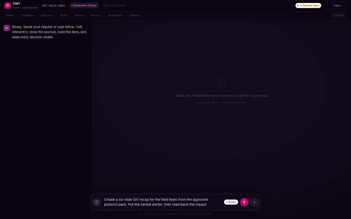
A dark voice prototype labelled Voice and Slide Tandem with a stage rail running from intent to handoff. The slide canvas is empty and reads that slides will appear once the storyline is approved, while a dictated request sits in the composer at the bottom.

The spoken-request prototype holds the same rule as the typed one. A person can dictate the whole task, and the canvas still stays empty until someone approves the storyline.

Source: Original voice prototype fixture, marked illustrative in the interface; invented request and record identifier, with a mis-rendered character in the trace control corrected

Follow a content task through review

Review the sources before drafting slides

An early content flow started making slides before establishing the sources. I moved source input and evidence review ahead of storyline confirmation, so the producer could see missing material before preparing the presentation.

The program lead asked me to coordinate the medical-content use case. I tracked dependencies and timing, helped manage expectations, and worked with colleagues to define the inputs and comparison for the demo. Reviewing the interface alone could not tell us whether the generated content was better.

Keep missing evidence visible after a request

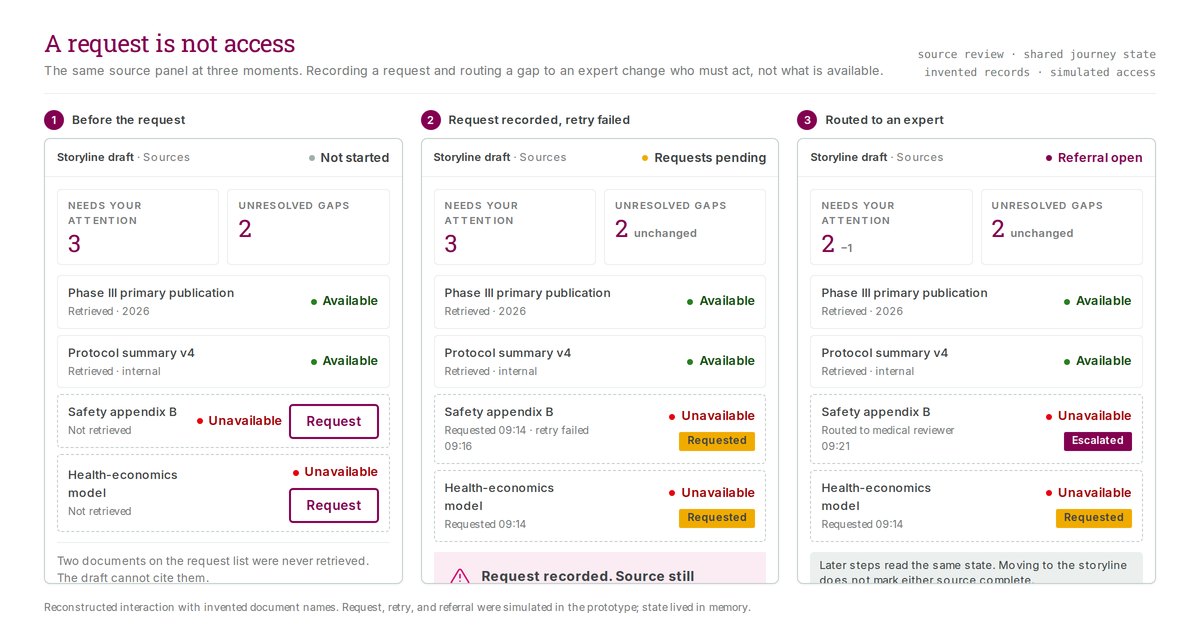
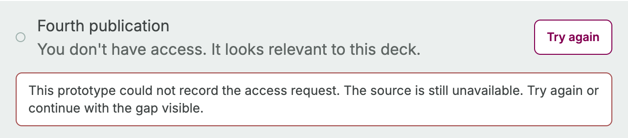
With AI assistance, I built the source-review interface, kept its state shared across steps, and added recovery from a failed request. The local demo deliberately failed the first access request. A retry recorded the request but left the source unavailable.

The gap stayed unresolved in the storyline. Routing it to an expert changed who needed to act, but left it in the unresolved count. Continuing the task did not mark the missing evidence complete.

Requests were simulated and state stayed in memory. Download and release controls displayed alerts.

Scope

This is an earlier local source-review prototype. Its original date and exact project assignment remain unresolved; later capture dates do not establish its place in the engagement timeline.

A request succeeds while the evidence stays missing
View original
Unavailable source with a Try again button and an error explaining that the prototype could not record the access request.

The first request fails and offers Try again. The source remains unavailable.

Source: Original archived prototype, captured locally 17 September 2026

View original
Source row labelled Source unavailable, access request noted in this prototype.

The retry records the request without granting access. This detail comes from the same archived source, captured separately.

Source: Original archived prototype, captured locally 17 September 2026

View original
Panel headed Still open from the evidence check, listing the dosing-modification gap and the disagreement over median follow-up.

Confirming the evidence step moved the producer forward without closing anything. Both gaps arrive at the storyline still open, carried by the shared journey state I implemented.

Source: Original archived prototype, captured locally 17 September 2026

Revise the requirements with medical specialists

Medical-training specialists reviewed a later prototype and challenged its assumptions. They needed to distinguish supported content from generated interpretation. A protocol was not always available. Priorities discussed in a kickoff might never appear in the uploaded documents.

They also wanted more ways to lay out a scientific story. Translation required someone to validate scientific language across markets, so the team removed it from the proposed first iteration.

That feedback gave me more specific source, context, layout, and scope requirements to work through. The session was a stakeholder walkthrough, not a usability study or scientific validation.

Preserve a reviewer's request for changes

The code in a later Workbench prototype counted a sent-back claim as reviewed while keeping its section blocked from export. The reviewer had made a decision; the content still needed changes. The export hold named the affected sections and linked to the first one needing attention.

Bulk acceptance filled in undecided claims and preserved earlier requests for changes. It could not erase a reviewer's objection.

This version contained local PowerPoint generation code, sample content, and a simulated reviewer. The archived sign-off wireframes belong to a separate version. Later records describe further review and release logic that was not connected to the interface. None of these establishes a connected scientific approval service.

Separate sign-off wireframes

View original
Toolbar reading Scientific approval required to export, beside an Add slide button and a greyed-out Export locked button.

Before review, the toolbar says why export is unavailable rather than only disabling it.

Source: Original archived design wireframe, 3 August 2026, cropped locally 18 September 2026

View original
The same toolbar slice after approval, showing an Add slide button beside an Export button with a download icon and no gating caption.

After sign-off the gating caption and the word locked are gone. It is the same control; only its condition changed.

Source: Original archived design wireframe, 3 August 2026, cropped locally 18 September 2026

View original
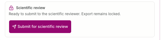
A card with a padlock icon headed Scientific review, reading ready to submit to the scientific reviewer and export remains locked, above a submit for scientific review button.

The card states the condition in the same place as the action. The deck can be submitted, and export stays locked until a reviewer signs off.

Source: Original archived design wireframe, 3 August 2026, cropped locally 18 September 2026

View original
The same card after approval, with a check icon and the line approved, export is unlocked and this sign-off remains visible.

The approved state keeps the sign-off on the screen instead of clearing it. A later reader can still see that a decision was made, and by which step.

Source: Original archived design wireframe, 3 August 2026, cropped locally 18 September 2026

State the gaps before writing anything
View original
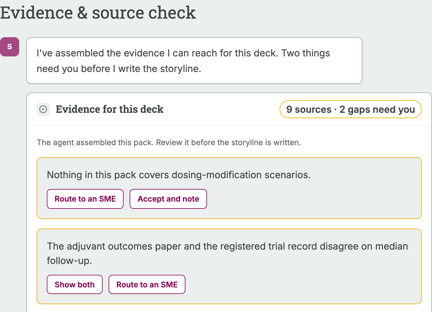
An evidence and source check step. A card labelled nine sources and two gaps need you holds two amber callouts, one saying nothing in the pack covers dosing-modification scenarios and one saying two records disagree on median follow-up, each with routing and acceptance controls.

Before a storyline is written, the agent states what it could not find and where two records conflict, and hands each gap to a person with a named next step.

Source: Original Workbench prototype, evidence and source check step; invented sources and gaps

Routed gap detailView original
An amber-bordered callout reading nothing in this pack covers dosing-modification scenarios, with a green check mark and the label route to an SME replacing the action buttons.

Once the gap is routed, the callout records the choice but keeps its amber border. The gap is assigned, not closed.

Source: Original Workbench prototype, evidence gap detail cropped from the source check step; invented gap

Requested source detailView original
A single source row with a hollow amber status ring, titled Fourth publication, with the status line request in progress.

A requested source stays amber and unresolved. The row records that a request was made, not that access was granted.

Source: Original Workbench prototype, evidence list detail cropped from the source check step; invented document name

A request is not access

View original
A three-column board showing the same source panel before a request, after a request is recorded and a retry fails, and after the gap is routed to a medical reviewer. The unresolved gap count stays at two in all three columns.

Requesting a source, retrying, and escalating all change who must act next. None of them change whether the source is available, so the gap count does not move.

Source: Reconstructed board built from the prototype with invented document names; request, retry, and referral were simulated and state lived in memory only

A run that pauses and takes a correction
View original
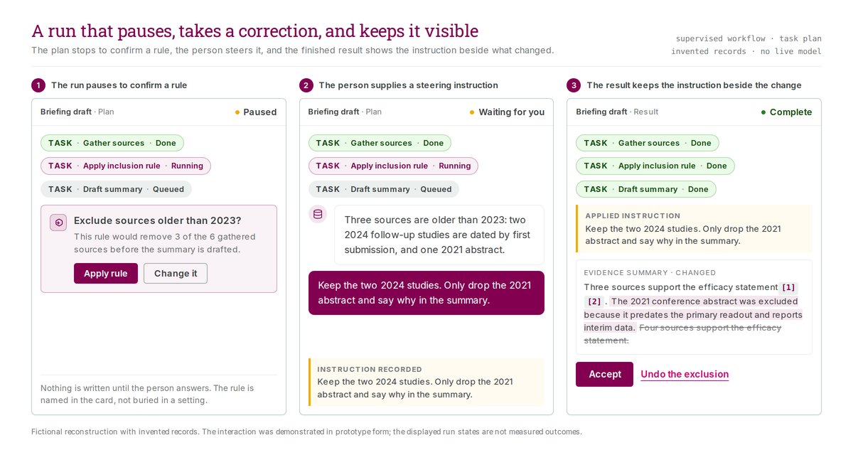
Three panels showing one run. The plan pauses on a card naming a rule and offering to apply or change it, the person types a steering instruction that is recorded, then the finished result shows the applied instruction beside the changed sentence with the old wording struck out.

The run stops where a rule would remove evidence, names the rule in a card rather than hiding it in a setting, and writes nothing until the person answers.

Source: Fictional reconstruction drawn for the portfolio; records are invented, no live model was run, and the run states shown are illustrative rather than measured

Say which review gates were real

Three gates, three different jobs

A medical training deck passed through three review gates before anyone could export it. A hygiene check for formatting and instructional design. A scientific check for accuracy and on-label claims. A template conversion that turned the approved draft into branded slides.

I interviewed the three people who staffed those gates. They did not want the same things. The scientific reviewer needed to trust that the gate before hers had already caught the mechanical problems, so she was not re-catching them herself. The content orchestrator needed to see every draft in flight at once, not just the finished ones. The hygiene reviewer needed one thing above all: confidence that pressing Export produced a working file rather than a gamble.

Design for the person whose time is the bottleneck

I made the scientific reviewer the primary user. Her gate carries the highest stakes, and her time was the most concretely costly thing in the process. Chasing subject-matter experts was, in her words, half her life, and a single protocol training could need input from seven of them. Source material arrived unpredictably, sometimes as a deck of three or four hundred slides where most of it did not apply. Designing for her first meant the other two roles got a system shaped around the scarcest expertise rather than the most frequent clicks.

The journey bottoms out exactly where it matters most

I mapped her path from the moment a draft arrives to the moment she sees what her sign-off produced. The lowest point is the review itself. It is the step with the highest stakes, the least verifiable signal, and the most external time pressure, all at once.

That is also where I found the problem. At her gate the system ran an accuracy checklist across four dimensions and reported all four as passing. It reported them as passing every time, for every draft, because there was no accuracy model behind it. The hygiene gate before hers did the same thing. Two of the three gates were reporting a result they had not actually produced.

Label the empty gate rather than let it look full

I argued for marking the checklist as not yet automated, in the interface, before anyone relied on it. The trade-off is real and worth stating plainly: a gate labelled unfinished looks worse in a demo than a clean row of green checkmarks. I took the worse-looking option. A reviewer who trusts a check that never ran will stop trusting the whole system the first time something real slips through, and that costs more than never having claimed the check in the first place.

Scope

This was discovery research, not usability testing. The reviewer had described her manual process but had not yet used the built pipeline, so the trust risk is one I predicted from the design rather than one I observed her hit.

Reuse what exists before building anything new

Two of the three fixes were already sitting in the building. A sibling workstream had a working triage and reminder system that could do the stakeholder chasing the scientific reviewer was doing by hand. The hygiene reviewer had already built a checker his own team used, and offered it. I sequenced both of those ahead of new work, and put the visibility the orchestrator asked for ahead of both, because the data for it already existed and only needed surfacing. I deliberately left two things out: a real accuracy model, which is a different size of problem, and the question of where the pipeline's audit trail should properly live, which deserved its own decision rather than a ride-along slot in this one.

Make specialist information usable

Explain how terms relate

Commercial and medical colleagues needed to look up a term and understand how other teams used it. I built the terminology prototype so they could do that without learning the underlying vocabulary structure.

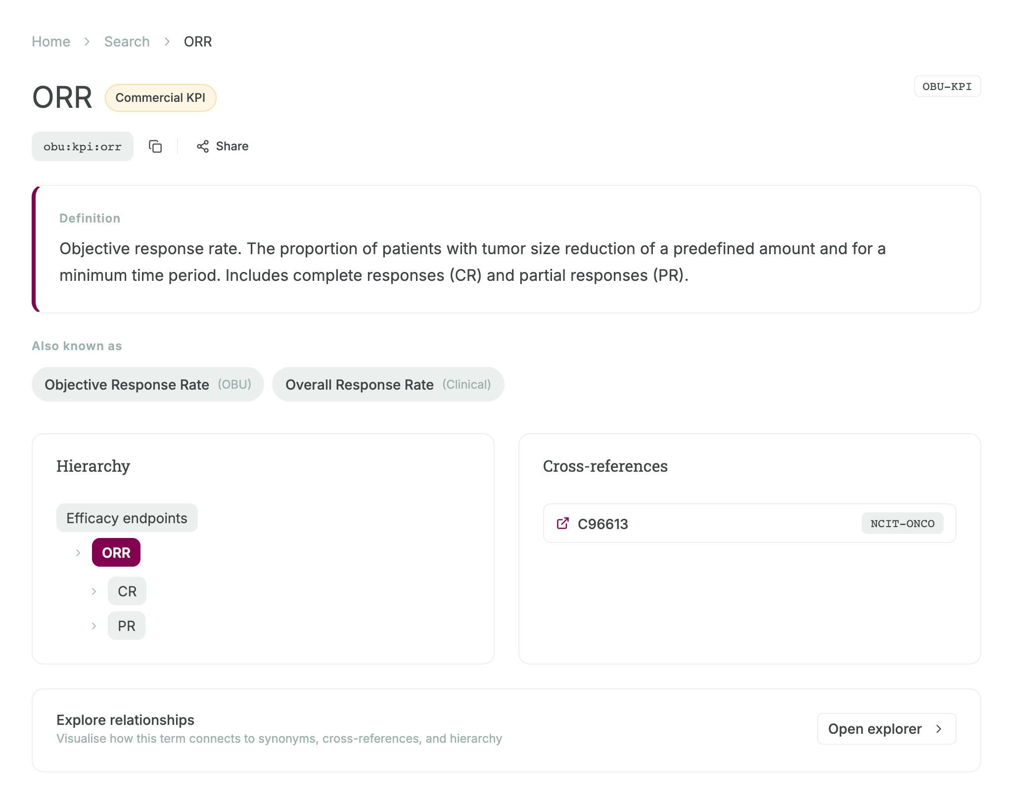
Search results showed the definition, identifier, source label, and synonyms. The detail view gave each relationship its own place: aliases for the same concept, a hierarchy of broader and narrower concepts, and cross-references to other vocabularies.

The reviewed search-to-detail path used prototype data. Live terminology services and external integrations were outside the original scope.

Scope

The original terminology prototype date remains unresolved. Capture dates do not establish when the work began or ended.

A term and its relationships
View original
Terminology detail for the ORR fixture, with identifier, sourced aliases, a parent and child hierarchy, and a vocabulary cross-reference.

The original term-detail interface distinguishes an alternative name from a related concept. This is a fresh capture of the preserved code bundle using mock terminology; the definition and identifiers are fixture content.

Source: Original archived prototype, captured locally 17 September 2026

The way in, and the structure underneath it
View original
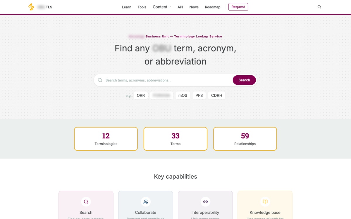
A terminology lookup landing page with a search field, example acronym chips, and counts of twelve terminologies, thirty-three terms, and fifty-nine relationships.

Example acronyms sit under the search box so someone can see the kind of thing the service holds, and the counts say how much is in it before anyone searches.

Source: Original prototype; sample vocabulary of thirty-three terms, with the business unit name and one example redacted

View original
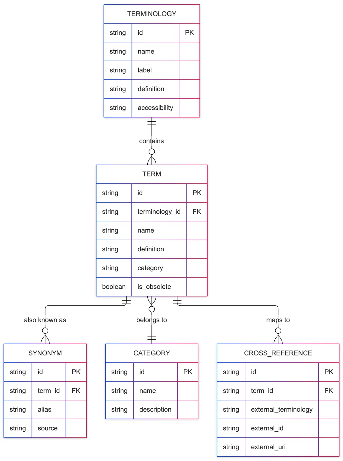
An entity relationship diagram in which a terminology contains terms, and each term links to synonyms, a category, and cross-references to outside vocabularies.

The structure behind the lookup. Aliases, categories, and links to other vocabularies are three separate relationships, which is why the detail view could give each one its own place instead of one flat list.

Source: Retrospective diagram drawn for the portfolio from the prototype's data structure; not an original client artifact

Results

  • I designed and revised AI workflow interfaces and implemented key frontend behavior with AI assistance.
  • I coordinated the medical-content use case and used prototype reviews to clarify requirements for sources, outputs, review, and scope.

Evidence limit

The AI prototypes do not establish production adoption or measured savings. The earlier source-review prototype simulated access, kept state in memory, and used alert-based download and release actions. The later Workbench had local PowerPoint generation code, with predefined sample content and a simulated reviewer identity.

Resume and contact