Supporting case study
Choosing a phone is only the start
AT&T
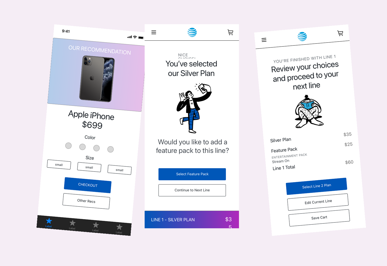
I designed device, plan, and feature-pack screens for AT&T's wireless experience. The work broke a line's choices into smaller decisions, then brought the plan, optional services, and total together for review.
- Role
- UX Designer
Facts
- Client
- AT&T Wireless CxT
- Employer
- IBM iX
- Dates
- March to July 2020
- Contribution
- Screen design, journey maps, prototypes, and remote workshop facilitation
- Collaboration
- IBM team and AT&T stakeholders
- Work shown
- Original device, plan, optional-pack, and line-review designs
Make the whole line understandable
The brief was to rethink how wireless customers used AT&T's web and app experiences. Device preferences, rate plans, and extra services all affected the decision. I needed to explain each choice while keeping the whole line understandable.
I facilitated remote workshops and designed journey maps and web and mobile prototypes in Sketch and Adobe XD, working with the IBM team and AT&T stakeholders. The device, plan, and feature-pack screens shown here are my design work.
Give each choice its own moment
The device recommendation follows questions about phone use and budget. An Other Recs action keeps the first suggestion from becoming a dead end.
The expanded plan keeps the price, terms, and Select action together. Other tiers remain available below it. After selection, a separate prompt offers a feature pack alongside a way to continue to the next line.
The review brings the plan, pack, and line total together, with actions to edit, save, or choose the next line's plan. I treated the extra service as a visible choice rather than letting it disappear into the total.
Follow four related design states
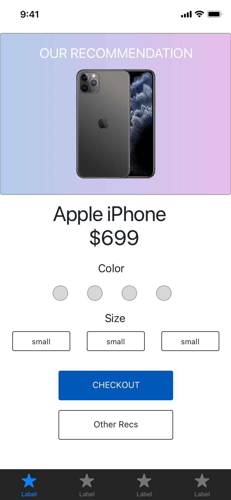
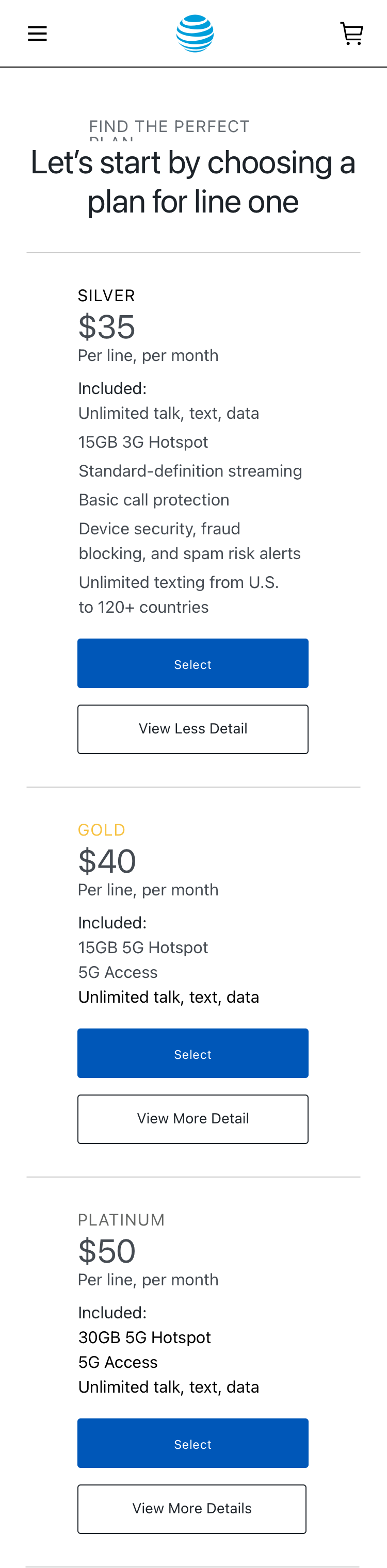
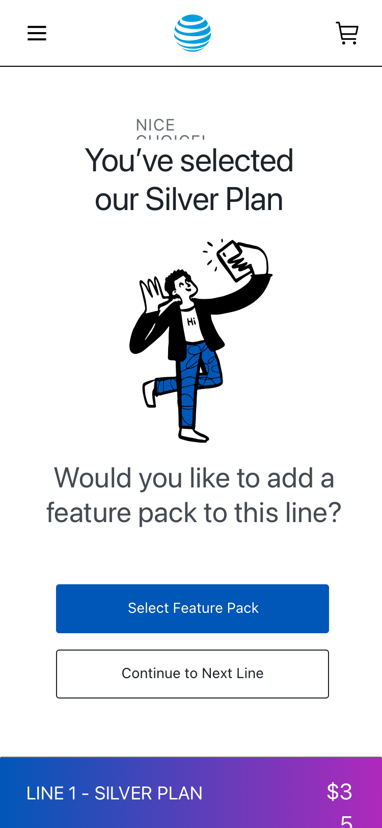
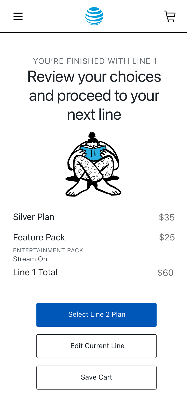
These are related states from two pages in the native design file: the device comes from Upgrade Flow; plan, pack, and review come from the feature-pack page. The tour brings those decisions together for reading. It is not a recording of one end-to-end session.
Leave a design the team can inspect
The surviving work makes the proposed choices concrete: what is recommended, what the plan includes, whether to add a service, and what one line costs. The screens and prototypes gave the team a way to inspect that experience together.
I explored several directions with the team. The original screens keep the design decisions visible, including the detail available at each choice and the route back to edit a line.
Results
- I designed device, plan, optional-service, and line-review screens as part of AT&T's wireless experience work.
- I supported the engagement with remote workshops, journey maps, and web and mobile prototypes.
Evidence limit
Original screen designs and prototypes from the 2020 engagement, supported by remote workshops and journey maps.
Related work
BPSupporting case study
A coffee order starts with the right site
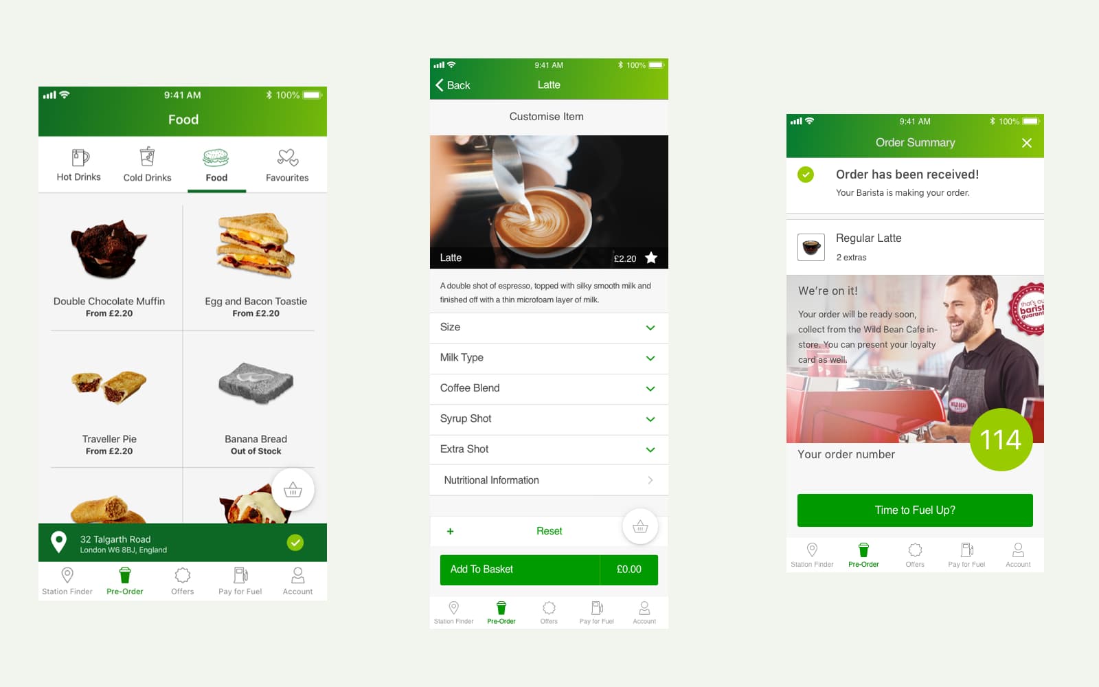
I worked with BP product owners in the UK and Australia on coffee pre-ordering for BPme. I refined the requirements through research, then created wireframes and a clickable prototype that carried the order through to collection.
- Interaction design
- Mobile commerce
- Prototyping
- Service design
United AirlinesSupporting case study
From thirteen systems to one service task
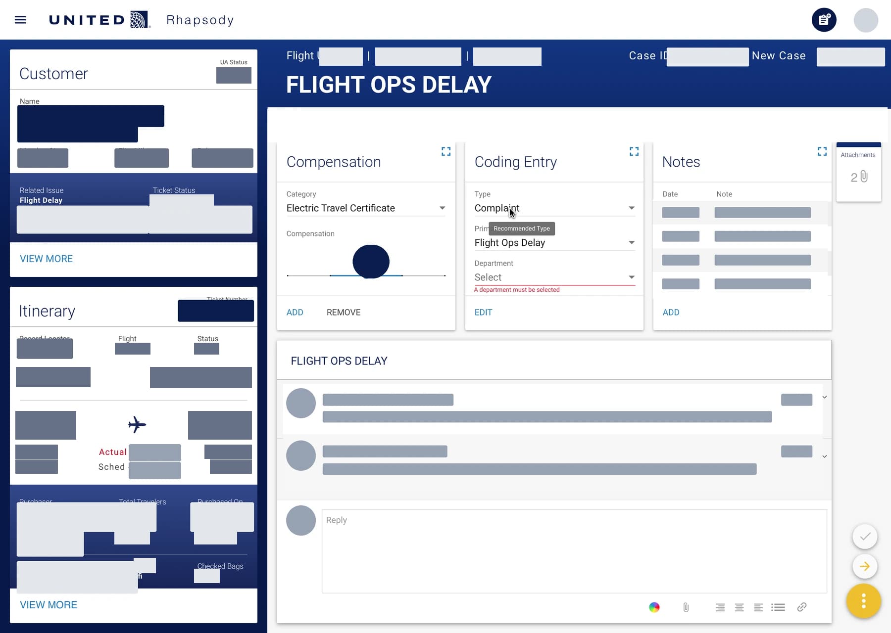
At IBM iX, I helped consolidate thirteen customer-care systems into one task-centered dashboard. During the pilot, average throughput rose from two to seven complaint resolutions per hour.
- Information architecture
- Interaction design
- Ethnographic research
- Service design
All Nippon AirwaysSupporting case study
A research-led direction for ANA's global website
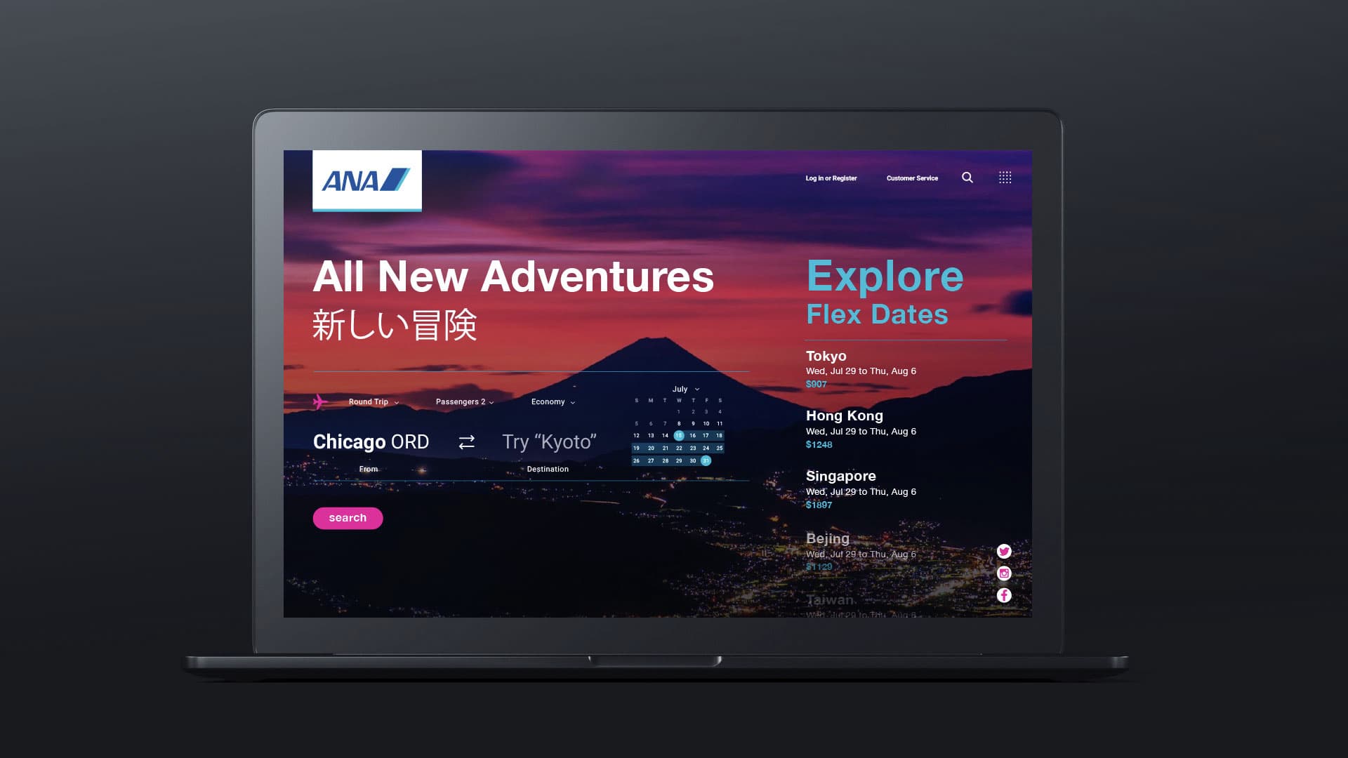
In 2019, I assessed earlier agency work, interviewed ANA stakeholders, and helped facilitate a two-day design-thinking workshop in Tokyo. I turned the findings into UX 2020, design principles and a roadmap for western business travelers.
- UX research
- Design strategy
- Workshop facilitation
- Concept design