Supporting case study
A coffee order starts with the right site
BP
I worked with BP product owners in the UK and Australia on coffee pre-ordering for BPme. I refined the requirements through research, then created wireframes and a clickable prototype that carried the order through to collection.
- Role
- UX Designer
Facts
- Client
- BP
- Employer
- IBM
- Dates
- 2019 to 2020
- Collaboration
- BP product owners in the UK and Australia
- Contribution
- User research, requirements, wireframes, and prototyping
- Work shown
- Coffee pre-order prototype and original flow diagrams
Establish where the order can happen
Ordering a coffee sounds simple until the selected site is closed, does not support pre-ordering, or cannot load its menu. I worked with BP product owners in the UK and Australia to refine the requirements and build a clickable prototype for participating BP locations.
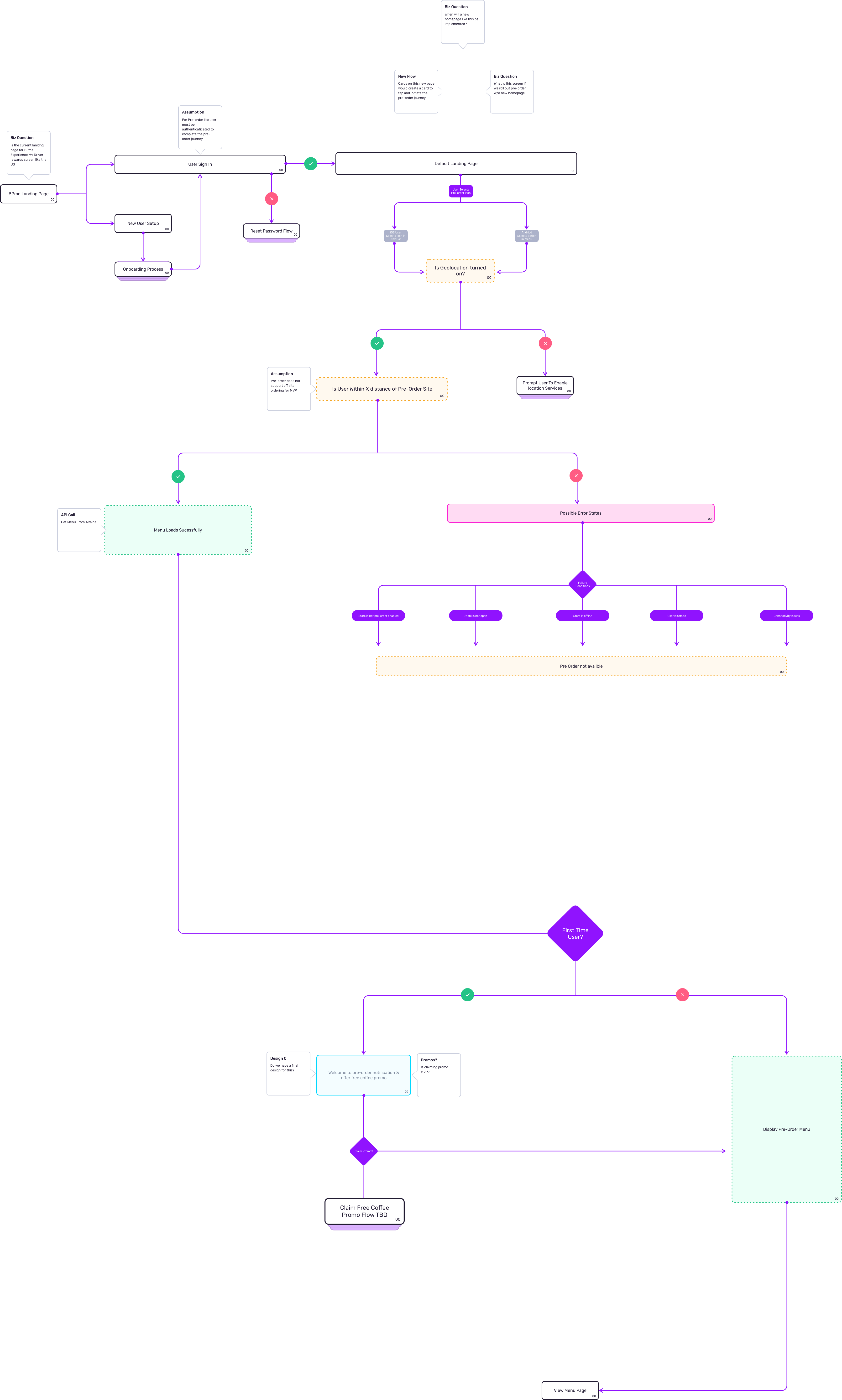
My work covered user research, wireframes, and prototyping. The site-selection flow put the conditions for an order ahead of the menu: sign-in, location access, and proximity to a participating site. It also kept open business questions visible, including the entry point and the first-order promotion.
The unavailable paths mattered as much as the successful one. The diagram names a site without pre-ordering, a closed store, an offline store, an offsite customer, and connectivity problems. It records offsite ordering as outside the proposed MVP.
Make the unavailable paths explicit
Check the site before building the order
The flow establishes whether the customer can order at this site before asking them to choose products and pay.
Keep the drink and its choices together
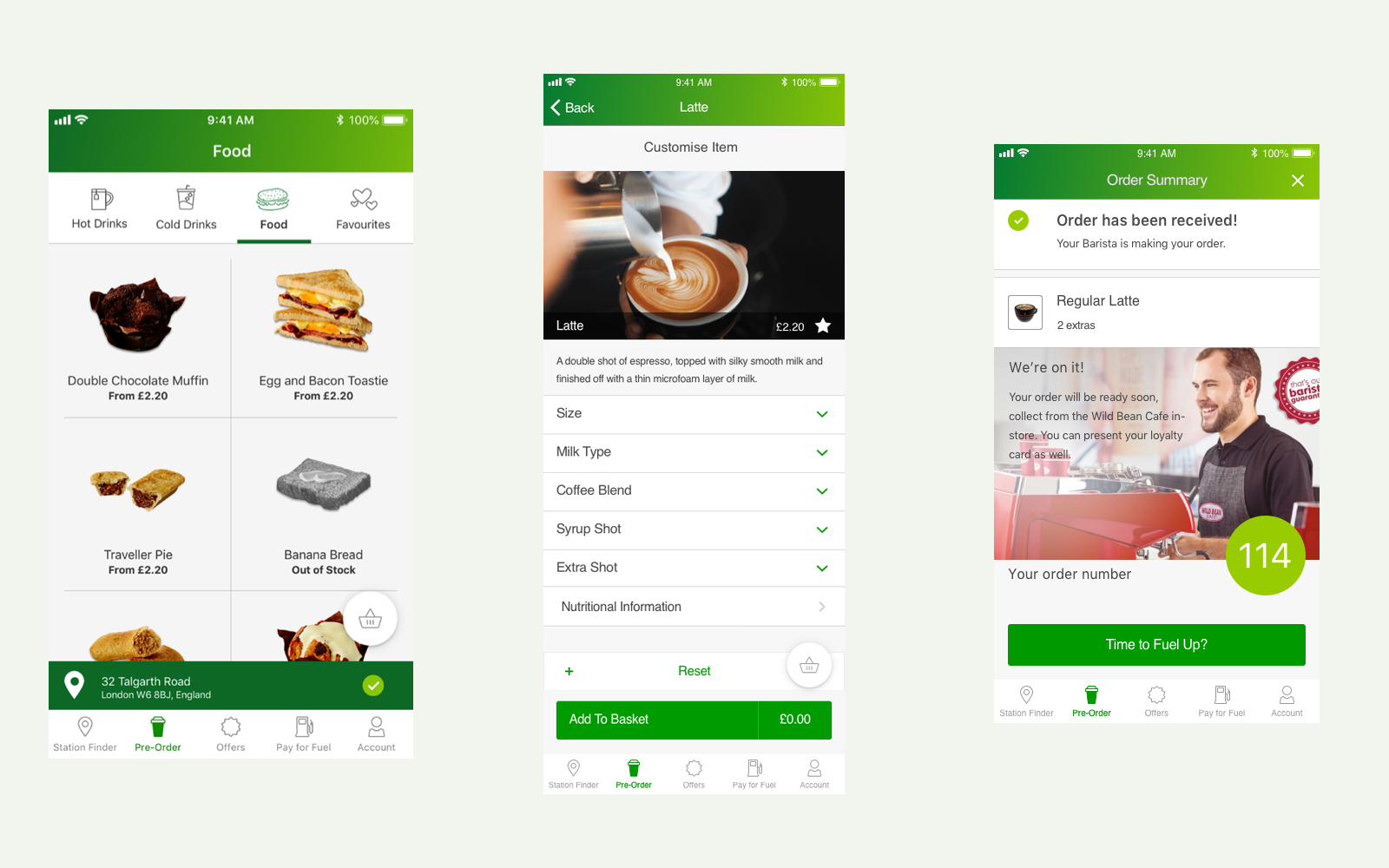
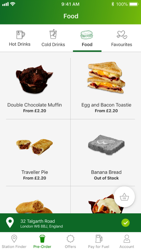
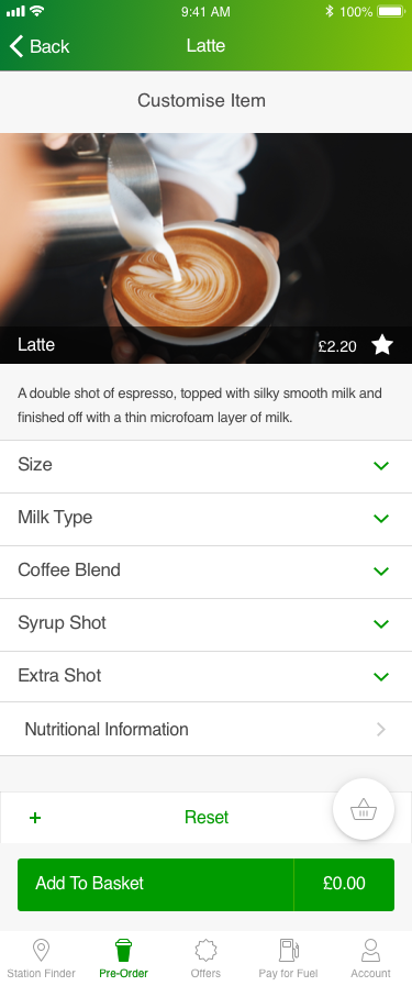
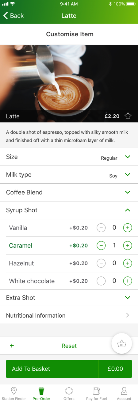
The menu keeps the selected site visible below the products. On the drink screen, size, milk, coffee blend, syrup, and extra-shot options sit with the product and the Add to Basket action.
The flow distinguishes required choices from optional extras. Size and coffee blend are marked as required in the diagram. The screen designs explore how those choices expand without taking the customer away from the drink.
Explore the original product screens
Inspect the modifier and basket rules
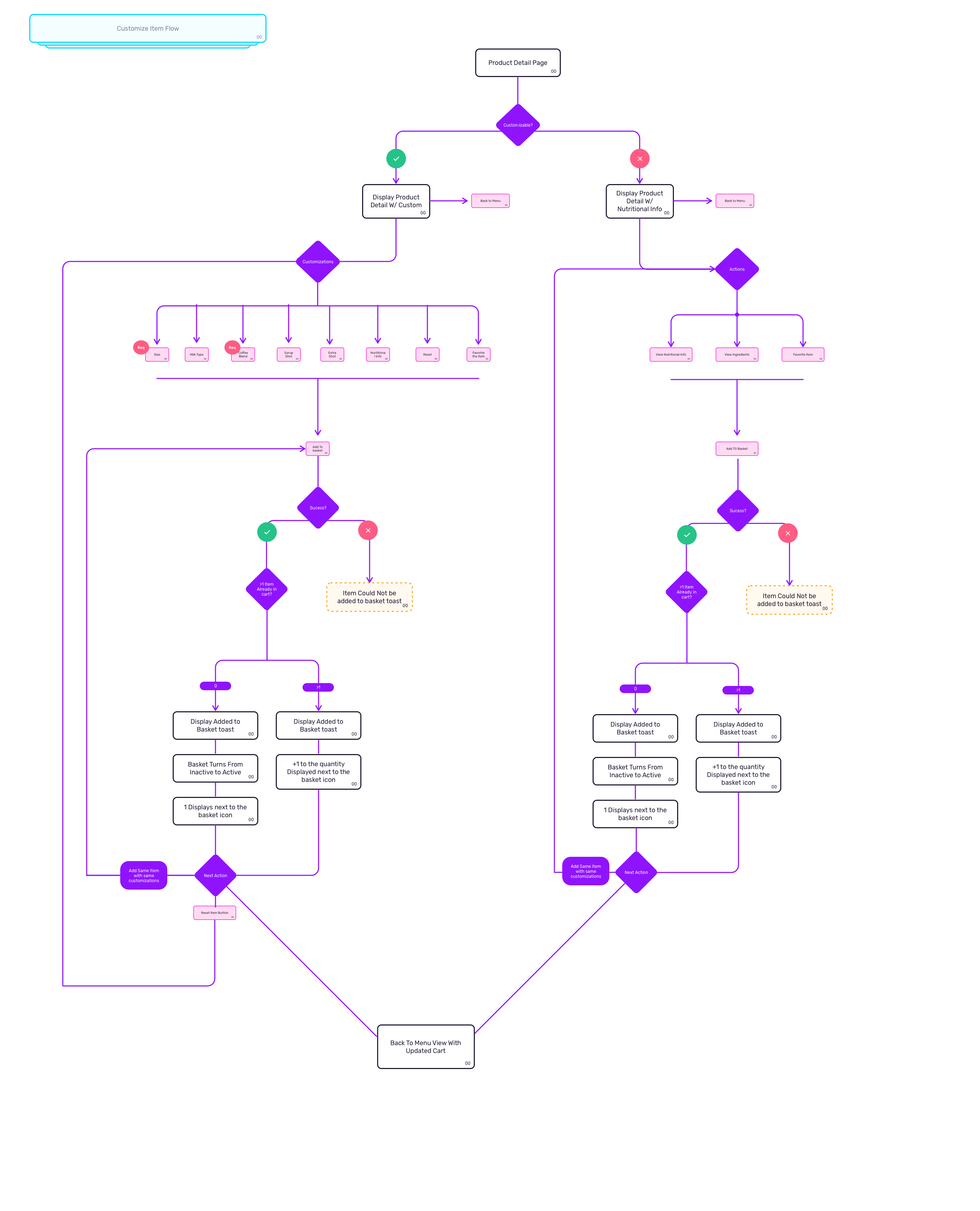
The original flow splits customizable products from products with nutrition and ingredient information. Both paths account for an item failing to enter the basket. On success, the basket becomes active or its existing count increases.
Required choices and explicit failure states
Let the customer check and change the order
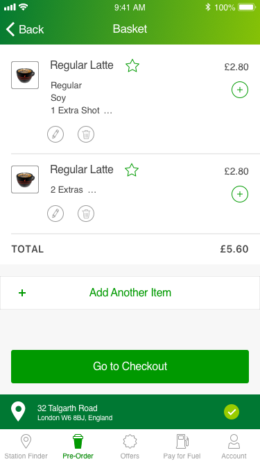
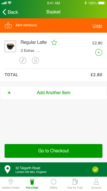
The basket brings the drink, its extras, quantity, and total back together before checkout. The original states also show a removal message with Undo. Changing an order should leave the customer able to see what remains and recover a mistaken removal.
Review the basket and a removal state
Finish with a clear collection handoff
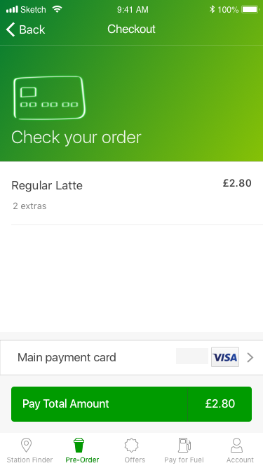
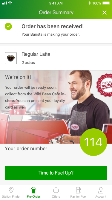
Checkout restates the drink and total before payment. The confirmation then changes the task: the order has been received, the barista is preparing it, and the customer has a collection number.
I used the prototype to review the complete journey with product owners, from checking the site to giving the customer a collection number.
Move from payment to collection
Results
- I translated coffee pre-order requirements into wireframes and a clickable prototype for review with BP product owners.
- The design covers availability, customization, basket changes, checkout, and collection.
Evidence limit
Original screen designs, wireframes, and prototype flows from the 2019 to 2020 engagement.
Related work
United AirlinesSupporting case study
From thirteen systems to one service task
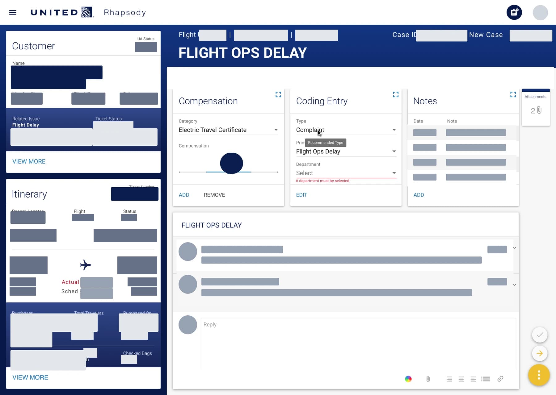
At IBM iX, I helped consolidate thirteen customer-care systems into one task-centered dashboard. During the pilot, average throughput rose from two to seven complaint resolutions per hour.
- Information architecture
- Interaction design
- Ethnographic research
- Service design
All Nippon AirwaysSupporting case study
A research-led direction for ANA's global website
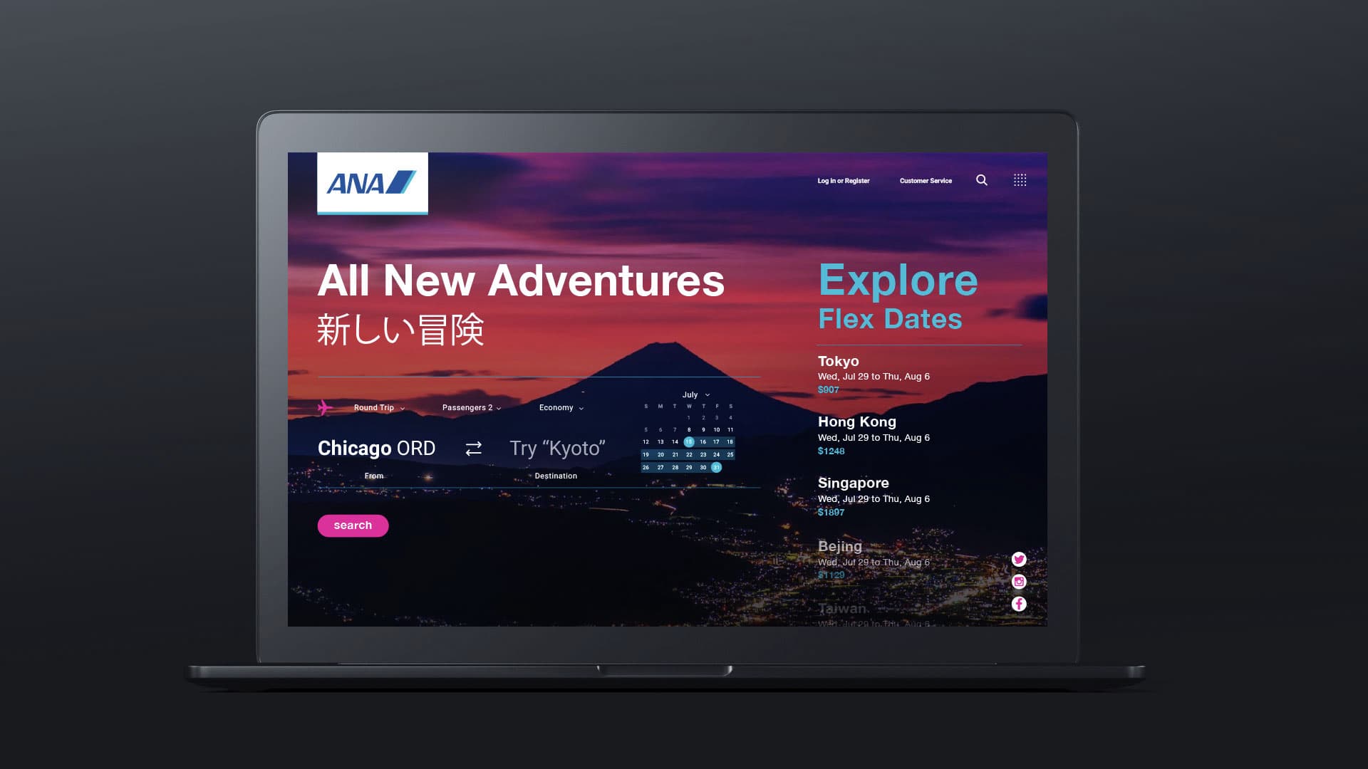
In 2019, I assessed earlier agency work, interviewed ANA stakeholders, and helped facilitate a two-day design-thinking workshop in Tokyo. I turned the findings into UX 2020, design principles and a roadmap for western business travelers.
- UX research
- Design strategy
- Workshop facilitation
- Concept design
JanssenSupporting case study
One working system for eighteen pharmaceutical brands
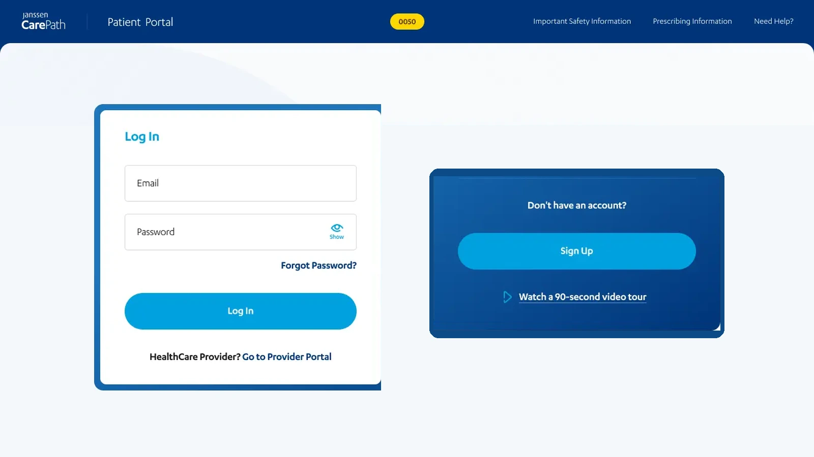
At IBM, I led UX across eighteen Janssen brands and managed two designers in a shared Figma system. Project records list more than 2,000 approved desktop and mobile screens.
- Design systems
- Regulated workflows
- Responsive design
- Design operations